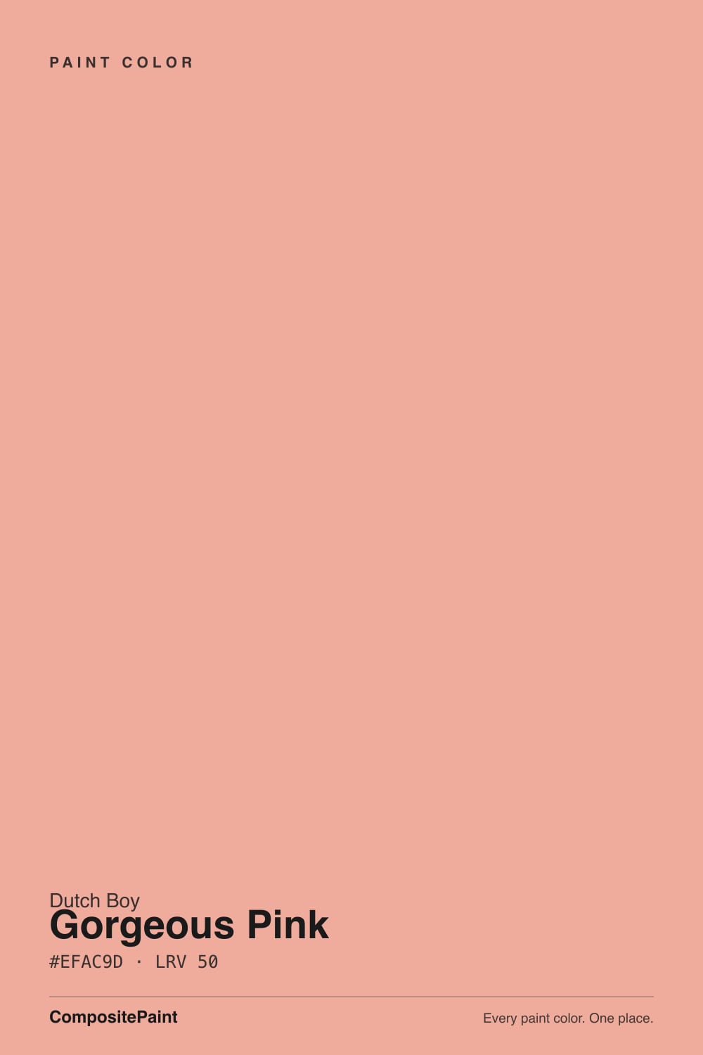
Color spec
| Brand | Dutch Boy |
| Name | Gorgeous Pink |
| SKU | 104-4DB |
| Hex | #EFAC9D |
| RGB | 239, 172, 157 |
| HSL | 11°, 72%, 78% |
| LRV | 50 |
| Undertone | warm red tone |
| Family | Pink |
About Dutch Boy Gorgeous Pink
At LRV 50, Gorgeous Pink is a light color that bounces daylight around a room without tipping into stark white. Its red undertone is the part to watch: it gets picked up by whatever sits next to it, so test it against your trim, floor and the room's main light before committing. It holds its undertone in most exposures, which is what makes light shades like this so forgiving room to room.
Gorgeous Pink is an easy whole-room color for living spaces and bedrooms, and light enough to carry onto trim or a ceiling if you want a soft, seamless look. Soft pinks flatter bedrooms and nurseries; deeper ones make a confident statement.
Closest matches by brand
13 brands within ΔE 5The closest matches per brand by ΔE2000, computed against each brand's full deck. Only colors within ΔE 5 (close enough to substitute on a wall) are shown — brands with no real match are left off. Tap any swatch for its full single-color spec; tap the brand title to browse all pink from that brand.
Sherwin-Williams
Behr
Benjamin Moore
Valspar
PPG / Glidden
Glidden
HGTV Home by Sherwin-Williams
Dunn-Edwards
Farrow & Ball
Diamond Vogel
Hirshfield's
C2 Paint
Kompozit
Similar Dutch Boy colors
closest in the Dutch Boy deckThe nearest shades to Gorgeous Pink within Dutch Boy's own range, ranked by perceptual color distance — useful when you want the same look a touch lighter, darker, or warmer.
Coordinated palette
Generated by hue-rotating #EFAC9D in HSL space. Pair Gorgeous Pink with one accent and one neutral — the swatches below are starting points, not final picks.
Accessibility (WCAG contrast)
WCAG 2.1: AA = 4.5:1 normal text · AA Large = 3:1 large text · AAA = 7:1 normal text.
Dutch Boy Gorgeous Pink Equivalents at Other Brands
Matching Gorgeous Pink from a different paint counter? Below is the single closest color in each major US deck and how close it really is. Remember that any paint store can also custom-tint Dutch Boy 104-4DB directly — these equivalents are for when you'd rather stay inside one brand's own deck.
Sherwin-Williams Equivalent of Gorgeous Pink
At Sherwin-Williams, the closest color to Gorgeous Pink is Youthful Coral (SW 6604) — very close at ΔE 3.16, though not an exact twin. It runs slightly lighter (LRV 52 vs 50) and carries a warm red undertone; sample both side by side if the room gets strong natural light. See the full Youthful Coral swatch →
Behr Equivalent of Gorgeous Pink
At Behr, the closest color to Gorgeous Pink is Peach Shortcake (M210-4) — very close at ΔE 2.19, though not an exact twin. It sits at the same lightness (LRV 50 vs 50) and carries a warm red undertone; sample both side by side if the room gets strong natural light. See the full Peach Shortcake swatch →
Benjamin Moore Equivalent of Gorgeous Pink
Benjamin Moore's nearest match is Georgia Peach (031), visually identical in normal room light (ΔE 1.16). It runs slightly darker (LRV 47 vs 50) and carries a warm red undertone, so it substitutes for Gorgeous Pink without repainting risk. See the full Georgia Peach swatch →
Valspar Equivalent of Gorgeous Pink
At Valspar, the closest color to Gorgeous Pink is Mad About Maddie (8002-9C) — very close at ΔE 3.1, though not an exact twin. It runs slightly lighter (LRV 52 vs 50) and carries a warm red undertone; sample both side by side if the room gets strong natural light. See the full Mad About Maddie swatch →
PPG / Glidden Equivalent of Gorgeous Pink
At PPG / Glidden, the closest color to Gorgeous Pink is Soft Salmon (PPG1190-4) — very close at ΔE 2.74, though not an exact twin. It sits at the same lightness (LRV 49 vs 50) and carries a warm red undertone; sample both side by side if the room gets strong natural light. See the full Soft Salmon swatch →
Glidden Equivalent of Gorgeous Pink
At Glidden, the closest color to Gorgeous Pink is Roslyn'S Periwinkle Blue (49BB 51/186) — very close at ΔE 2.74, though not an exact twin. It sits at the same lightness (LRV 51 vs 50) and carries a warm red undertone; sample both side by side if the room gets strong natural light. See the full Roslyn'S Periwinkle Blue swatch →
HGTV Home by Sherwin-Williams Equivalent of Gorgeous Pink
At HGTV Home by Sherwin-Williams, the closest color to Gorgeous Pink is Indulgent Peach (HGSW 1076) — very close at ΔE 3.16, though not an exact twin. It runs slightly lighter (LRV 52 vs 50) and carries a warm red undertone; sample both side by side if the room gets strong natural light. See the full Indulgent Peach swatch →
Dunn-Edwards Equivalent of Gorgeous Pink
Dunn-Edwards has no exact twin of Gorgeous Pink. The nearest is Aloha Sunset (DE5178) at ΔE 4.15 — close, but the difference shows next to trim and in side light. It runs slightly darker (LRV 45 vs 50). Compare large swatches before substituting. See the full Aloha Sunset swatch →
Farrow & Ball Equivalent of Gorgeous Pink
At Farrow & Ball, the closest color to Gorgeous Pink is Blooth Pink (NO. 9806) — very close at ΔE 2, though not an exact twin. It runs slightly darker (LRV 47 vs 50) and carries a warm red undertone; sample both side by side if the room gets strong natural light. See the full Blooth Pink swatch →
Diamond Vogel Equivalent of Gorgeous Pink
At Diamond Vogel, the closest color to Gorgeous Pink is Pale Terra (1058) — very close at ΔE 2.86, though not an exact twin. It sits at the same lightness (LRV 50 vs 50) and carries a warm red undertone; sample both side by side if the room gets strong natural light. See the full Pale Terra swatch →
Hirshfield's Equivalent of Gorgeous Pink
At Hirshfield's, the closest color to Gorgeous Pink is Pale Terra (1058) — very close at ΔE 2.27, though not an exact twin. It runs slightly darker (LRV 48 vs 50) and carries a warm red undertone; sample both side by side if the room gets strong natural light. See the full Pale Terra swatch →
C2 Paint Equivalent of Gorgeous Pink
C2 Paint has no exact twin of Gorgeous Pink. The nearest is Tomfoolery (C2-544) at ΔE 3.94 — close, but the difference shows next to trim and in side light. It runs slightly lighter (LRV 54 vs 50). Compare large swatches before substituting. See the full Tomfoolery swatch →
Kompozit Equivalent of Gorgeous Pink
At Kompozit, the closest color to Gorgeous Pink is Pale Terra (1058) — very close at ΔE 2.27, though not an exact twin. It runs slightly darker (LRV 48 vs 50) and carries a warm red undertone; sample both side by side if the room gets strong natural light. See the full Pale Terra swatch →