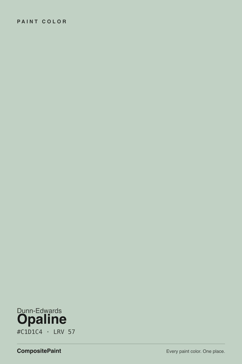
Opaline
DEC783 · #C1D1C4 · LRV 57 — cool green tone, light — bounces daylight without going clinical.
- 1Evergreen Fog30
- 2Clary Sage41
- 3Opaline57
- 4Hancock Green66
- 5Alabaster82
What Color Is Opaline, Really?
Opaline reads as a cool green tone — light — bounces daylight without going clinical. The notes below cover how Dunn-Edwards DEC783 behaves in different light and the closest matches at competing US brands.
Best Rooms and Uses for Opaline
Opaline is an easy whole-room color for living spaces and bedrooms, and light enough to carry onto trim or a ceiling if you want a soft, seamless look. Greens bridge indoors and out, so they suit living rooms, kitchens and sunrooms.
How Lighting Changes Opaline
At LRV 57, Opaline is a light color that bounces daylight around a room without tipping into stark white. Its green undertone is the part to watch: it gets picked up by whatever sits next to it, so test it against your trim, floor and the room's main light before committing. It holds its undertone in most exposures, which is what makes light shades like this so forgiving room to room.
Most complaints about Opaline are a light mismatch. Upload a photo of your actual room and see it on your walls — then ask for the same wall in north light or evening lamps before you buy a single sample.
Need It From Another Brand?
Any paint counter can custom-tint Dunn-Edwards DEC783 directly. If you would rather stay in one brand's own deck, these are the closest stock matches, measured as ΔE2000. Under 2 is a difference you will not see on the wall.
| Brand | Closest color | ΔE | LRV | |
|---|---|---|---|---|
| Sherwin-Williams | WaterscapeSW 6470 · Sherwin-Williams | 1.9 | 62 | Color page → |
| Behr | Frosted JadePPU11-13 · Behr | 1.1 | 61 | Color page → |
| Benjamin Moore | Turquoise Mist695 · Benjamin Moore | 0.9 | 60 | Color page → |
| Valspar | Fountain FoamV099-2 · Valspar | 3.0 | 61.3 | Color page → |
| PPG / Glidden | White CloverPPG10-31 · PPG / Glidden | 1.2 | 61 | Color page → |
| Glidden | White CloverPPG10-31 · Glidden | 1.4 | 61 | Color page → |
Similar Dunn-Edwards Colors
The nearest shades to Opaline within Dunn-Edwards's own range, ranked by perceptual color distance — useful when you want the same look a touch lighter, darker, or warmer.
WCAG 2.1: AA is 4.5 : 1 for normal text, 3 : 1 for large text, AAA is 7 : 1.
Coordinated palette
Generated by hue-rotating #C1D1C4 in HSL space. Pair Opaline with one accent and one neutral — the swatches below are starting points, not final picks.
Have you painted with Opaline?
Rate it — one tap helps the next reader decide.
Ask a Question