Cornflower Blue
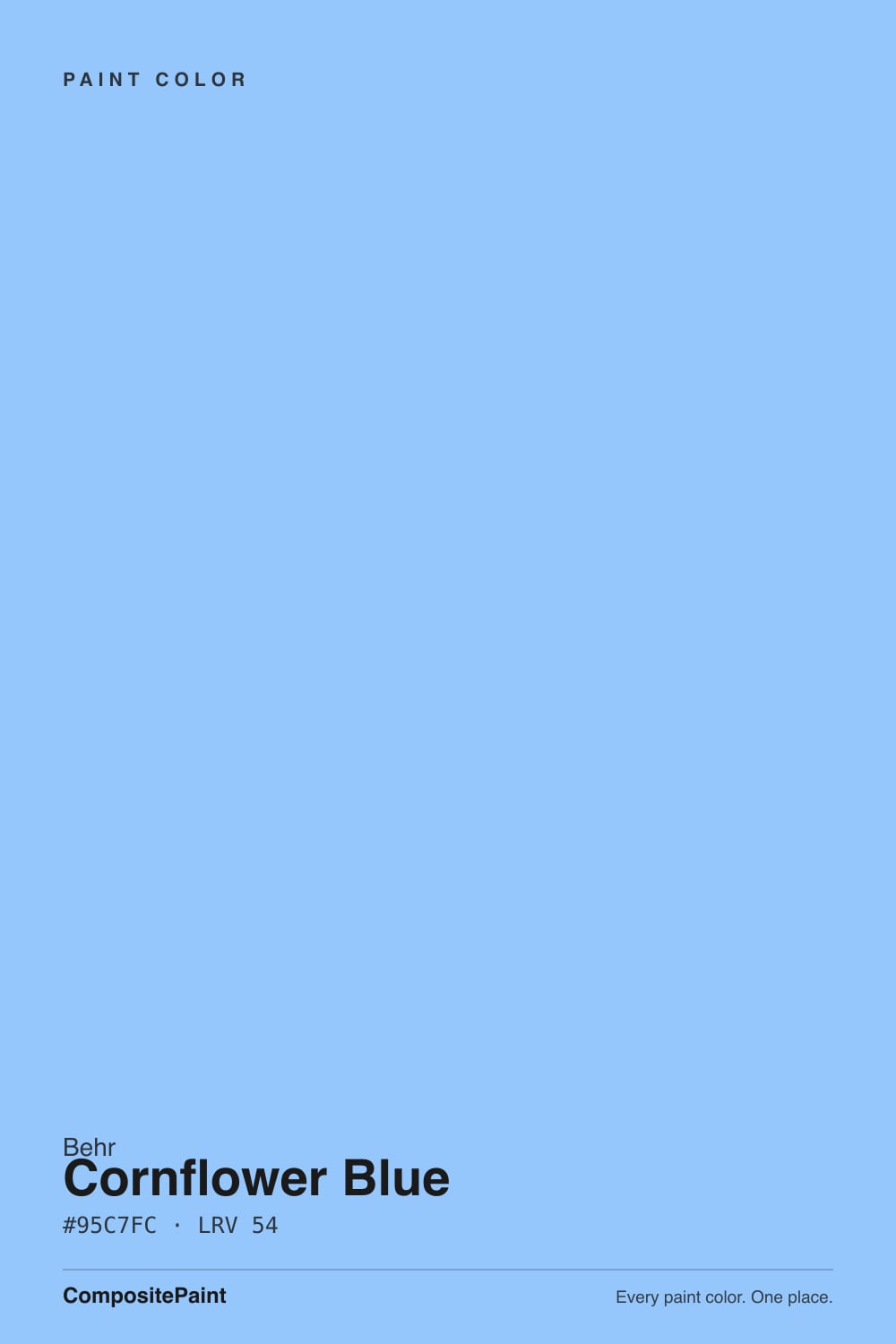
580B-5 · #95C7FC · LRV 54 — cool blue tone, light — bounces daylight without going clinical.
- 1Williamsburg Wedgwood Blue28
- 2Resolute Blue40
- 3Cornflower Blue54
- 4Honolulu Blue62
- 5After Rain68
What Color Is Cornflower Blue, Really?
Cornflower Blue 580B-5 is a clear sky blue. It sits at LRV 54, right in the light band, so it bounces daylight around a room without going pale or washed out. What separates it from the many grayed blues on a fan deck is chroma. Its hue is at 211 degrees with saturation near 94 percent, so this is an openly blue blue, not a blue-gray that only shows its color in certain light.
People pick it when they want the room to read cheerful and awake. It suits bedrooms for kids, bathrooms, laundry rooms, painted furniture, and ceilings, and it carries the easy coastal feeling that a muddier blue cannot. At LRV 54 it still keeps a small room feeling open.
The honest catch is the saturation. Colors this clean look far stronger on four walls than on a chip, and in a north-facing room the blue can turn cool and slightly icy, which is unflattering on skin tones in a bathroom mirror. It also fights warm creams and yellow-based woods. Paint a big sample and live with it for a couple of days before you commit a whole room.
There is not much hiding in Cornflower Blue. At 211 degrees the hue sits just on the cool side of pure blue, with a whisper of violet rather than green, and the saturation is high enough that the color reads as blue in almost any light.
What changes is how strong it looks, not what color it is. Against a crisp white it looks clean and bright. Against a warm cream it can look colder and more intense, because the cream pushes it further from neutral. Next to a green-blue like Behr Bayou 570B-4 at LRV 58 it reads more violet, and next to the softer Bellflower 610D-4 at LRV 51 it reads clearer and less gray.
The practical check is a large sample beside your trim and your flooring. Warm oak and yellow-toned wood set up a strong contrast with this blue, which can be lively or jarring depending on what you want.
Best Rooms and Uses for Cornflower Blue
This is a good color for rooms meant to feel light and cheerful rather than serious. Children's rooms, guest bedrooms, laundry rooms, mudrooms, and powder rooms all take it well, and at LRV 54 it keeps small spaces feeling open instead of boxed in.
Ceilings are an underrated use. A clear blue overhead in a porch, sunroom, or bedroom reads as sky and lifts the room, and the mid-range reflectance stops it from turning heavy. On painted furniture, a built-in bookcase, or a laundry cabinet run it gives a strong hit of color for very little commitment.
Outside it suits shutters, a front door, or a porch ceiling on a light-bodied house. Behr paint is mixed at The Home Depot, which makes matching later coats easy. Where it struggles is in formal rooms full of warm wood and cream, and in north-facing bathrooms where the coolness works against you at the mirror.
How Lighting Changes Cornflower Blue
At LRV 54 Cornflower Blue reflects a moderate amount of light, so the room never goes dark, but the light source changes how cool it feels. North-facing rooms get cool indirect daylight that stacks on top of an already cool color, and there it can look icy, closer to a pale winter sky than a summer one.
South and west rooms are kinder. Warm sunlight softens the edge and the blue looks fuller and friendlier, particularly in the afternoon. East rooms look brightest and coolest in the morning and settle down later.
Bulbs matter a lot here. Warm 2700K lamps knock some of the coolness out and can make it read slightly greener or grayer at night, which most people find pleasant. Neutral 4000K bulbs keep the color true but also keep it cold. If the room is north-facing, warm bulbs are the simplest way to stop the blue from feeling clinical after dark.
Most complaints about Cornflower Blue are a light mismatch. Upload a photo of your actual room and see it on your walls — then ask for the same wall in north light or evening lamps before you buy a single sample.
Need It From Another Brand?
Any paint counter can custom-tint Behr 580B-5 directly. If you would rather stay in one brand's own deck, these are the closest stock matches, measured as ΔE2000. Under 2 is a difference you will not see on the wall.
| Brand | Closest color | ΔE | LRV | |
|---|---|---|---|---|
| Valspar | Bluish4006-9C · Valspar | 4.3 | 54.4 | Color page → |
| PPG / Glidden | Sweet DreamsPPG1241-3 · PPG / Glidden | 3.3 | 53 | Color page → |
| Glidden | Sweet DreamsPPG1241-3 · Glidden | 3.7 | 54 | Color page → |
| Dunn-Edwards | Sail to the SeaDE5863 · Dunn-Edwards | 2.0 | 49 | Color page → |
| Diamond Vogel | Watery Sea0638 · Diamond Vogel | 3.6 | 49 | Color page → |
Similar Behr Colors
The nearest shades to Cornflower Blue within Behr's own range, ranked by perceptual color distance — useful when you want the same look a touch lighter, darker, or warmer.
WCAG 2.1: AA is 4.5 : 1 for normal text, 3 : 1 for large text, AAA is 7 : 1.
Cornflower Blue vs Similar Colors
Dunn-Edwards Sail to the Sea DE5863 at LRV 49 is the closest match, measuring 1.96, which means it looks visually identical in normal room light even though its reflectance runs a few points lower.
PPG Sweet Dreams PPG1241-3 at LRV 53 is 3.31 away and Glidden's version of Sweet Dreams at LRV 54 is 3.66, so both are very close but worth sampling first. They are slightly grayer, which takes some of the brightness out. Diamond Vogel Watery Sea 0638 at LRV 49 measures 3.56 and is close but visibly different side by side, reading darker and softer.
Valspar Bluish 4006-9C at LRV 54.4 is the furthest at 4.28. Same lightness, clearly less saturated, so it behaves more like a traditional gray-blue. If the chroma in Cornflower Blue worries you, that difference is exactly the direction to go. Within Behr, Bellflower 610D-4 at LRV 51 does the same job.
Colors That Go With Cornflower Blue
Inside Behr's range the nearest partners give you a way to build depth without changing families. Honest P530-3 at LRV 58 and Bayou 570B-4 at LRV 58 are both lighter, with Bayou leaning aqua, which makes either one a good ceiling above Cornflower Blue walls. Anemone 590B-4 at LRV 53 is almost the same weight and reads slightly softer. For a step down, Hopeful Dream M540-4 at LRV 48 is deeper with more violet, and Bellflower 610D-4 at LRV 51 is grayer and quieter, useful on cabinets or a lower wall. Sailors Knot M510-3 at LRV 55 sits at the same brightness but with less punch, a good choice if this blue feels too clean.
Outside the blues, keep trim in a clean white rather than a cream, since cream exaggerates the coolness. Natural rattan, oak, brass, and unfinished wood warm the room back up, and a charcoal or black accent anchors it.
Coordinated palette
Generated by hue-rotating #95C7FC in HSL space. Pair Cornflower Blue with one accent and one neutral — the swatches below are starting points, not final picks.
Cornflower Blue FAQ
Is Cornflower Blue warm or cool?
It is a cool color. The hue sits at 211 degrees, just on the cool side of pure blue with a slight violet lean, and the saturation is high, so there is no warm undertone to soften it. In a north-facing room that coolness doubles up and can read icy, which is worth testing before you commit.
What LRV is Cornflower Blue?
Behr lists Cornflower Blue at LRV 54. That is squarely in the light range, so it reflects a good amount of daylight and keeps a small room feeling open, but it is not a pastel. On four walls it holds enough color to read clearly as blue rather than as a tinted white.
Does Cornflower Blue work in a dark room?
It can, with help. At LRV 54 there is plenty of reflectance, so the room will not go gloomy, but a dark room is usually a north-facing one, and cool light makes this blue feel colder. Warm 2700K bulbs and wood or rattan furnishings pull it back toward comfortable.
What white trim goes with Cornflower Blue?
A clean white works better than a cream. Cream trim sits opposite this blue on the color wheel and makes both look more extreme, while a crisp white keeps the blue looking fresh and lets the edges read sharp. If the room already has warm flooring, sample the trim white against the wall color before painting.
Is Cornflower Blue good for a ceiling?
It is one of its best uses. A clear blue at LRV 54 overhead reads as open sky rather than as weight, which suits porches, sunrooms, and bedrooms. Because ceilings get less direct light than walls, the color usually looks a shade deeper up there than it does on a sample board.
How is Cornflower Blue different from Valspar Bluish?
They share almost the same lightness, LRV 54 for Cornflower Blue and 54.4 for Bluish 4006-9C, but the measured difference is 4.28, so they are close and still visibly different side by side. Bluish is the grayer, quieter blue. Cornflower Blue is the cleaner and more saturated of the two.
Have you painted with Cornflower Blue?
Rate it — one tap helps the next reader decide.
Ask a Question