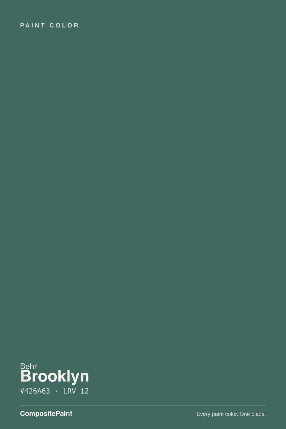
Brooklyn
N440-6 · #586766 · LRV 13 — cool blue-green tone, dark — high drama, needs strong daylight or warm bulbs.
- 1Salamander6
- 2Brooklyn13
- 3Adirondack Blue22
- 4Van Courtland Blue31
What Color Is Brooklyn, Really?
Brooklyn N440-6 is a dark teal green. Its hex value is #426A63 and its LRV is 12, which sits well down in the dark band, so it absorbs most of the light in a room and reads as a deep, saturated color rather than a tinted neutral. The hue is 170 degrees with about 23 percent saturation, which places it just on the green side of teal and keeps it muted instead of jewel-bright.
People choose Brooklyn when they want depth without going black or navy. It has enough green to feel organic and enough blue to stay cool and quiet, which is why it turns up on cabinets, built-ins, and moody accent walls more often than on whole rooms. Under warm light it can look almost like dark spruce; under cool light it reads closer to slate.
The thing to plan for is the LRV. At 12 this color needs light to show its color at all. In a dim or north-facing room it can flatten into something that looks nearly black, which some people want and others regret. It also shows sheen and surface flaws more than a mid-tone does, so surface prep and a lower sheen matter here. Sample a large piece and look at it at night before you commit.
Brooklyn is a cool blue-green. The hue reading of 170 degrees puts it slightly on the green side of true teal, so it usually reads as a deep forest or spruce tone rather than a blue one. Saturation of about 23 percent keeps it grounded; this is a muted, dusty version of the color, not a clear emerald or peacock.
Which side you see depends on the company it keeps. Next to a warm white or an oak floor, the green comes forward and the color looks like a dark evergreen. Next to a true green, the blue in it shows and it reads gray and cool. Beside a navy, it flips green again.
Because it is this dark, the undertone hides in shadow and only appears where light lands. Paint a large sample board and stand it upright in the room rather than judging a small chip flat on a table.
Best Rooms and Uses for Brooklyn
At LRV 12 Brooklyn is a statement color, and it is happiest on surfaces rather than whole rooms. Kitchen islands, lower cabinets, bathroom vanities, and built-in bookcases all suit it, because the dark value makes the cabinetry feel solid and lets counters and hardware stand out.
On walls it works best in rooms where you want enclosure: a study, a dining room, a den, or a powder room. In a bedroom it can be restful if the room has decent daylight. In a small north-facing room with one window, expect it to read as a dark room, not a green one.
Outside it is a strong front door, shutter, and trim color against a light body, and it holds its own on a garage door. Behr is carried at The Home Depot, so it is easy to pick up a sample quart and try a board on the actual elevation before you order gallons.
How Lighting Changes Brooklyn
An LRV of 12 means Brooklyn returns very little light, so the room does almost none of the work for you. In north-facing rooms the cool, indirect daylight drains the warmth and the color goes very dark, closer to charcoal-teal than to green. It can look handsome and cave-like there, but it will not stay readable as a color in the corners.
South-facing rooms are where it comes alive. Strong direct light lifts the green and lets the depth show as color rather than as shadow. East rooms look coolest in the morning and deepen through the day; west rooms stay flat until late sun brings the green out.
Bulbs make a real difference at this depth. Warm 2700K light pushes it green and softens it. Cooler 3500K to 4000K light keeps it slate. In any room where you use it, plan for more light fixtures than you would with a mid-tone.
Most complaints about Brooklyn are a light mismatch. Upload a photo of your actual room and see it on your walls — then ask for the same wall in north light or evening lamps before you buy a single sample.
Need It From Another Brand?
Any paint counter can custom-tint Behr N440-6 directly. If you would rather stay in one brand's own deck, these are the closest stock matches, measured as ΔE2000. Under 2 is a difference you will not see on the wall.
| Brand | Closest color | ΔE | LRV | |
|---|---|---|---|---|
| Sherwin-Williams | Mountain PassSW 9655 · Sherwin-Williams | 1.5 | 14 | Color page → |
| Benjamin Moore | Nocturnal Gray2135-30 · Benjamin Moore | 4.0 | 14 | Color page → |
| Valspar | Relaxed Navy5001-2B · Valspar | 3.0 | 13 | Color page → |
| PPG / Glidden | Juniper BerryPPG1145-6 · PPG / Glidden | 2.4 | 14 | Color page → |
| Glidden | Juniper BerryPPG1145-6 · Glidden | 2.1 | 14 | Color page → |
| Dutch Boy | Steeled Blue430-7DB · Dutch Boy | 4.2 | 13 | Color page → |
Similar Behr Colors
The nearest shades to Brooklyn within Behr's own range, ranked by perceptual color distance — useful when you want the same look a touch lighter, darker, or warmer.
WCAG 2.1: AA is 4.5 : 1 for normal text, 3 : 1 for large text, AAA is 7 : 1.
Brooklyn vs Similar Colors
Within Behr, Mythic Forest 500F-7 at LRV 12 is more clearly teal, and Blue Fir S430-7 at LRV 11 is darker and pulls further toward green. Walk Me Home MQ6-02 at LRV 12 is the same depth with a grayer, bluer read. If you want the family with a little more light back, Solitude 510F-6 at LRV 13 is the practical step up.
Across brands, Valspar Shady Palm 5003-6C at LRV 12.7 is the closest, with a deltaE of 0.87; at that distance the two act as the same color. Sherwin-Williams Raging Sea SW 6474 at LRV 14 and Dunn-Edwards Day In The Shade DEFD39 at LRV 13 come in at deltaE 2.2 and 2.3, very close but worth sampling first. PPG Christmas Ivy PPG1138-6 at LRV 14 sits at 3.3, in the same band. Benjamin Moore Polished Slate 713 at LRV 15 and deltaE 4.5 is close but visibly different side by side, reading lighter and grayer.
Colors That Go With Brooklyn
White trim is the obvious partner, and at this depth almost any white above LRV 75 will give a hard, clean line. A warm white softens the edge and makes the green side read more natural; a cooler white sharpens the contrast and makes the color look more slate.
Inside the Behr deck, the near neighbors give you controlled variations. Amphibian 730F-6 at LRV 12 and Binary Star N450-6 at LRV 12 are both the same depth with slightly different leans, useful when you want a second dark surface that does not read as a mismatch. Solitude 510F-6 at LRV 13 is a touch lighter and bluer for an adjoining room, and Blue Fir S430-7 at LRV 11 is deeper and greener for a door.
Beyond paint, warm wood is the strongest partner. Oak, walnut, and cane all lift the color. Brass and aged bronze suit it better than chrome, and unpolished stone keeps the whole thing from looking heavy.
Coordinated palette
Generated by hue-rotating #586766 in HSL space. Pair Brooklyn with one accent and one neutral — the swatches below are starting points, not final picks.
Brooklyn FAQ
Is Brooklyn warm or cool?
Brooklyn is a cool color. It is a blue-green with a hue of 170 degrees, which puts it just on the green side of teal, and about 23 percent saturation keeps it muted. Warm bulbs and direct sun bring the green forward and make it feel softer, but it never becomes a warm color.
What LRV is Brooklyn?
Brooklyn N440-6 has an LRV of 12. On the 0 to 100 scale, that is firmly in the dark range: the color reflects roughly one eighth of the light that hits it. Expect it to add depth and enclosure to a room rather than brightness, and plan lighting accordingly.
Does Brooklyn work in a dark room?
It works only if you want the room to read dark. At LRV 12 it gives back very little light, and in a north-facing or low-window space the green retreats and the walls can look near-black. Used deliberately in a study, den, or powder room that is a good effect. For a lighter version of the same family, Solitude 510F-6 at LRV 13 is only a small step up, so consider a genuinely mid-tone teal instead.
What white trim goes with Brooklyn?
Almost any white above LRV 75 will read as crisp trim against a color this dark, so the choice is about temperature rather than contrast. A warm white softens the line and lets the green side look natural. A cleaner, cooler white sharpens the contrast and makes Brooklyn read more slate than forest.
Is Brooklyn good for cabinets or exteriors?
Yes. Its LRV of 12 gives an island, vanity, or lower-cabinet run real weight against light counters, and it pairs well with brass, bronze, or black hardware. Outdoors it makes a strong front door, shutter, or garage door against a light body. Because dark colors show surface flaws, prep matters and a lower sheen is usually more forgiving.
What is the closest match to Brooklyn from another brand?
Valspar Shady Palm 5003-6C at LRV 12.7 is the nearest, with a deltaE of 0.87 against Brooklyn, which means the two are effectively the same color on a wall. Sherwin-Williams Raging Sea SW 6474 at LRV 14 is next at deltaE 2.2, very close but worth sampling first since it sits slightly lighter.
Have you painted with Brooklyn?
Rate it — one tap helps the next reader decide.
Ask a Question