Bluebird
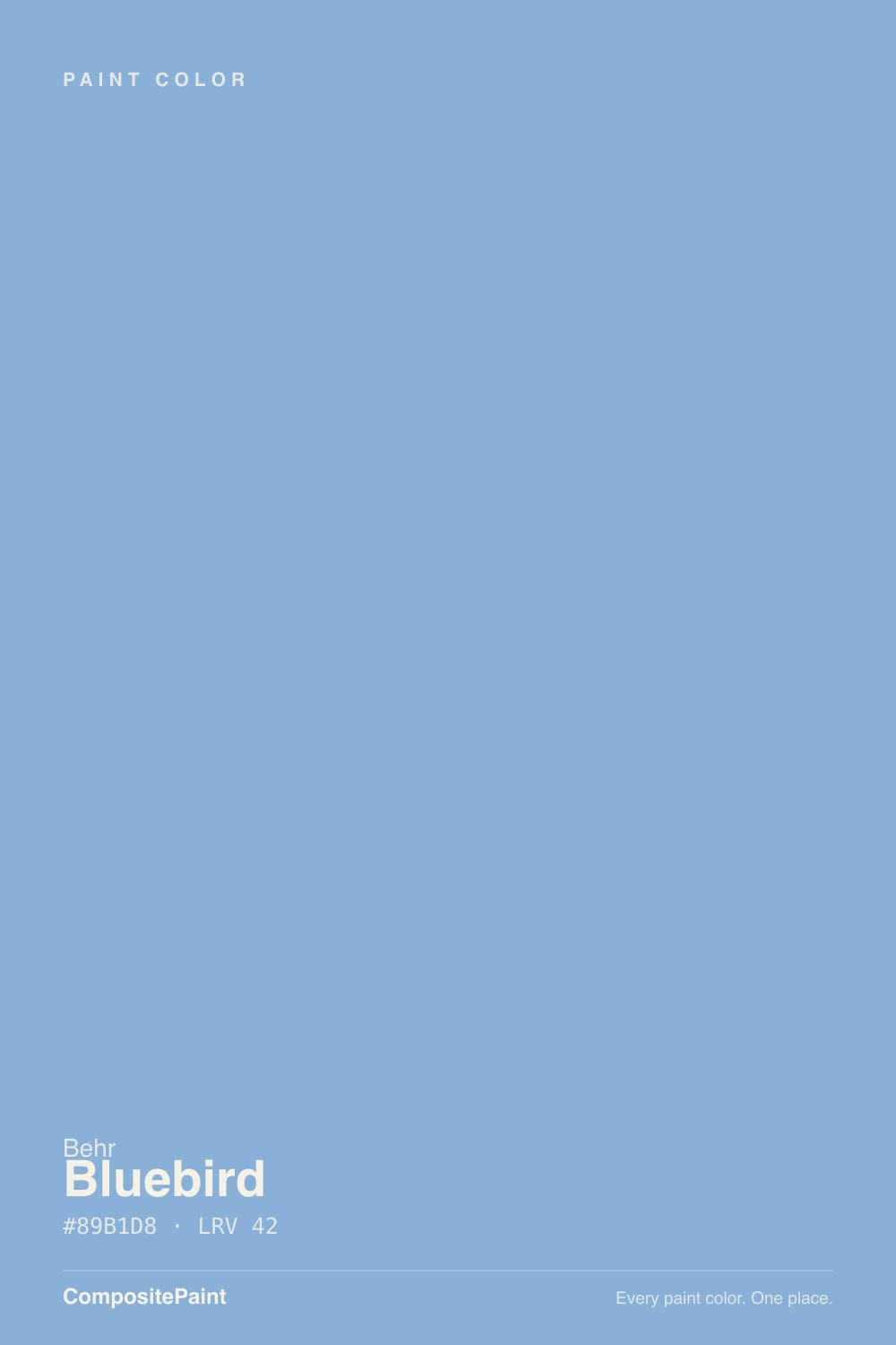
PPU15-12 · #89B1D8 · LRV 42 — cool blue tone, mid-tone — versatile but shifts visibly with light.
- 1Waterloo13
- 2Charcoal Blue19
- 3Bluebird42
- 4Honolulu Blue62
- 5After Rain68
What Color Is Bluebird, Really?
Bluebird (PPU15-12) is a clear mid-tone blue. Its hex value is #89B1D8 and its LRV is 42, which lands right in the middle of the scale. On a wall that means it holds real color and reads unmistakably blue, while still giving back enough light that the room stays open. The hue sits at 210 degrees with 50 percent saturation, so this is a cool, straightforward sky blue with no green in it and no purple to speak of.
People pick it when they want blue that actually looks blue. A lot of popular blues are grayed down until they behave like neutrals; Bluebird is not one of those. At half saturation it has enough color to set the mood of a room on its own, which is why it turns up in bedrooms, nurseries, and bathrooms more than in open living areas. Behr is sold at The Home Depot, so getting a sample pot is easy.
The thing to check is how cool it goes. A saturated blue at this lightness bounces its own color onto ceilings, floors, and white trim, and in a north-facing room with no warm light it can feel chilly. Warm wood, brass, or a creamy white nearby keeps that in check.
Bluebird is about as honest as a blue gets. Hue 210 sits between true blue and the first hint of cyan, so there is no green pulling it toward teal and no red pulling it toward periwinkle. What you see on the chip is close to what you get on the wall, which is not true of most blues in this family.
The undertone that does show is coolness itself. With 50 percent saturation the color throws a noticeable cool cast onto anything near it. White trim beside it can pick up a faint blue tint, and a warm beige across the room will look yellower than it did before.
It reads cleanest next to crisp white and natural wood. Next to gray it can look more purple than expected, and next to a teal or a green-blue it suddenly reads flat and dull. Test it against the fixed colors in the room, not just against paper.
Best Rooms and Uses for Bluebird
This is a bedroom and bathroom color first. At LRV 42 it is deep enough to feel restful without going dark, and the clean blue suits nurseries, kids rooms, and guest rooms where you want a calm, uncomplicated color. In a bathroom it pairs naturally with white tile and chrome or nickel fixtures.
On full living room or open-plan walls it is a bigger commitment, because a half-saturated blue tints everything around it. Many people get better results using it on one wall, on built-in shelving, or inside a cabinet or bookcase where the color reads as an accent.
Outside it works as a shutter, porch ceiling, or front door color against a white or light gray body. As an exterior body color it is bright, so look at a large sample in direct sun first. Keep trim in a separate white; painting trim the same blue removes the contrast this color needs.
How Lighting Changes Bluebird
At LRV 42 Bluebird returns a moderate amount of light, so the color stays visible in most conditions but changes character with the source. North-facing rooms get cool, indirect daylight, which stacks cool on cool. There the blue deepens, loses its friendliness, and can feel icy on all four walls.
South-facing rooms are the opposite. Strong warm sun softens the saturation and makes Bluebird look lighter, brighter, and closer to a real sky. East rooms show it at its coolest in the morning and calmer by afternoon. West rooms stay quiet early and warm noticeably in late-day sun, which can make the blue look slightly greener for an hour or two.
Bulbs swing it hard. Warm 2700K lamps take the edge off and make the color feel softer at night, while 4000K bulbs push it toward a cold, clinical blue. If the room has no warm light source, check a sample after dark before you commit.
Most complaints about Bluebird are a light mismatch. Upload a photo of your actual room and see it on your walls — then ask for the same wall in north light or evening lamps before you buy a single sample.
Need It From Another Brand?
Any paint counter can custom-tint Behr PPU15-12 directly. If you would rather stay in one brand's own deck, these are the closest stock matches, measured as ΔE2000. Under 2 is a difference you will not see on the wall.
| Brand | Closest color | ΔE | LRV | |
|---|---|---|---|---|
| Benjamin Moore | Aqua Marina816 · Benjamin Moore | 2.9 | 41 | Color page → |
| Valspar | Wild Blue Yonder8001-44D · Valspar | 0.3 | 41 | Color page → |
| Glidden | Horizon Blue10BB 43/206 · Glidden | 2.0 | 43 | Color page → |
| Dutch Boy | On Cloud Nine140-4DB · Dutch Boy | 1.9 | 40 | Color page → |
| Dunn-Edwards | Bachelor BlueDE5878 · Dunn-Edwards | 3.6 | 36 | Color page → |
| Farrow & Ball | Bay Area BlueNO. 9815 · Farrow & Ball | 3.0 | 37 | Color page → |
Similar Behr Colors
The nearest shades to Bluebird within Behr's own range, ranked by perceptual color distance — useful when you want the same look a touch lighter, darker, or warmer.
WCAG 2.1: AA is 4.5 : 1 for normal text, 3 : 1 for large text, AAA is 7 : 1.
Bluebird vs Similar Colors
Valspar Wild Blue Yonder (8001-44D) at LRV 41 and hex #88B0D7 is the same color in practice. Its deltaE of 0.28 is below the threshold where any eye can separate them, so pick on convenience alone. Dutch Boy On Cloud Nine (140-4DB) at LRV 40 and Glidden Horizon Blue (10BB 43/206) at LRV 43 land at deltaE 1.88 and 1.96, close enough to be visually identical in normal room light.
A step further out, Benjamin Moore Aqua Marina (816) at LRV 41 and deltaE 2.92 carries a little more violet, and Kompozit Calm Tint (0645) at LRV 42 and deltaE 2.73 is slightly grayer. Both are very close, but sample first.
Farrow and Ball Bay Area Blue (No. 9815) at LRV 37 and Dunn-Edwards Bachelor Blue (DE5878) at LRV 36 are the ones to watch. Their lower LRV makes them read clearly deeper, and at deltaE 3.05 and 3.56 they are close but visibly different side by side.
Colors That Go With Bluebird
Within the Behr range, the nearby blues are best used as alternates or as a soft gradient between rooms. Cloudberry (590F-4) at LRV 45 and River Valley (580F-4) at LRV 44 are both a step lighter and slightly softer, which suits a ceiling or an adjoining space. Private Jet (S520-4) at LRV 40 is a touch deeper and grayer for trim-heavy rooms or a darker accent. Simply Posh (MQ5-55) at LRV 43 sits almost on top of Bluebird with a faint green lean. Wild Thistle (630F-4) at LRV 40 moves toward periwinkle if you want a violet turn.
For trim and ceilings, a clean white keeps the blue crisp, while a warm off-white takes the chill out and makes the room feel softer. For materials, oak, walnut, and rattan all warm it up, and brass or aged bronze hardware gives the contrast that chrome does not.
Coordinated palette
Generated by hue-rotating #89B1D8 in HSL space. Pair Bluebird with one accent and one neutral — the swatches below are starting points, not final picks.
Bluebird FAQ
Is Bluebird warm or cool?
Bluebird is cool. Its hue sits at 210 degrees with 50 percent saturation, which is a true blue with no green or red pulling it off course. At that saturation it also casts coolness onto nearby surfaces, so white trim and light floors can pick up a faint blue tint.
What LRV is Bluebird?
Bluebird has an LRV of 42. On a scale where 0 is black and 100 is pure white, 42 is a true mid-tone. It reflects a moderate amount of light, so the blue stays clear and visible without darkening the room the way a deep navy would.
Does Bluebird work in a north-facing room?
It works, but expect it to look colder than the chip. North light is cool and indirect, and layering it over a cool blue can make the room feel icy. Warm 2700K bulbs, wood furniture, and a creamy white trim all help balance it.
What white trim goes with Bluebird?
A clean, bright white gives the sharpest contrast and keeps the blue looking fresh, which suits bathrooms and kids rooms. A softer off-white with a little warmth takes the chill out and works better in north-facing rooms. Both are safe; the choice is about how cool you want the space to feel.
Is Bluebird too bright for a bedroom?
Usually not. At LRV 42 it is a mid-tone rather than a pastel, so it settles down on a full wall and reads calm instead of loud. If you are worried, use it on the headboard wall only, or check a large sample in evening light where the saturation shows most.
What is the closest match to Bluebird from another brand?
Valspar Wild Blue Yonder (8001-44D) at LRV 41 is the closest, with a deltaE of 0.28. That is below the level anyone can see, so the two are interchangeable in practice. Dutch Boy On Cloud Nine (140-4DB) at LRV 40 and Glidden Horizon Blue (10BB 43/206) at LRV 43 are next, both visually identical in normal room light.
Have you painted with Bluebird?
Rate it — one tap helps the next reader decide.
Ask a Question