What Is Pearl Finish Paint?
Pearl finish reads 25–45 gloss units at 60°. It sits between satin and semi-gloss, and half the major brands no longer make it. Here's why.

Walk into a paint store, ask for pearl finish, and watch what happens. At one chain the clerk pulls down a can without blinking. At another they say “we don’t do pearl, you want satin or semi-gloss.” Both clerks are right. Pearl is a real sheen with real chemistry and a real place on the gloss ladder, and it’s also a marketing name that half the major brands quietly dropped from their consumer lines. Both things are true at the same time, and the result is a finish category that confuses every shopper who walks between two stores.
Pearl reads 25 to 45 gloss units measured on a gloss meter at 60°. Satin sits below it at 15 to 35, semi-gloss climbs above it to 35 to 65, and the ranges overlap at the seams because brand calibration moves the slot around by 5 to 10 units in either direction. What matters is that pearl occupies the half-step between the soft glow of satin and the noticeable shine of semi-gloss, and the dried film picks up a silky luster in raking light without throwing back a hard reflection. That slot has a use case. It also has a naming problem.
Where the Sheen Comes From
Sheen is a ratio. The number that controls it is pigment volume concentration, or PVC. The binder is the clear acrylic polymer that forms the film. The pigment is the solid particles suspended in it. A high-PVC formula has more pigment than the binder can fully coat, so pigment sticks up above the dried film and scatters light in every direction. Your eye reads that scatter as low sheen. Drop the PVC by loading the formula with more binder, and a continuous layer of pure resin grows on top of the pigment. Light hits that resin layer and bounces more directionally, which your eye reads as gloss.
Pearl lives at roughly 25 to 30% PVC. The resin layer is thicker than eggshell or satin, thin enough that the wall doesn’t read mirror-shiny. Functionally it’s a satin film with more binder, and the extra binder is what buys the higher scrub rating, the better water resistance, and the silky look. The reason satin and pearl feel so close is they sit just two or three PVC points apart, and three points is right at the edge of what an unaided eye can separate.
Why the Marketing Names Don’t Line Up
The chemistry is consistent. The naming isn’t. A film cured at 35 gloss units is the same film whether the can says “Pearl,” “Satin Enamel,” or “Low Sheen.” Brands name the slot for shelf differentiation, not for science.
The rough state of the consumer-line ladders:
- Benjamin Moore keeps pearl as a distinct SKU in Regal Select, Aura, and ben.
- Sherwin-Williams uses pearl in pro lines (ProClassic, Emerald Trim Enamel) and drops it from most consumer lines (Cashmere, SuperPaint, Duration Home), where the ladder runs flat to matte to satin to semi-gloss with no pearl step.
- Behr keeps pearl across Marquee and Premium Plus Ultra.
- PPG uses “Pearl” in some lines and “Satin Enamel” in others for the same sheen.
- Farrow & Ball doesn’t use the word at all. Their Modern Eggshell hits around 40 gloss units, which is functionally pearl by another name.
If your contractor specs pearl and you buy at the SW counter, you’ll be handed satin or semi-gloss. The fix is to spec a target gloss range, not a sheen label, when the job crosses brands.
Why Some Brands Ditched It
Resin chemistry improved enough over the last twenty years that a single base could be re-pigmented across the whole ladder, and brands added pearl everywhere. Then shoppers stopped being able to tell the steps apart. The reason for that is the gloss-unit gaps between adjacent finishes shrank as binders got better at film formation. You’d hold a satin chip next to a pearl chip in the store and they looked identical until you carried both into north-facing afternoon light. That’s a hard sell at the counter, and returns went up.
The brands that pruned decided the labor cost of explaining pearl wasn’t worth the SKU. The brands that kept it lean on it for the trim-adjacent slot, where you want satin’s softness with semi-gloss’s wipeability. Both choices defensible. Neither universal.
When to Use Pearl
Use it for:
- Bathroom walls in a powder room or guest bath where you want a step up from satin’s scrub rating without the shine of semi-gloss showing every drywall imperfection.
- Kitchen walls outside the immediate splash zone — the breakfast nook, the wall above a banquette, the side of a pantry door.
- Hallways and stair walls where bag scrapes and hand smudges are routine and the wall has to wipe clean repeatedly.
- Trim and doors when the homeowner explicitly doesn’t want semi-gloss. Pearl is the trim sheen for people who think semi-gloss is too shiny.
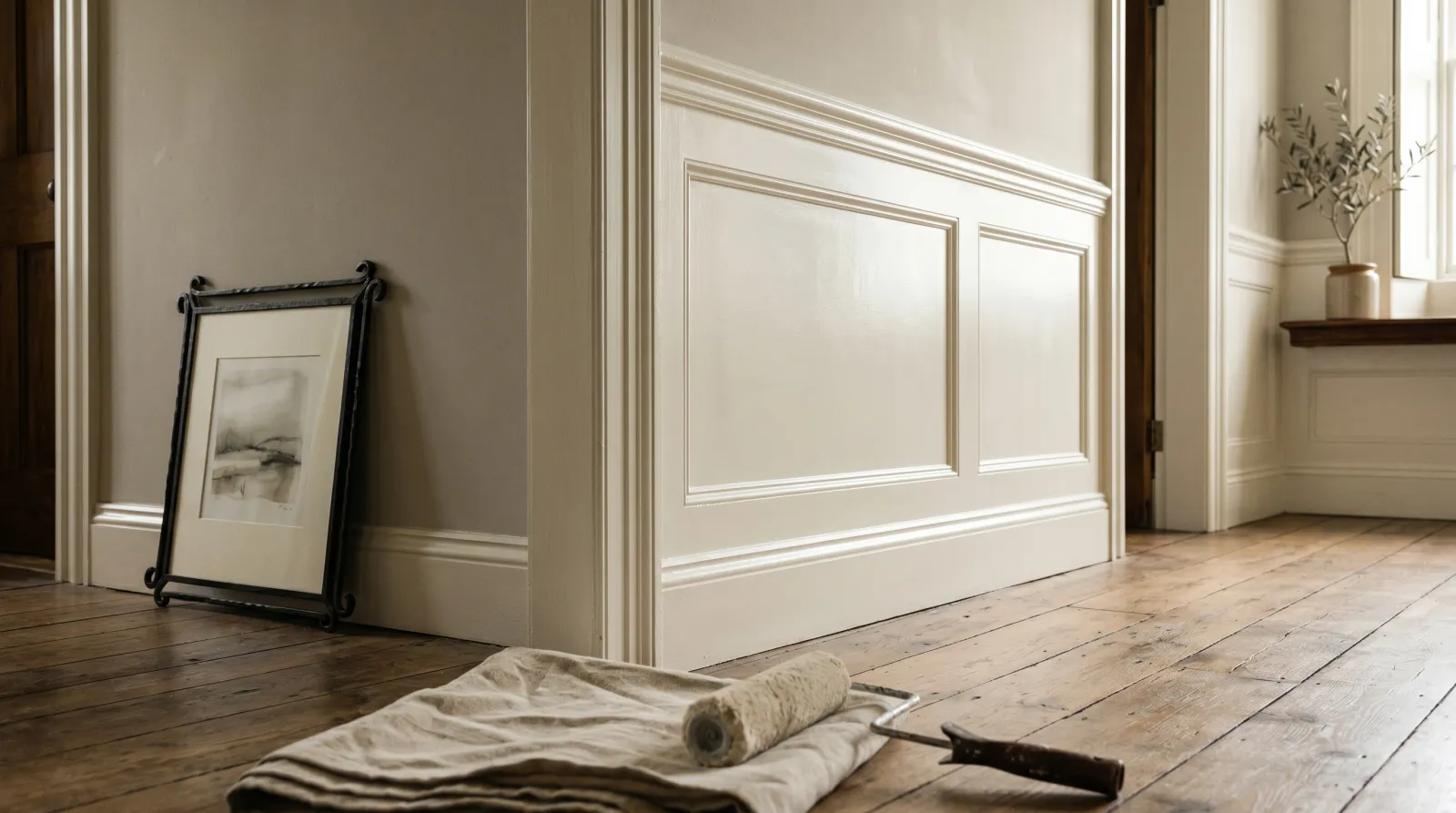
- Wainscoting and chair-rail panels. The lower wall gets touched and cleaned, the upper wall stays calmer.
When Not to Use Pearl
Don’t use it for:
- Living rooms, bedrooms, dining rooms. Pearl is too shiny for most wall surfaces above eye level in a room where you want the paint to disappear. Step down to eggshell.
- Old-construction walls with visible roller stipple, seam ridges, or screw pops. Sheen catches raking light, and pearl catches it harder than satin. Skim-coat or step down.
- Ceilings. Side light plus sheen equals every drywall seam showing. Flat or matte only.
- The direct splash zone behind a kitchen sink or above a shower surround. Step up to semi-gloss or use a dedicated bath product.
- Bare wood trim with visible grain. Pearl shows every brushstroke and grain valley. Either grain-fill first or use a self-leveling alkyd-modified acrylic.
How Pearl Compares
| Property | Satin | Pearl | Semi-Gloss |
|---|---|---|---|
| Gloss units (60°) | 15–35 | 25–45 | 35–65 |
| Hides wall flaws | 🟢 Good | ⚪ Fair | 🔴 Worst |
| Scrubbability | 🟢 Strong | 🟢 Stronger | 🟢 Best |
| Touch-up forgiveness | 🟡 Poor | 🔴 Worst | 🔴 Worst |
| Best surface | Kitchen, bath walls | Bathroom walls, trim | Trim, doors, cabinets |
For the full ladder including matte and gloss, see the sheen guide. For the head-to-head one step in either direction, see satin vs semi-gloss.
Common Mistakes
- Asking for pearl across brands and expecting the same film. Behr’s pearl runs near the bottom of the range and reads close to satin. Benjamin Moore’s sits in the middle. SW’s consumer lines skip the slot entirely. Spec the target gloss range or carry a sample chip when you switch stores.
- Using pearl on a wall that hasn’t been skim-coated. Pearl catches raking light harder than satin and shows every dimple, seam, and roller mark. Skim first or step down to eggshell.
- Trying to touch up pearl mid-panel. It almost never works. The reason for that is touch-up reads as a sheen mismatch, not a color mismatch, and pearl sits high enough on the gloss ladder that the second-coat film cures noticeably glossier than the first. Plan to paint corner to corner.
- Treating pearl as the safe middle. It isn’t. It’s a deliberate step up from satin for surfaces that get wiped. If you want a forgiving wall sheen, you want eggshell, not pearl.
Where to Use It
Pearl is the trim-and-bathroom finish for people who don’t want semi-gloss. It’s the upper-wall finish in a powder room with smooth drywall. It’s the wainscoting sheen when the upper wall is calmer. It is not the default living-room paint, no matter how the chip looks under store lights. If your brand carries pearl and you’ve got a smooth wall in a wet room, it earns the slot. If your brand doesn’t carry pearl, satin is the substitute, and the world keeps turning. Sherwin-Williams customers have been doing fine without it for years.