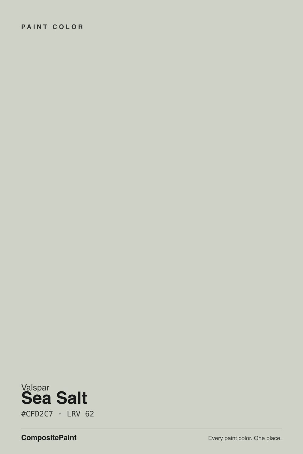
Color spec
| Brand | Valspar |
| Name | Sea Salt |
| SKU | 6005-1A |
| Hex | #CFD2C7 |
| RGB | 207, 210, 199 |
| HSL | 76°, 11%, 80% |
| LRV | 62 |
| Undertone | cool green tone |
| Family | Gray |
What Color Is Sea Salt, Really?
Valspar Sea Salt (6005-1A) is a soft, light gray-green that reads as a quiet neutral first and a color second. Its hex is #CFD2C7, and the numbers back up what your eye senses: a light value with very low saturation, so most of the time it looks like a calm pale gray with a faint wash of green. In bright rooms the green surfaces; in dim ones it settles closer to gray.
With an LRV of 62 it is genuinely light. It bounces daylight around a room and keeps things airy without tipping into stark white. That soft, spa-like quality is exactly why it stays popular. Valspar Sea Salt is Lowe's coastal-green benchmark and the house cousin to Sherwin-Williams Sea Salt.
It suits people who want a color that feels restful and clean but not cold. Think bathrooms, bedrooms, and open living spaces in coastal, cottage, or relaxed modern homes.
Sea Salt leans cool green, but only just. Its saturation sits at 11 percent, barely above the line where a color stops being a true neutral, so treat it as a near-neutral that carries a slight green tone rather than a full green paint. The hue lands in the yellow-green range, which keeps it soft instead of minty or icy.
That green shows most in bright, direct daylight and against clean whites, where the surrounding contrast pushes the color forward. In lower light, or next to warm woods and beiges, the green recedes and Sea Salt looks like a gentle gray.
Before you commit, tape a sample next to a pure white trim card and a warm beige. Against the white you will see the green wake up; against the beige you will see how gray it can go. Testing both extremes tells you which face of Sea Salt your room will actually show.
Best Rooms and Uses for Sea Salt
With an LRV of 62, Sea Salt is a light, versatile wall color rather than a statement shade. It works across whole rooms without closing them in, which makes it a natural fit for bathrooms, bedrooms, laundry rooms, and open living and dining areas. The soft green tone reads as calm and clean, so it suits spaces where you want to relax.
It also performs well on cabinets and built-ins, especially in kitchens and baths where a light gray-green feels fresh next to white counters and natural wood. On trim it is usually too soft to contrast against light walls, so save it for the walls or millwork and pair it with a brighter white.
Outside, its light value holds up on siding for a coastal, weathered look, and it can read as a muted backdrop on a shaded porch. For a front door you would typically want more saturation, so treat Sea Salt as the calm field color and let a deeper accent do the talking.
How Lighting Changes Sea Salt
At an LRV of 62, Sea Salt has plenty of light to work with, so lighting mostly shifts its temperature rather than making it dark or heavy.
North-facing rooms get cool, even light that pulls the green and gray forward and can make the color feel slightly more muted. South-facing rooms get warm, strong sun that lifts the value and can wash the green toward a soft, sun-bleached gray. East light is cool and bluish in the morning, so the green looks crisper early, then warms by afternoon. West rooms do the reverse, staying quiet in the morning and turning warmer and golder in the evening.
Bulb choice matters just as much. A warm 2700K bulb tames the green and makes Sea Salt cozier. A cooler 3500K to 4000K bulb sharpens the green and the cool cast. If you want the calm spa look, warm bulbs keep it grounded.
Most complaints about Sea Salt are a light mismatch. Upload a photo of your actual room and see it on your walls — then ask for the same wall in north light or evening lamps before you buy a single sample.
TEST IT IN YOUR LIGHT →Sea Salt vs Similar Colors
Sea Salt's closest Valspar neighbors are all light gray-greens, and the differences are subtle but usable. Misty Memory (8004-29B), LRV 63, is a hair lighter and reads a touch more neutral gray, so choose it if Sea Salt's green shows more than you want in a bright room. Chilean Sea Bass (8004-30C), LRV 62, sits at essentially the same value but holds a slightly cleaner green, making it the pick when you want the coastal tone to stay visible.
Passing Shadow (T668), LRV 62.2, is another near-match that leans just slightly warmer and grayer, which helps in cool north-facing rooms where you want to soften the green.
Because these colors are within a point or two of each other in LRV, the deciding factor is undertone, not lightness. Sample two or three side by side on the actual wall; in your specific light one will clearly look greener and another grayer, and that comparison makes the choice obvious.
Colors That Go With Sea Salt
For trim and ceilings, Ultra White (7006-24) at LRV 92 gives you a clean, bright frame that makes Sea Salt's green read a touch crisper. If you want a softer, warmer edge, Swiss Coffee (7002-9) at LRV 84 keeps the contrast gentle and cottage-friendly.
For a second wall color or an adjoining space, Filtered Shade (4007-1A) at LRV 65 is a warm light neutral that balances Sea Salt's cool lean and keeps an open floor plan cohesive. Quail Egg (4007-1B) at LRV 60 sits at a similar value for a low-contrast, tonal pairing.
For accents and depth, Polished Pine (5006-2B) at LRV 11 is a deep green that grounds the palette on cabinets, a door, or a built-in. Lyndhurst Duchess Blue (5001-9A) at LRV 8 makes a strong front-door or accent-wall partner. Warm mid-tones like Mocha Latte (3002-10C) at LRV 31, plus natural oak and brushed brass or matte black hardware, round out the scheme.
Need It From Another Brand?
Any paint counter can custom-tint Valspar 6005-1A directly — but if you would rather stay in one brand's own deck, these are the closest stock matches:
Similar Valspar colors
closest in the Valspar deckThe nearest shades to Sea Salt within Valspar's own range, ranked by perceptual color distance — useful when you want the same look a touch lighter, darker, or warmer.
Coordinated palette
Generated by hue-rotating #CFD2C7 in HSL space. Pair Sea Salt with one accent and one neutral — the swatches below are starting points, not final picks.
Accessibility (WCAG contrast)
WCAG 2.1: AA = 4.5:1 normal text · AA Large = 3:1 large text · AAA = 7:1 normal text.
The Questions Everyone Asks
Is Valspar Sea Salt warm or cool?
It is cool, but only mildly. Sea Salt (6005-1A) has a cool green undertone with very low saturation, so it reads as a near-neutral gray-green rather than a strongly cool color. In warm light or next to wood and beige it softens and looks calmer; in cool light or against pure white it shows more of its green and cool character.
Is Sea Salt more green or more gray?
Both, depending on the light. Its saturation is just 11 percent, so it hovers right on the edge between a soft gray and a light green. In bright daylight and against clean whites the green comes forward. In dim rooms or beside warm neutrals it settles toward gray. Sample it in your actual room to see which side dominates.
What white trim goes with Valspar Sea Salt?
Ultra White (7006-24), at LRV 92, is a clean bright white that frames Sea Salt crisply and makes its green read a little sharper. If you prefer a warmer, softer edge, Swiss Coffee (7002-9) at LRV 84 keeps the contrast gentle and works well in cottage and coastal rooms. Both give clear separation from the wall color.
Does Sea Salt work on cabinets and exteriors?
Yes to both. On kitchen and bath cabinets its light gray-green looks fresh next to white counters and natural wood, and it pairs well with brass or matte black hardware. Outside, its LRV of 62 holds up on siding for a coastal, weathered look and reads as a muted backdrop on shaded porches. Pair it with a brighter white trim for definition.
What does an LRV of 62 mean for Sea Salt?
LRV measures how much light a color reflects, from 0 (black) to 100 (white). At 62, Sea Salt is genuinely light and reflects a good amount of daylight, keeping rooms airy without going stark white. It is bright enough for small or low-light spaces yet soft enough to feel restful, which is why it works as an all-over wall color.
How is Valspar Sea Salt different from Sherwin-Williams Sea Salt?
They share a name and a coastal, spa-green character, and Valspar's version is essentially its cousin to the Sherwin-Williams color. Because they are matched at different paint counters, the exact tone can differ slightly in undertone and depth from wall to wall. If you are deciding between them, sample both on the same wall in your own light; small differences in green and gray will show clearly side by side.
Will It Work in YOUR Room?
No page can promise how Sea Salt behaves in your light. Upload a photo and see it on your own walls in seconds — before you spend a cent on samples.
TRY SEA SALT ON YOUR ROOM →Ask a Question

Not sure about Sea Salt in your room?
Ask Jessica below — every question gets a real reply, usually within a day.