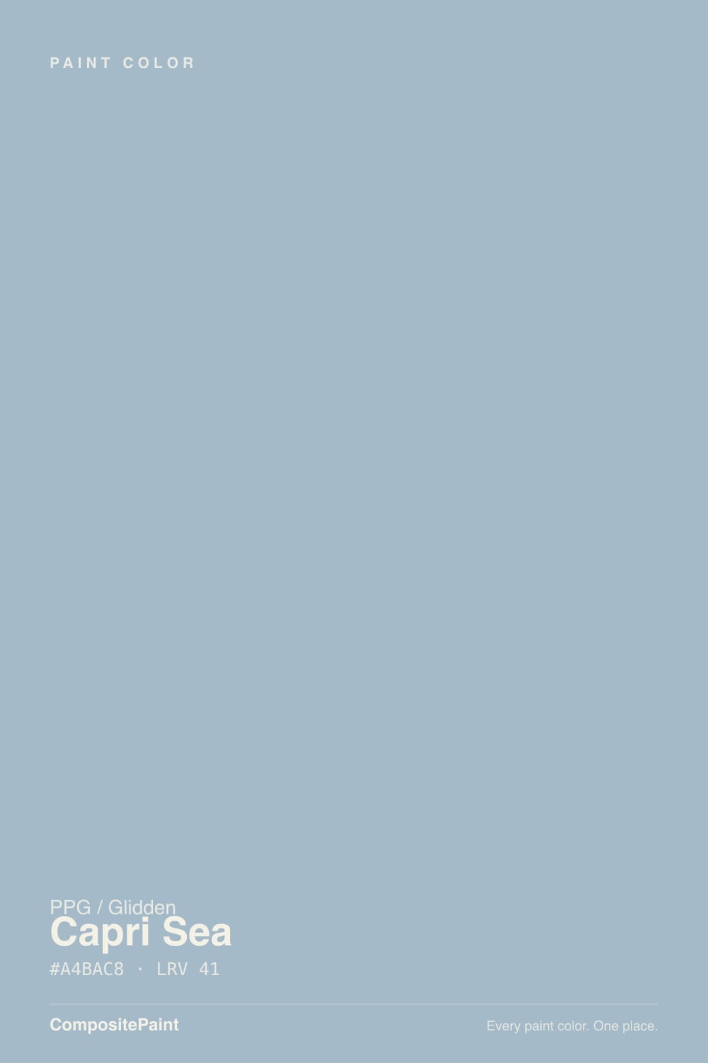
Color spec
| Brand | PPG / Glidden |
| Name | Capri Sea |
| SKU | PPG1147-3 |
| Hex | #A4BAC8 |
| RGB | 164, 186, 200 |
| HSL | 203°, 25%, 71% |
| LRV | 41 |
| Undertone | cool blue tone |
| Family | Blue |
What Color Is Capri Sea, Really?
Capri Sea (PPG1147-3) is a soft, dusty coastal blue. Its hue sits at 203 degrees, so it reads as a clean sky-and-water blue with a faint cool cast rather than a teal or a periwinkle. At 25 percent saturation it is muted, not vivid, which keeps it calm on a full wall instead of loud.
With an LRV of 41 it lands squarely in the mid-tone range: deep enough to have real presence, light enough that it never feels like a dark color. That is a big part of its appeal. PPG treats it as a go-to spa-bath blue at Lowe's and Home Depot because it delivers a relaxing, watery feel without the room going gray or heavy.
It suits bathrooms, bedrooms, and coastal or cottage-style homes, and works for anyone who wants blue to feel restful and grounded rather than bright.
Capri Sea leans genuinely blue. At 25 percent saturation it is muted but not near-neutral, so you will read it as a real color rather than a blue-tinted gray. Its hue of 203 degrees puts it on the cool, watery side of blue, just shy of the green line, which is why it can flash a faint sea-glass note in some rooms.
The undertone shows most on large, uninterrupted walls and under bright daylight, where the blue saturates and looks clearly coastal. In dim or artificial light it settles down and can look softer and grayer.
Test it against a crisp white and a warm greige on the same wall. Next to pure white the blue looks stronger; next to a beige or gray it reveals whether it is pulling cooler or a touch green in your specific light. Always judge it at mid-morning and again at night.
Best Rooms and Uses for Capri Sea
At LRV 41 Capri Sea is a versatile mid-tone, so you can use it as a whole-room wall color without the space feeling dark. It is a natural fit for bathrooms, where it earns its spa reputation, and for bedrooms that want a calm, restful feel. It also works in a home office or a laundry room that could use some quiet color.
It is a strong cabinet color, especially on a bathroom vanity or a kitchen island, where its muted blue holds up next to white counters and wood tones. As trim it would be unusual, since trim usually wants to be lighter, so keep it on the larger surfaces.
Outside, it makes a soft, coastal body or shutter color and a friendly front door on a light-sided house. Because it is mid-tone rather than deep, treat it as a color-forward field rather than a high-contrast statement.
How Lighting Changes Capri Sea
With an LRV of 41, Capri Sea reflects a moderate amount of light, so its look depends heavily on your exposure. In north-facing rooms, which get cool, indirect light, it deepens and can read grayer and more subdued. That can be lovely in a bedroom but may feel cool in a room you use in the morning.
South-facing rooms flood it with warm light and bring out its cleanest, brightest coastal blue. East-facing rooms give a bright, true blue in the morning that mellows by afternoon; west-facing rooms do the reverse, staying softer early and warming up at night.
Bulb choice matters just as much. Warm 2700K bulbs take some of the edge off the blue and make it cozier. Cool or daylight 4000K-plus bulbs push it crisper and more saturated. In a spa bathroom, warm bulbs keep it relaxing rather than clinical.
Most complaints about Capri Sea are a light mismatch. Upload a photo of your actual room and see it on your walls — then ask for the same wall in north light or evening lamps before you buy a single sample.
TEST IT IN YOUR LIGHT →Capri Sea vs Similar Colors
Capri Sea sits at LRV 41, which makes it the deeper, more grounded member of PPG's soft-blue group. Heavenly Blue (PPG1159-3) at LRV 48 and Always Blue (PPG1156-3) at LRV 47 are close in hue but noticeably lighter and airier on the wall. If you want the room to feel more open and bright, those two are the safer pick; if you want the blue to carry more weight and hold its color in dim light, Capri Sea wins.
Graceful (PPG1152-3) at LRV 50 is lighter again and reads the most delicate of the set, better suited to a small bathroom that needs to feel larger. Because Capri Sea is several LRV points darker, it shows its blue more confidently and grays out less under low light, but it can feel a touch enclosing in a room with little natural light. Sample all of them side by side, since the differences are subtle on a chip but obvious on a full wall.
Colors That Go With Capri Sea
For trim and ceilings, Pure White (PPG1001-1), at LRV 88, gives a clean, bright frame that makes the blue look crisp and intentional. If you want something softer and warmer, Antique White (PPG1015-2) at LRV 78 keeps the edges gentle.
For a second, lighter blue in an adjoining space or on a ceiling, Reflecting Pool (PPG1148-3) at LRV 51 stays in the same family but reads airier. To warm the palette and keep it from going cold, add a natural neutral like Stone Beige (PPG1024-3) at LRV 49 through wood, textiles, or a cabinet.
For an accent or a front door, go deep with Mariner Blue (PPG1162-7) at LRV 8 or Naval Adventure (PPG1163-7) at LRV 5; both anchor the soft blue with real contrast. Brushed nickel or aged brass hardware and light oak flooring round it out.
Need It From Another Brand?
Any paint counter can custom-tint PPG / Glidden PPG1147-3 directly — but if you would rather stay in one brand's own deck, these are the closest stock matches:
Similar PPG / Glidden colors
closest in the PPG / Glidden deckThe nearest shades to Capri Sea within PPG / Glidden's own range, ranked by perceptual color distance — useful when you want the same look a touch lighter, darker, or warmer.
Coordinated palette
Generated by hue-rotating #A4BAC8 in HSL space. Pair Capri Sea with one accent and one neutral — the swatches below are starting points, not final picks.
Accessibility (WCAG contrast)
WCAG 2.1: AA = 4.5:1 normal text · AA Large = 3:1 large text · AAA = 7:1 normal text.
The Questions Everyone Asks
Is Capri Sea warm or cool, and is it more gray than blue?
Capri Sea is a cool color and a genuine soft blue, not a blue-gray. Its hue sits at 203 degrees, on the watery, slightly green-leaning side of blue. At 25 percent saturation it is muted, so it stays calm on a full wall, but you will clearly read it as blue rather than gray, especially in daylight. Warm 2700K bulbs soften the coolness.
What trim white goes with Capri Sea?
Pure White (PPG1001-1), at LRV 88, is the cleanest trim and ceiling partner. It gives crisp contrast that makes the soft blue look intentional and bright. If you prefer a warmer, gentler edge, Antique White (PPG1015-2) at LRV 78 keeps the look softer without muddying the blue.
Does Capri Sea work on cabinets and exteriors?
Yes. Its mid-tone LRV of 41 makes it a strong cabinet color on a bathroom vanity or kitchen island, where it holds up against white counters and wood. Outside it works as a coastal body or shutter color and a soft front door on light siding. Pair it with a deep blue like Mariner Blue (PPG1162-7) for contrast.
What does an LRV of 41 mean for Capri Sea?
LRV measures how much light a color reflects, from 0 for black to 100 for white. At 41, Capri Sea is a true mid-tone: deep enough to show real color and presence, but light enough that it never feels dark. It keeps rooms comfortable without brightening them the way a pale blue would, and it shifts visibly with your light.
How is Capri Sea different from Heavenly Blue?
They are close in hue, but Heavenly Blue (PPG1159-3) has an LRV of 48 versus Capri Sea's 41, so Heavenly Blue is lighter and airier on the wall. Capri Sea reads deeper and holds its blue better in low light, while Heavenly Blue helps a small or dim room feel more open. Sample both, since the difference is subtle on a chip.
Should I sample Capri Sea before painting?
Yes, always. Capri Sea is a mid-tone blue that shifts visibly with light, looking crisper in south light and grayer in north light. Paint a large sample on more than one wall, or use a peel-and-stick swatch, and check it in morning, afternoon, and evening under your own bulbs before committing to the whole room.
Will It Work in YOUR Room?
No page can promise how Capri Sea behaves in your light. Upload a photo and see it on your own walls in seconds — before you spend a cent on samples.
TRY CAPRI SEA ON YOUR ROOM →
Ask a Question
Not sure about Capri Sea in your room?
Ask Jessica below — every question gets a real reply, usually within a day.