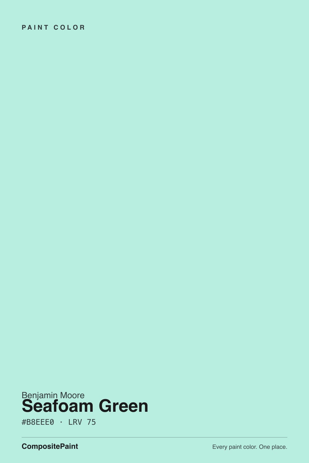
Seafoam Green
2039-60 · #B8EEE0 · LRV 75 — cool blue-green tone, very light — near-white, broadens small spaces.
- 1Saybrook Sage45
- 2Soft Fern57
- 3Seafoam Green75
- 4Alabaster82
- 5Frosty Lime89
What Color Is Seafoam Green, Really?
Seafoam Green 2039-60 is a pale blue-green. The hex is #B8EEE0 and the hue sits at 164 degrees, which is the aqua end of green, just short of turquoise. What separates it from most pastels is saturation: at about 61 percent it carries real color, and the lightness of 83 percent is what keeps it looking soft. With an LRV of 75 it reflects plenty of light and makes a small room feel wider.
People choose it when they want a room to feel cool and clean rather than warm and cozy. It is the color of tempered glass and sea water, and on a wall it behaves like a tinted white with a definite mint cast. In bathrooms and small bedrooms it reads fresh, and it flatters white fixtures, chrome, and pale tile.
The catch is the saturation. This is not one of the quiet grayed greens that behaves like a neutral. On four walls the mint is unmistakable, and in the wrong light it can slide toward a dated institutional green or toward baby blue. It also fights warm materials. Against orange-toned oak or a yellow-beige tile it can look sour. Sample it against your floor and fixtures, not just against white.
Seafoam Green sits at a hue of 164 degrees, which places it between green and blue with the balance tipped slightly to green. The undertone is cool blue-green, and at about 61 percent saturation it is far more colorful than a typical pale wall color. The high lightness is doing all the softening.
Which side you notice depends on what shares the room. Next to a true green it reads blue. Next to a sky blue it reads clearly green. Against white it looks minty and clean. Against a warm cream or a yellowed beige it can turn slightly acidic, because there is nothing warm in it to meet those tones halfway.
This is a color that dislikes competing undertones. Gray-veined marble, white subway tile, pale maple, and chrome all sit easily with it. Orange-toned oak floors, honey cabinets, and terracotta tile do not. Check the fixed materials you cannot change before you decide on the walls.
Best Rooms and Uses for Seafoam Green
Bathrooms are the natural home. The LRV of 75 keeps a small windowless bath bright, and the cool aqua flatters white porcelain, chrome, and pale tile. Powder rooms, guest baths, and laundry rooms all take it well.
Bedrooms work if you want a cool, restful room rather than a warm one. It is a common children's room and nursery color for the same reason, since it reads playful without being loud. Sunrooms, screened porches, and coastal-leaning living rooms suit it too, because the color has an obvious water association and does not need to be justified.
On cabinets it is a specialty choice, best on a bathroom vanity, a laundry run, or a piece of painted furniture rather than a full kitchen. Outdoors it can work on a porch ceiling or on shutters against a white body, where it stays a small accent. As a full exterior body color it is a strong statement and will sit at odds with most brick and stone.
How Lighting Changes Seafoam Green
At LRV 75 Seafoam Green is bright and will not go dim, but the strong hue means light changes its character more than its lightness. North-facing rooms get cool, indirect daylight that reinforces the blue side, and the color can read closer to a pale aqua or even a soft blue there. If you specifically want green, a north room may not deliver it.
South and west rooms bring warmer light, which pushes the color back toward mint and makes it look fresher and slightly more green. Direct afternoon sun on a saturated pastel like this can also make it glow, so a large sunny wall will look more intense than the chip.
Bulbs are worth planning. Warm 2700K lamps mute the coolness and can leave it looking slightly gray-green at night. Neutral 4000K bulbs keep the aqua crisp and clean, which usually suits the color better. Look at your sample after dark, since a cool color under warm light is where most disappointment happens.
Most complaints about Seafoam Green are a light mismatch. Upload a photo of your actual room and see it on your walls — then ask for the same wall in north light or evening lamps before you buy a single sample.
Need It From Another Brand?
Any paint counter can custom-tint Benjamin Moore 2039-60 directly. If you would rather stay in one brand's own deck, these are the closest stock matches, measured as ΔE2000. Under 2 is a difference you will not see on the wall.
| Brand | Closest color | ΔE | LRV | |
|---|---|---|---|---|
| Sherwin-Williams | AquatintSW 6936 · Sherwin-Williams | 2.6 | 73 | Color page → |
| Behr | Rhythmic Blue510E-2 · Behr | 0.6 | 78 | Color page → |
| Valspar | Sprinkle5008-9A · Valspar | 3.2 | 76.8 | Color page → |
| PPG / Glidden | Wintergreen MintPPG1229-2 · PPG / Glidden | 2.7 | 73 | Color page → |
| Glidden | Aqua Sky56GG 77/156 · Glidden | 3.8 | 77 | Color page → |
| Dutch Boy | Hint of Turquoise131-2DB · Dutch Boy | 4.3 | 74 | Color page → |
Similar Benjamin Moore Colors
The nearest shades to Seafoam Green within Benjamin Moore's own range, ranked by perceptual color distance — useful when you want the same look a touch lighter, darker, or warmer.
WCAG 2.1: AA is 4.5 : 1 for normal text, 3 : 1 for large text, AAA is 7 : 1.
Seafoam Green vs Similar Colors
Inside the Benjamin Moore line the differences are small and worth naming. Florida Aqua 2042-60 shares the LRV of 75 and differs by one step of hex at #B8EEE1, so it is functionally the same color. Crystal Clear 2044-60 at #B3EDE1 and LRV 76 and Winter Green 2045-60 at #B3EDE2 and LRV 76 are both a shade lighter and cooler, leaning further toward blue. Tropical Pool 2038-60 at #BFEDDE holds the same LRV of 75 but shifts toward green, which is the one to sample if Seafoam Green looks too blue on your wall.
Across brands, Behr Rhythmic Blue 510E-2 at LRV 78 is a deltaE of 0.62, an effectively exact match that is slightly brighter. Dunn-Edwards East Cape DE5694 is a deltaE of 1.68, visually identical in normal room light, though its listed LRV of 70 means it will read a little deeper. Sherwin-Williams Aquatint SW 6936 at LRV 73 is 2.62, very close but worth sampling first. Glidden Aqua Sky at deltaE 3.76 is close but visibly different side by side, reading bluer.
Colors That Go With Seafoam Green
Clean white trim is the safest and best partner. Because Seafoam Green is cool and saturated, a warm cream trim can look yellowed against it, so lean toward whites with no obvious yellow in them. Ceilings in the same clean white keep the room feeling crisp.
Within Benjamin Moore's line the neighbors are variations on the same theme rather than contrasts. Florida Aqua 2042-60 at #B8EEE1 and LRV 75 is virtually the same wash. Tropical Pool 2038-60 at #BFEDDE and LRV 75 leans a touch greener, which helps if the blue side is winning in your room. Misty Teal 2046-60 at #B4ECE3 and LRV 75 and Winter Green 2045-60 at #B3EDE2 and LRV 76 both tip a shade cooler and bluer.
For materials, chrome and polished nickel read cleaner against it than brass, and pale woods such as maple or white oak sit better than orange-toned oak. Natural rattan, white marble, and black metal accents all give the room a point of contrast without adding a competing color.
Coordinated palette
Generated by hue-rotating #B8EEE0 in HSL space. Pair Seafoam Green with one accent and one neutral — the swatches below are starting points, not final picks.
Seafoam Green FAQ
Is Seafoam Green warm or cool?
It is a cool color. The hue sits at 164 degrees with a cool blue-green undertone and no warm cast at all. That is why it flatters chrome, white tile, and gray-veined stone but can look sour next to orange-toned wood or yellow-beige materials. Warm bulbs mute it rather than warm it up.
What LRV is Seafoam Green?
Seafoam Green has an LRV of 75. On the 0 to 100 scale that is near the top of the light range, so it reflects a lot of light and helps a small or windowless room feel wider. The lightness is also what keeps its 61 percent saturation from reading as a strong mint.
Does Seafoam Green look blue or green on the wall?
It can go either way depending on light. At 164 degrees the hue is balanced between the two with a slight green tilt. Cool north light pushes it toward pale aqua or blue, while warmer south and west light brings the mint forward. If you want a reliably greener version, Tropical Pool 2038-60 at LRV 75 shifts that way.
What white trim goes with Seafoam Green?
Choose a clean white with no obvious yellow. Because Seafoam Green is a cool, fairly saturated color, a creamy trim white tends to look dull or yellowed beside it, while a crisp white keeps the whole room reading fresh. The same white on the ceiling keeps the effect consistent.
Does Seafoam Green work in a bathroom?
It is one of its strongest uses. An LRV of 75 keeps a small or windowless bath bright, and the cool blue-green flatters white porcelain, chrome fixtures, and pale tile. Check it against your existing floor tile first, since a warm beige tile will fight the color rather than support it.
How is Seafoam Green different from Florida Aqua?
Barely at all. Florida Aqua 2042-60 has a hex of #B8EEE1 against Seafoam Green's #B8EEE0, and both sit at LRV 75. On a wall you would not be able to tell them apart. If you are trying to nudge the color, the useful moves are Tropical Pool 2038-60 for more green or Winter Green 2045-60 for more blue.
Have you painted with Seafoam Green?
Rate it — one tap helps the next reader decide.
Ask a Question