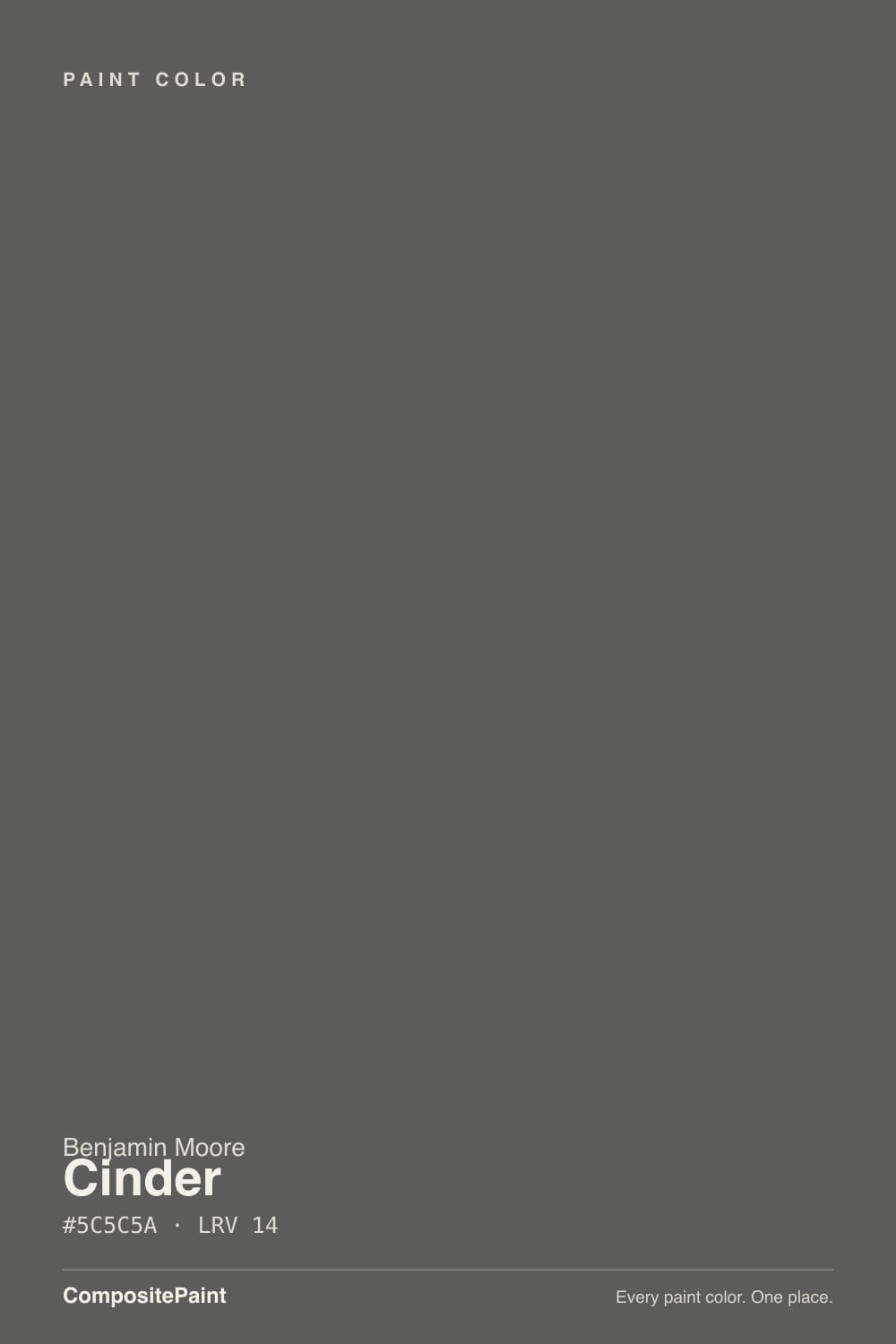
Cinder
The Affinity charcoal that is actually gray, reviewed honestly: the white-cabinet rooms where it looks custom, the basement light that swallows it, and why it is not the Iron Mountain alternative people mean.

Jessica has spec'd whites and neutrals for more than 300 rooms and keeps a sample wall of painted drawdowns in her studio. Every color review is checked against real reader rooms in the comments and re-tested when a formula changes. About the testing process →
- 1Black Fox7
- 2Pewter Green12
- 3Cinder23
- 4Stardew43
- 5Quietude48
The Fast Verdict
Cinder is the charcoal you pick when you actually want gray — not Chelsea Gray's greige, not Kendall Charcoal's olive, not Iron Mountain's brown-black. At LRV 23 it sits at Chelsea's depth, which is why the two get sampled together and why Cinder can flash purple next to Chelsea's green. Give it white millwork and real daylight and it is a custom cabinet color. Ask it to fill a basement, or to stand in for Iron Mountain, and the chip will feel like a lie.
Kitchen islands, vanities, and cabinet runs · bathrooms and laundry rooms with white millwork · fireplace and accent walls in real daylight · anyone who wants charcoal without Chelsea's green or Kendall's dim-room black
You wanted Iron Mountain's warm near-black · you wanted Chelsea Gray's greige soul · the room is a dim north box or a basement · cool white LEDs are staying and purple on the walls is a dealbreaker
- True charcoal gray — no beige, no blue, almost no chroma
- Same useful depth as Chelsea Gray, without the green-violet mix
- Reads custom on islands, vanities, and white-cabinet baths
- Light enough at LRV 23 that hardware and grain still show
- Sits next to chrome, brass, and matte black without picking a fight
- Goes a full step darker in basements and dim north rooms
- Flashes purple next to Chelsea Gray, warm greige, or cool LEDs
- Not the Iron Mountain alternative — two LRV bands too light, and not brown
- Quieter online record than Kendall or Chelsea if you need a famous name
What Color Is Cinder, Really?
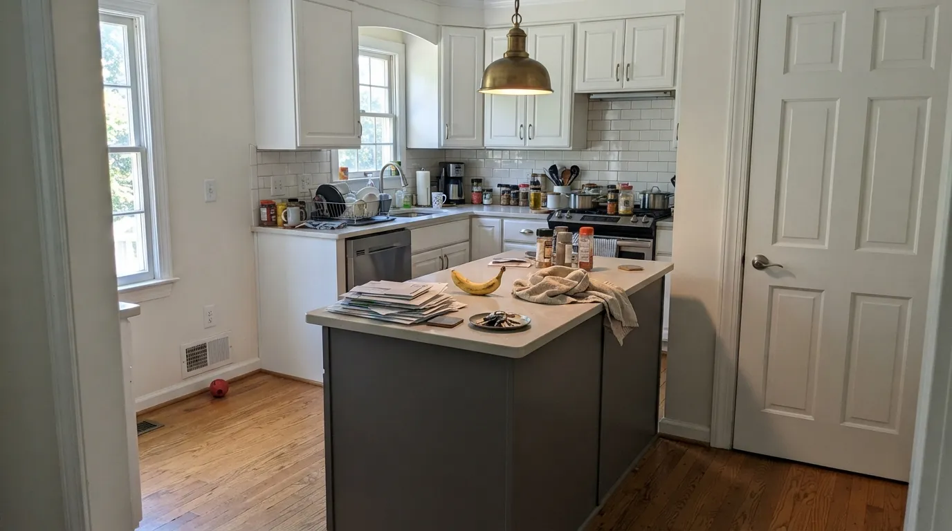
A mid-deep charcoal that is almost perfectly even gray. The hex is #868583 — red 134, green 133, blue 131 — which is as close to a dead-neutral gray as Benjamin Moore sells at this depth. Color consultants who live in the BM deck treat it that way: Cinder is the Affinity Collection go-to when they want a dark charcoal with no beige and no blue, and they reach for Chelsea Gray or Kendall Charcoal instead the moment the rest of the house is already a warm greige. It has never been a Color of the Year and no famous room is built around it. Its whole reputation is millwork, fireplaces, and white-cabinet baths that needed a gray with no personality of its own.
At LRV 23 it is the same depth as Chelsea Gray, not a cousin of Iron Mountain. That number is the whole identity problem. Iron Mountain (LRV 11) is a warm near-black; Kendall Charcoal (LRV 15) is a step darker still and famous for collapsing toward black in dim rooms. Cinder lives in the band where a color is dark enough to look like a decision on an island and light enough that you can still name it gray when the under-cabinet lights are on. On four walls it is a real commitment — not a cave at noon, but a room that will need lamps after 4pm, and a basement sample will read a full step deeper than the chip. Plan for that.
Undertone in one line: gray first, almost nothing second — a whisper of warmth, never beige, never blue. If the sample looks purple, you are seeing it next to a greener neighbor (Chelsea Gray is the usual culprit) or under cool LEDs. If it looks brown, that is oak bounce or west sun. If it looks black, the room is too dim. All three are the same gallon being honest about where you put it.
Where It Shines
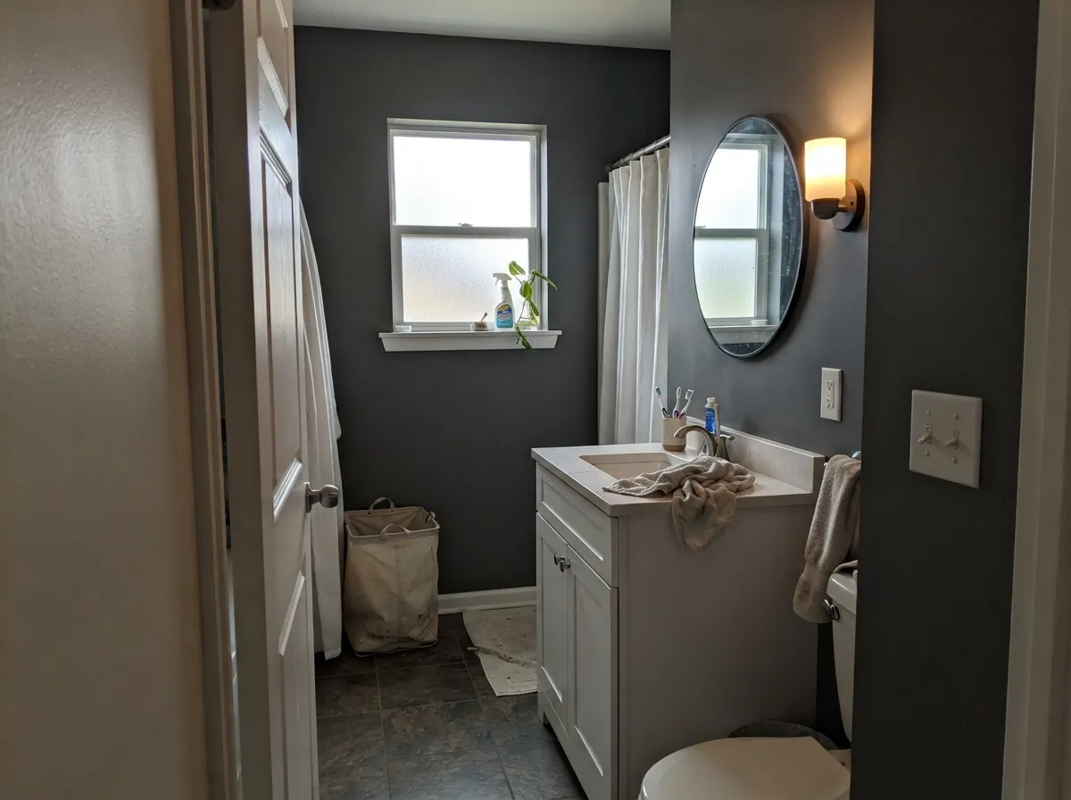
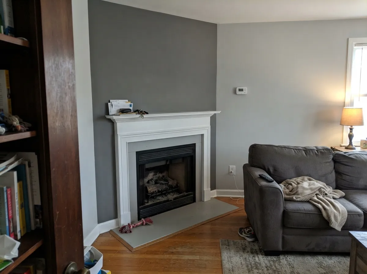
This color is built for surfaces that should look like millwork, not a mood board: an island, a vanity, a run of laundry cabinets, a fireplace wall, a powder-room drench against a white sink. LRV 23 is the useful trick — dark enough to photograph as charcoal, light enough that hardware, grain, and a white door still show. Color consultants put it in bathrooms and mud rooms that already have all-white cabinets for exactly that reason: the gray supplies the edge, the white keeps the room from going cave. Keep the bulbs warm and the daylight real, and it stays a true gray instead of sliding purple or flat.
Where It Fails
Almost every regret story about Cinder follows one of three scripts, and all three are visible on the sample board. None of them are a bad batch — but if your room or the Pinterest save you are matching belongs to one, this is not your gray, and a third coat will not fix it.
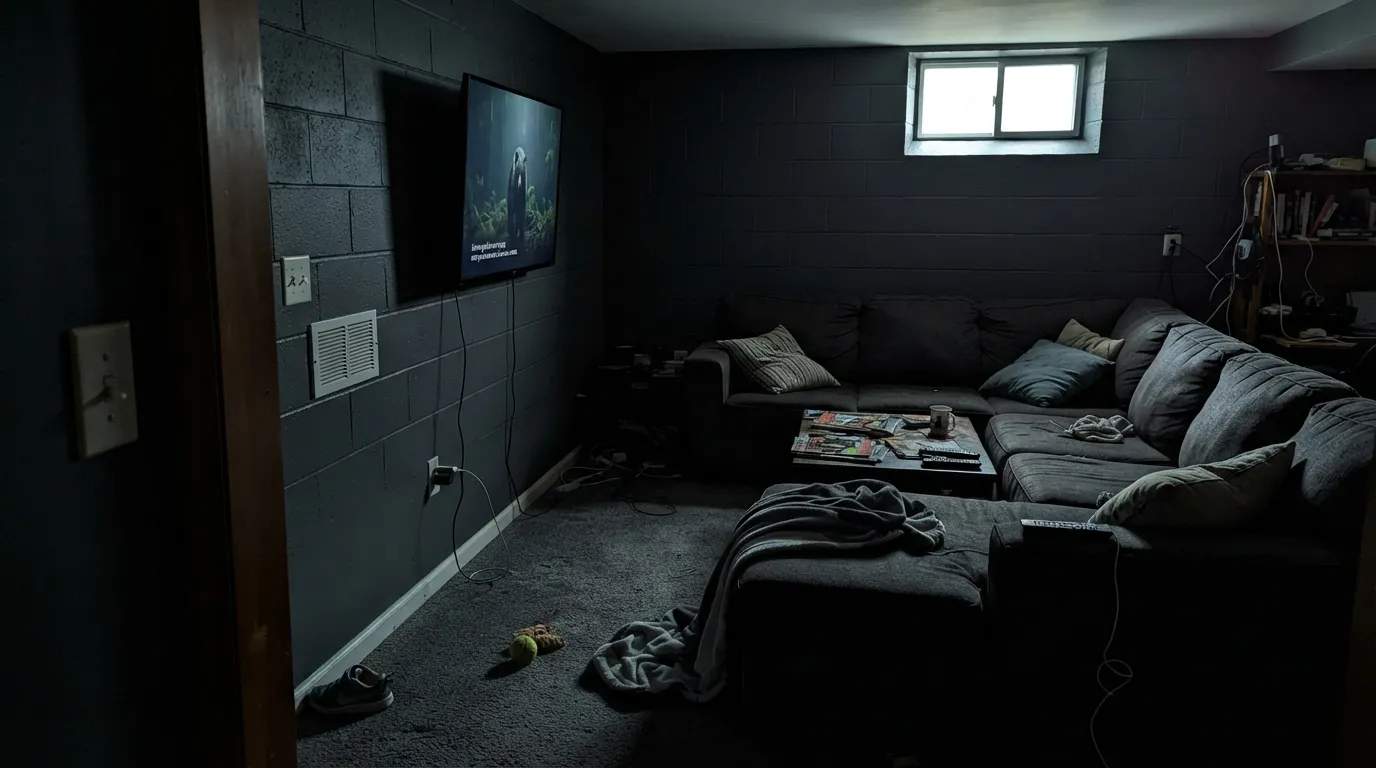
On an island or one fireplace wall it is charcoal. On four walls of a basement family room with one window, or a north living room with the lamps off, it reads a full step darker than the chip and the corners go cave. Owners who sampled it downstairs to match an upstairs inspiration photo say the same thing: the gray they loved became a heavy, slightly dusty charcoal. Keep it to millwork or one wall that actually sees a window, add 2700K lamps, or pick a lighter true gray and give the room some air.
Cinder is so close to even gray that a greener or browner neighbor will shove it toward violet. Sample it beside Chelsea Gray and the purple shows; sample it under 4000K LEDs and the same flash appears without Chelsea in the room. Consultants call it undertone-free until the day it sits next to Revere Pewter or a sage tile. If the rest of the house is already a warm greige, Chelsea Gray is the honest partner — Cinder will look like the cool, slightly purple one in the lineup.
People cite Cinder as the Iron Mountain alternative. They are two different jobs. Iron Mountain is a warm near-black at LRV 11 that needs light to stay brown. Cinder is a true gray at LRV 23 — the same depth as Chelsea Gray, a full band lighter than Kendall Charcoal. If the photo you saved was bronze, inky, or wool-coat dark, this can will look like a mid-charcoal. If you wanted a clean gray that does not go olive or chocolate, you are in the right strip — just do not expect the brown-black to come out of this gallon.
Room by Room
This is the use the color was waiting for. Satin Cinder on an island, a vanity, or a run of lowers reads custom at LRV 23: dark, not black, still gray when the lights are on. White Dove or Chantilly Lace on the perimeter keeps the contrast clean. Brass, matte black, and chrome all sit well because there is no loud undertone to argue with. A whole kitchen of it is a bigger bet — sample a door in place first.
Cinder is the charcoal color consultants reach for in baths and mud rooms that already have white cabinets. The gray adds a dramatic edge without beige or blue fighting the tile, and white millwork keeps LRV 23 from swallowing a small room. Eggshell on the walls, satin on any cabinet. Skip it in a windowless hall bath that runs on a cool vanity bar — steam plus cool LEDs is how the purple shows up.
One wall, real daylight, white trim. Behind a sofa or wrapping a fireplace it gives the room a hard charcoal edge without asking the other three walls to live in a cave. Matte or eggshell; White Dove on the millwork. Keep the adjacent walls in a related gray, not a green-greige, so Cinder does not pick up purple by contrast. Revere Pewter next door is the risk; Classic Gray or Stonington Gray is the safer handoff.
Small rooms take deep color. All four powder-room walls, a white vanity, and one warm sconce is a weekend project that reads custom. Satin on the millwork. This is Cinder at its most expensive-looking, because you never see a big field of it in flat daylight — just a jewel box that stays charcoal after dark.
At LRV 23 the room goes quiet once the desk lamp is on, and a screen wall in this gray does not compete with the picture. Eggshell for wipeability, 2700K bulbs as part of the paint job. A single north window and no lamps is the version that feels like a basement. Sample that wall at 4pm with the overheads off before committing.
A front door in satin or semi-gloss Cinder against white trim is a clean, modern gray that does not go olive the way Kendall can in sun. Whole-house siding is a different bet: this is an Affinity interior gray with far less of an exterior track record than Chelsea Gray or Kendall Charcoal, and full sun will lift it a step lighter than the shady elevation. If the house has to match on all four sides, sample boards outside for a week, or pick the Historical charcoal with the proven street record.
Your Light Is the Risk
Bright, even sun is the honest read: a medium anchoring charcoal you can still name as gray. White millwork stays crisp, and the almost-even RGB does not throw beige or blue. This is the light the cabinets were waiting for.
Weak cool daylight plus no lamps is the Houzz complaint in one sentence: the chip's gray disappears and the walls go a full step darker, slightly dusty, with heavy corners. Test at 4pm with the overheads off before you drench a room.
Morning light keeps it a clean gray. West sun and golden hour warm the whisper of yellow in the RGB, so it can read a hair more taupe for an hour. The shift is small — it does not become a new color — but sample at 6pm if even a hint of warmth is a problem.
2700K lamps keep it a dead charcoal after dark. Cool white LEDs (4000K and up) are how the purple gets in with no Chelsea Gray in the room — swap the bulbs before you blame the paint. Recessed daylight LEDs in a bath are the version to test on the actual vanity wall.
Most complaints about Cinder are a light mismatch. Upload a photo of your actual room and see it on your walls — then ask for the same wall in north light or evening lamps before you buy a single sample.
Need It From Another Brand?
Any paint counter can custom-tint Benjamin Moore AF-705 directly. If you would rather stay in one brand's own deck, these are the closest stock matches, measured as ΔE2000. Under 2 is a difference you will not see on the wall.
| Brand | Closest color | ΔE | LRV | |
|---|---|---|---|---|
| Sherwin-Williams | Classic French GraySW 77 · Sherwin-Williams | 1.8 | 24 | Color page → |
| Behr | Slate Gray6695 · Behr | 2.2 | 24 | Color page → |
| Valspar | Cadet Gray4001-2A · Valspar | 4.0 | 23.5 | Color page → |
| PPG / Glidden | Dover GrayPPG1001-5 · PPG / Glidden | 1.8 | 24 | Color page → |
| Glidden | Dover GrayPPG1001-5 · Glidden | 1.4 | 23 | Color page → |
| Dutch Boy | Relaxed Gray437-4DB · Dutch Boy | 1.2 | 25 | Color page → |
Similar Benjamin Moore Colors
The nearest shades to Cinder within Benjamin Moore's own range, ranked by perceptual color distance — useful when you want the same look a touch lighter, darker, or warmer.
WCAG 2.1: AA is 4.5 : 1 for normal text, 3 : 1 for large text, AAA is 7 : 1.
Cinder vs the Colors You're Also Considering
Every Cinder sample board has the same rivals on it. The numbers show the real lightness gap — then it comes down to which risk you would rather live with.
Pick this when you actually want gray at the same LRV 23, without Chelsea's green, and without the purple Cinder shows next to it.
Benjamin Moore HC-168 · LRV 23Chelsea GrayPick this if you want the greige soul — the go-to charcoal-greige for islands, exteriors, and accent walls, with the brown-green-violet mix that gives it depth.
Pick this when you want millwork that still reads as gray with the lights on, a full step lighter and without the olive.
Benjamin Moore HC-166 · LRV 15Kendall CharcoalPick this for the famous darker charcoal — best-behaved in the BM deck, with a whisper of warm olive and one real dim-room trap.
Benjamin Moore has several charcoals within a few LRV points of Cinder, and the differences come down to undertone and depth.
Flint AF-560, at LRV 12, is the closest rival but leans cool, with a subtle blue-green cast. In a north-facing room Flint can read steely where Cinder stays even-keeled. Choose Flint if your palette already runs cool; choose Cinder if you want a charcoal that stays neutral next to warm floors and furniture.
Gray 2121-10, also LRV 12, is a straightforward darker gray that sits very close to Cinder but with slightly less light reflectance, so it reads a touch heavier in dim rooms. Temptation 1609, at LRV 11, tips clearly toward blue-gray and is the pick when you want your charcoal to feel cooler and moodier, for example in a study with cool white trim. In most mixed-finish homes, Cinder is the safest of the group because it commits to no direction.
Cinder Coordinating Colors
The rule for coordinating with Cinder is stay on the true-gray and crisp-white side of the fence. It loves white millwork, near-black metal, and lighter true grays — and it argues with green-greiges that shove it toward violet. These are the partners that keep showing up in rooms that work:
The Iron Mountain Alternative That Isn't
Cinder gets named as an Iron Mountain alternative because both live in the charcoal aisle and both are quieter than Kendall Charcoal online. That comparison falls apart on the wall. Iron Mountain is a warm near-black at LRV 11 — bronze-brown in good light, flat black when the light drops. Cinder is a true gray at LRV 23, the same number as Chelsea Gray. You can put both chips on one board and they will not look related. One is a door color that needs sun to stay brown. The other is a millwork gray that needs daylight so it does not go cave.
The useful comparison is Chelsea Gray. Same depth, opposite personality: Chelsea is the greige with green and a violet flash, Cinder is the even gray. Color consultants who want a dark charcoal with no beige and no blue pull Cinder from Affinity; the moment the house is already Revere Pewter, they switch to Chelsea or Kendall so the undertones agree. If you came here because a blog said Cinder instead of Iron Mountain, sample both. If you came here because Chelsea felt too green, you are in the right can.
Cinder With Wood Tones and Floors
True gray is more forgiving than a violet or a green charcoal, but it is not undertone-proof. Walnut, espresso, and pale white oak all sit cleanly against Cinder — the wood supplies the warmth the paint refused to. Gray-washed floors and cool LVP are safe and make the charcoal read modern. Cream tile is fine in a bath; true gray stone is fine.
Honey oak is the one to sample in place. Yellow-orange does not fight Cinder the way it fights a mauve, but it will make the walls look cooler, and a few owners will suddenly see the purple that was not there on the white chip. A large rug between golden floors and these walls helps. If the oak is staying and you want the gray to pick up the wood instead of cooling off, Chelsea Gray is the more honest partner.
Metals are easy: matte black, unlacquered brass, antique bronze, and polished chrome all work, which is unusual for a charcoal. Chrome is the one that looks cold next to Chelsea or Kendall and looks correct next to Cinder, because the paint is already a true gray.
Three Ready Palettes Built on Cinder
A color is never alone on the wall. These are complete combinations in the 60-30-10 pattern, with the reason each one holds together. Every one opens in the visualizer.
This is the consultant pairing: Cinder on the field, White Dove on the millwork, one near-black note so the gray reads deliberate. The white cabinets are what keep LRV 23 from turning a small bath into a cave, and Wrought Iron is soft enough that the scheme stays charcoal instead of high-contrast black-and-white.
Try this palette in your roomChantilly Lace is the crisp, clean BM white — the right cut against a true gray, not a cream that would warm Cinder toward taupe. The island carries the charcoal; Hale Navy is one darker accent if you want a second note. Brass or chrome hardware both work, because Cinder has almost nothing to clash with.
Try this palette in your roomClassic Gray is a quiet true-gray off-white, so the handoff to Cinder reads as the same house getting darker, not a temperature change. Revere Pewter in this slot is the risk — its greige can shove Cinder toward purple. White Dove on the mantel keeps the charcoal from eating the millwork.
Try this palette in your roomCinder FAQ
Is Cinder warm or cool?
Neither, which is the point. It is a true mid-deep gray with a whisper of warmth in the RGB and no beige or blue to name. In south light it reads as a clean charcoal. Cool LEDs and greener neighbors (Chelsea Gray, sage tile) are what make people call it purple. Warm lamps and oak bounce are what make people call it taupe. Sample it on the actual wall at night before you decide which camp you are in.
Cinder or Chelsea Gray?
Same LRV 23, different jobs. Chelsea Gray is the charcoal-greige with brown, green, and a violet flash — the island and farmhouse-exterior default. Cinder is the even gray. If the rest of the house is already Revere Pewter or oak-and-brass greige, Chelsea will agree with it and Cinder will look like the cooler, slightly purple one. If you actually wanted gray with no greige in it, Cinder is the one.
Is Cinder a good Iron Mountain alternative?
Only if you wanted a true gray, not the brown-black. Iron Mountain is LRV 11 and needs light to stay bronze-brown. Cinder is LRV 23 — two full bands lighter, and not brown. People sample them together because both get called charcoal. On a door or an island they will not look like cousins. If the photo you saved was inky and warm, stay with Iron Mountain or Kendall Charcoal.
Is it good for kitchen cabinets?
Yes — that is its best indoor job. Satin on an island or the lowers, a crisp white on the perimeter, and it reads custom without going black when the under-cabinet lights are on. A whole kitchen of Cinder cabinets is a stronger commitment; sample a door in place for a few days, including after dark. Use a satin cabinet enamel either way.
What trim white goes with Cinder?
White Dove if you want the soft, finished cut; Chantilly Lace if you want gallery-crisp contrast against a true gray. Silver Satin is the Affinity near-white Benjamin Moore pairs with it, and it works if you already like a quieter, slightly confusing off-white. A yellowed builder cream will make Cinder look cooler and a little dirty. Semi-gloss on the trim, matte or eggshell on the walls.
Does Cinder work on exteriors?
A front door, yes. Whole siding is a bigger maybe. Cinder lives in the Affinity Collection and does not have Chelsea Gray's or Kendall Charcoal's exterior track record; full sun lifts it a step, shade drops it, and the two elevations will not match unless you sample both. If the house has to look the same from the street on a cloudy Tuesday and a July afternoon, paint large boards and walk them around the house, or pick the Historical charcoal with the street photos behind it.
Have you painted with Cinder?
Rate it — one tap helps the next reader decide.
Ask a Question