Color spec
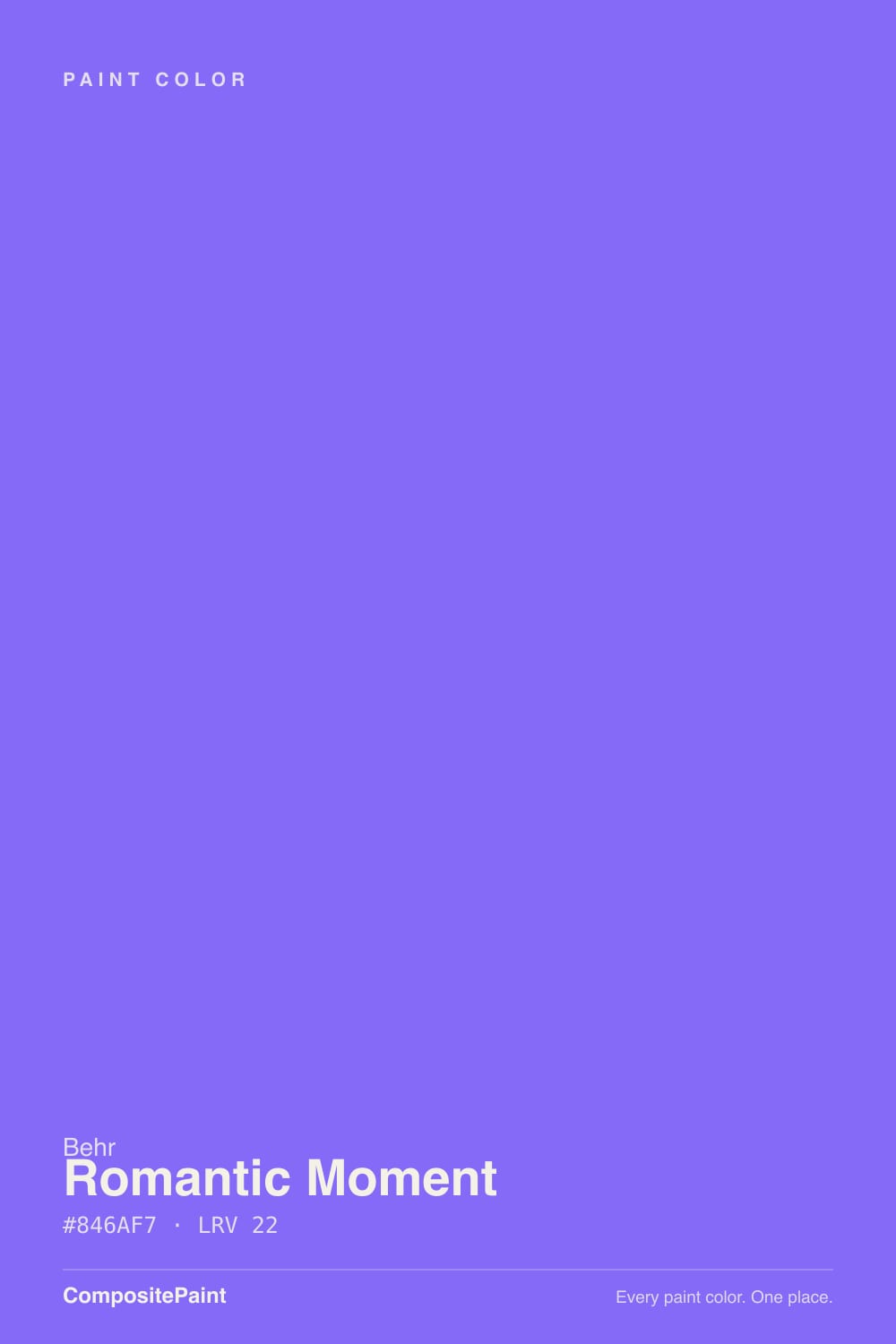
| Brand | Behr |
| Name | Romantic Moment |
| SKU | P570-5 |
| Hex | #846AF7 |
| RGB | 132, 106, 247 |
| HSL | 251°, 90%, 69% |
| LRV | 22 |
| Undertone | cool blue tone |
| Family | Purple |
About Behr Romantic Moment
With an LRV of 22, Romantic Moment is a deep, dramatic shade. It soaks up light in north-facing rooms and looks richest where strong daylight hits it. Its blue undertone is the part to watch: it gets picked up by whatever sits next to it, so test it against your trim, floor and the room's main light before committing. Warm artificial light softens it; cool LED can make it look flat, so match your bulbs to the mood you want.
Romantic Moment works best as a feature — a single wall, built-ins, a study or dining room — rather than wrapping a whole bright space. Purples range from restful (bedrooms) to dramatic (powder rooms) depending on depth.
Similar Behr colors
closest in the Behr deckThe nearest shades to Romantic Moment within Behr's own range, ranked by perceptual color distance — useful when you want the same look a touch lighter, darker, or warmer.
Coordinated palette
Generated by hue-rotating #846AF7 in HSL space. Pair Romantic Moment with one accent and one neutral — the swatches below are starting points, not final picks.
Accessibility (WCAG contrast)
WCAG 2.1: AA = 4.5:1 normal text · AA Large = 3:1 large text · AAA = 7:1 normal text.