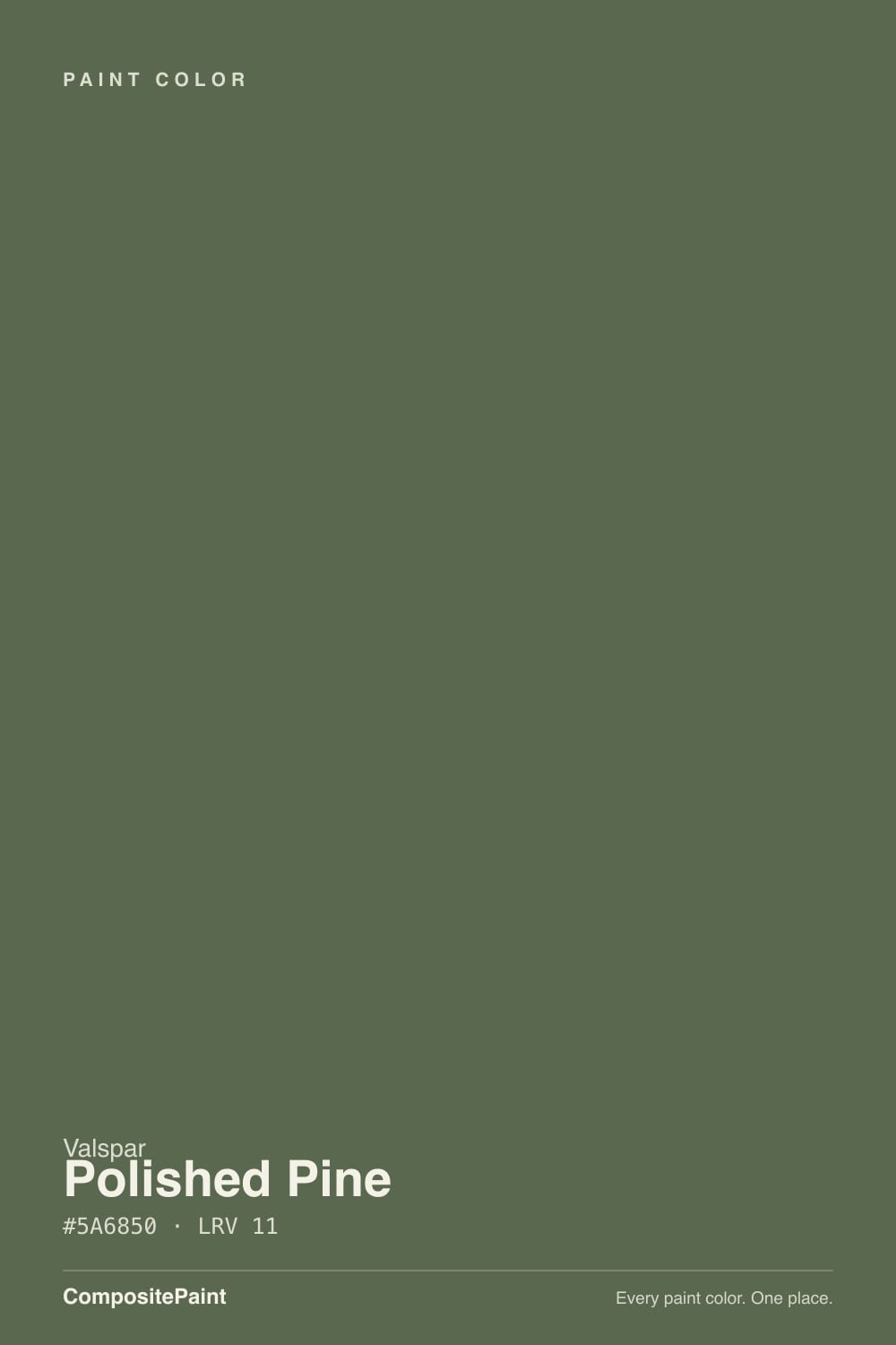
Color spec
| Brand | Valspar |
| Name | Polished Pine |
| SKU | 5006-2B |
| Hex | #5A6850 |
| RGB | 90, 104, 80 |
| HSL | 95°, 13%, 36% |
| LRV | 11 |
| Undertone | cool green tone |
| Family | Green |
What Color Is Polished Pine, Really?
Valspar Polished Pine is a deep, muted forest green with a hex of #5A6850 and an LRV of 11, which puts it firmly in dark-color territory. The saturation reads at 13 percent, so this is not a loud, grassy green. It is a soft, grayed green that leans just enough to keep it clearly green rather than sliding into gray or brown. Think of the color of pine needles seen in shade.
It earned attention as Valspar's 2022 Color of the Year, and it became a go-to for painted kitchen islands, built-ins, and moody accent walls. That popularity is easy to explain: it feels grounded and natural without being trendy-bright.
Polished Pine suits homes that want depth and a connection to nature, and it works for people who like a rich, saturated backdrop rather than a pale neutral. It rewards good light.
Polished Pine reads as a true muted green, but the numbers tell you how muted. With saturation at only 13 percent and a hue around 95 degrees, it sits just past the yellow-green line, so there is a faint olive warmth buried in it rather than a cool blue-green cast. The name says cool green tone, but in practice it is closer to a grayed, earthy pine than a crisp emerald.
Because the color is low in saturation and dark in value, the undertone tends to hide until light hits it. In a bright room it can show its olive side and feel slightly warm. In shade or under cool light it can drift grayer and read almost like a green-charcoal.
Test it against a clean white card and a true gray. Next to white the green is obvious. Next to gray you will see whether the olive or the cooler side is winning in your room.
Best Rooms and Uses for Polished Pine
With an LRV of 11 this is a statement and contrast color, not a whole-home light neutral. It shines as a saturated feature rather than as four bright walls in a small dim room.
The strongest uses are cabinetry and millwork: kitchen islands, lower cabinets, a built-in bookcase, or a mudroom bank of lockers. The depth reads as intentional and holds up against wood and stone. It also makes an excellent front door and a handsome exterior body or accent, where full daylight keeps the green from going flat.
As a full wall color it works best in rooms you want to feel enveloping, like a study, dining room, or bedroom with good light. Pair it with plenty of pale trim to keep contrast crisp. It is generally too dark to use as trim itself unless you are deliberately doing dark trim against a light wall. Sample a large area before committing, because a dark green shifts a lot between a chip and a full wall.
How Lighting Changes Polished Pine
At an LRV of 11 this color absorbs most of the light that reaches it, so exposure matters more than it would for a mid-tone. In a north-facing room the cool, weak light pulls Polished Pine toward gray-green and deepens it further, which can feel heavy unless you add warm bulbs and pale trim. South-facing rooms give it the most life, warming the olive undertone and letting the green stay rich instead of muddy.
East light in the morning warms it briefly, then it settles darker through the afternoon. West rooms do the reverse, going flat by day and glowing warm at sunset.
Bulb choice is a real lever here. Warm white bulbs around 2700K flatter the olive base and keep the color inviting. Cooler 4000K or higher bulbs push it gray and can make a dark green room feel cold, so use warm light in rooms where you want it to feel cozy.
Most complaints about Polished Pine are a light mismatch. Upload a photo of your actual room and see it on your walls — then ask for the same wall in north light or evening lamps before you buy a single sample.
TEST IT IN YOUR LIGHT →Polished Pine vs Similar Colors
Against Mallard 8003-35F at LRV 13, the difference is direction. Mallard carries a teal, blue-green pull, so it feels cooler and more coastal. Polished Pine stays on the warmer, olive side of green. If you want a green that leans toward the water, choose Mallard; for a grounded forest green, stay with Polished Pine.
Tarragon 6001-4C at LRV 12.1 goes the other way, showing an obvious yellow-olive cast. It reads more like herb or moss than pine, so it feels warmer and a touch more rustic. Polished Pine is the more balanced, less yellow option.
Herb Garland 8003-29G shares the exact LRV of 11 but is a browner, drabber olive with less green identity. Side by side, Polished Pine looks cleaner and more clearly green, while Herb Garland leans toward a khaki-olive. Because all three are dark and close in value, sample them together on one wall to judge the undertone honestly.
Colors That Go With Polished Pine
For trim and ceilings, a warm off-white keeps the contrast soft and stops the green from looking stark. Swiss Coffee 7002-9 at LRV 84 and Du Jour 7002-16 at LRV 87 both give you a creamy trim that flatters the olive base. If you want a cleaner, brighter edge, Ultra White 7006-24 at LRV 92 delivers more contrast.
For a second, lighter wall color or an adjacent room, Sea Salt 6005-1A at LRV 62 is a pale gray-green that stays in the same family, and Filtered Shade 4007-1A at LRV 65 reads as a warm greige that grounds the scheme.
For accents, Mocha Latte 3002-10C at LRV 31 brings a warm wood-toned bridge, while Lyndhurst Duchess Blue 5001-9A at LRV 8 makes a deep, moody partner for a front door or feature piece. Warm brass or aged bronze metals and natural oak tones also sit comfortably against Polished Pine.
Need It From Another Brand?
Any paint counter can custom-tint Valspar 5006-2B directly — but if you would rather stay in one brand's own deck, these are the closest stock matches:
Similar Valspar colors
closest in the Valspar deckThe nearest shades to Polished Pine within Valspar's own range, ranked by perceptual color distance — useful when you want the same look a touch lighter, darker, or warmer.
Coordinated palette
Generated by hue-rotating #5A6850 in HSL space. Pair Polished Pine with one accent and one neutral — the swatches below are starting points, not final picks.
Accessibility (WCAG contrast)
WCAG 2.1: AA = 4.5:1 normal text · AA Large = 3:1 large text · AAA = 7:1 normal text.
The Questions Everyone Asks
Is Polished Pine warm or cool?
It is a muted green that sits slightly on the warm, olive side despite being described as a cool green tone. With low saturation of 13 percent, it stays grayed rather than vivid. In bright, warm light the olive warmth shows; in cool north light or under cool bulbs it drifts grayer and reads more neutral. Warm 2700K bulbs keep it inviting.
Is Polished Pine more gray than green?
It is clearly green, not gray, but it is a soft, grayed green rather than a bright one. The saturation of 13 percent keeps it from looking loud, so against pure gray it still reads green, and against clean white the green is obvious. It is a natural pine or forest tone with a faint olive cast, not a green-tinted gray.
What trim white goes with Polished Pine?
A warm off-white works best. Swiss Coffee 7002-9 at LRV 84 or Du Jour 7002-16 at LRV 87 give a creamy trim that flatters the olive base and softens the contrast. If you prefer a brighter, cleaner edge with more contrast, use Ultra White 7006-24 at LRV 92. Warm whites suit this dark green better than stark, cool whites.
Does Polished Pine work on cabinets and exteriors?
Yes. Its depth makes it a strong choice for kitchen islands, lower cabinets, and built-ins, where the rich green reads as intentional against wood and stone. It became popular for painted islands after being named Valspar's 2022 Color of the Year. On exteriors it works well as a body or accent and as a front door, since full daylight keeps the dark green from looking flat.
What does an LRV of 11 mean for Polished Pine?
LRV measures how much light a color reflects, from 0 for black to 100 for pure white. At 11, Polished Pine reflects little light and reads as a dark, dramatic color. That means it deepens in low light and needs strong daylight or warm bulbs to stay rich rather than heavy. It is a statement color, not a whole-room brightener.
How is Polished Pine different from Mallard?
Both are dark, muted greens, but they lean different directions. Mallard 8003-35F at LRV 13 has a teal, blue-green pull that feels cooler and more coastal. Polished Pine stays on the warmer, olive side and reads as a grounded forest green. Choose Mallard for a green that leans toward water, and Polished Pine for a natural pine feel.
Will It Work in YOUR Room?
No page can promise how Polished Pine behaves in your light. Upload a photo and see it on your own walls in seconds — before you spend a cent on samples.
TRY POLISHED PINE ON YOUR ROOM →Ask a Question

Not sure about Polished Pine in your room?
Ask Jessica below — every question gets a real reply, usually within a day.