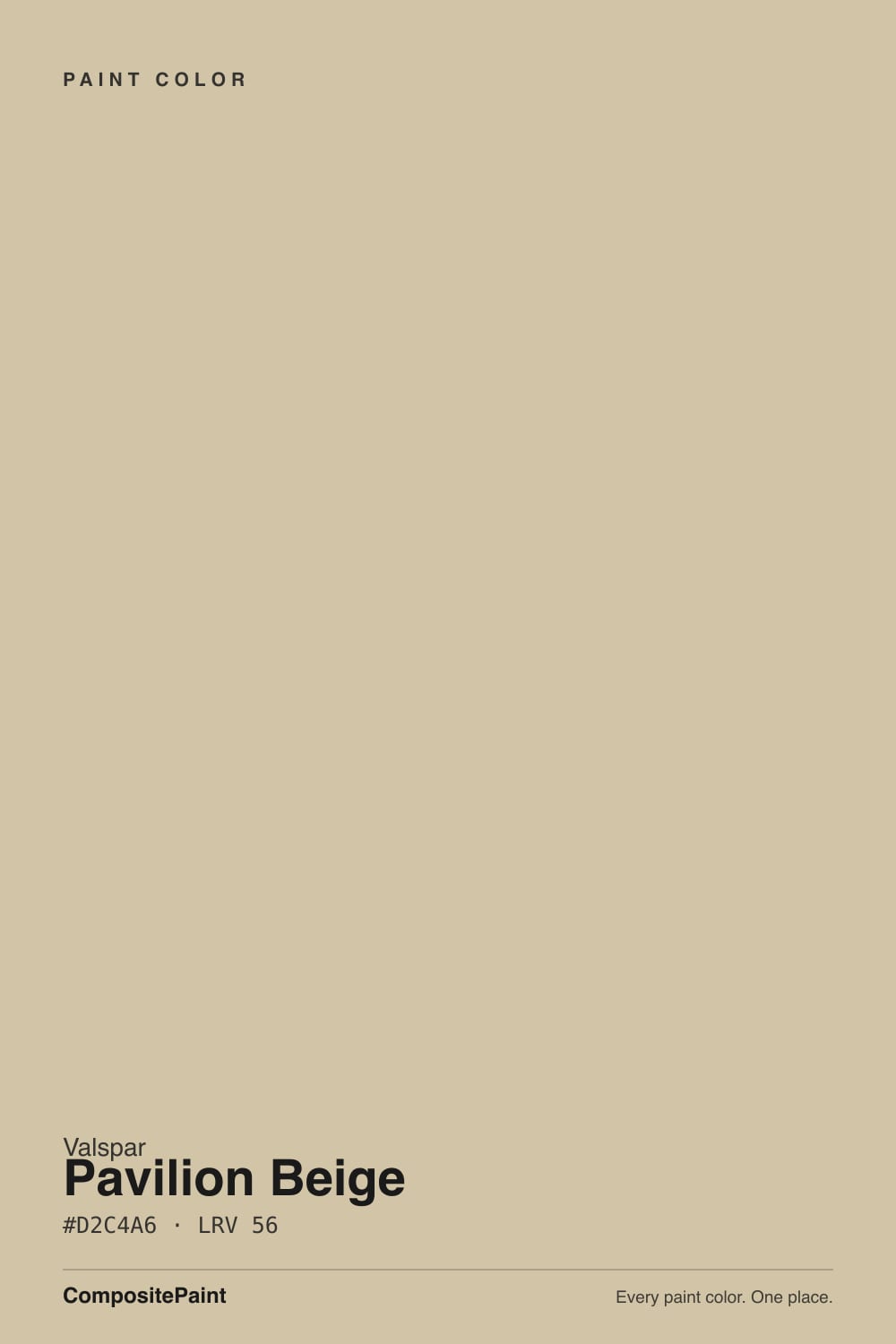
Color spec
| Brand | Valspar |
| Name | Pavilion Beige |
| SKU | 3005-10A |
| Hex | #D2C4A6 |
| RGB | 210, 196, 166 |
| HSL | 41°, 33%, 74% |
| LRV | 56 |
| Undertone | warm red-orange tone |
| Family | Neutral |
What Color Is Pavilion Beige, Really?
Valspar Pavilion Beige (3005-10A) is a soft, mid-light beige with an honest warm cast. Its hex is #D2C4A6 and its LRV of 56 puts it right in the middle of the scale, so it reads as a real, grounded beige rather than a pale off-white. The warmth is genuine: with a hue around 41 and about a third of the way toward full saturation, you get a sandy tan that leans gently toward gold and red-orange without ever looking orange.
People reach for it because it is the practical warm alternative in the endless beige-versus-greige debate, often lined up against cooler tans in side-by-side searches. It gives you color and coziness where a gray-beige would feel flat.
It suits traditional and transitional homes, anyone tired of cold grays, and rooms that need to feel welcoming rather than crisp. Think living rooms, bedrooms, and open main floors that get real daylight.
Pavilion Beige leans warm, toward soft gold with a faint red-orange thread underneath. At about 33 percent saturation it is not a near-neutral that only whispers its color; the warmth is clearly there, so plan for it rather than hoping it disappears.
Where the undertone shows most is in the shadows and next to true whites. Butt it against a bright white trim and it will look distinctly tan and a little peachy. Set it beside a yellow-based cream and the gold in it can amplify, so it starts to feel warmer than expected.
Test it against a plain white card and against a cooler greige on the same wall. On the card it will read warm and sandy; against a gray it will look clearly browner and softer. Always view large samples in the actual room before committing, since the red-orange base can strengthen under lamplight.
Best Rooms and Uses for Pavilion Beige
As a mid-LRV neutral, Pavilion Beige is versatile enough for whole rooms without either washing out or closing them in. It works well on living room, bedroom, hallway, and open-plan main-floor walls where you want warmth and a soft envelope of color rather than a bright white shell.
It is a strong cabinet and built-in color for a warm, lived-in kitchen or laundry, especially paired with wood tones and brass or bronze hardware. On trim it is usually too deep to act as the crisp accent; keep trim a cleaner white and let Pavilion Beige be the field color.
Outside, it makes a friendly, classic siding or stucco color that avoids the cold look of gray exteriors, and it takes a saturated front door well. It is a body color, not a statement accent, so use it as the calm base and add contrast with the trim, door, and roof.
How Lighting Changes Pavilion Beige
With an LRV of 56, Pavilion Beige sits in the mid band. It reflects a fair amount of light and holds up in average rooms, but it is not a bright, walls-disappear color, so it will feel a touch deeper in dim spaces.
In north-facing rooms the cool, flat light tames the gold and can pull it slightly grayer or more muted, which many people actually like since it keeps the beige from turning yellow. South-facing rooms flood it with warm light and bring the sandy, golden quality forward, so it can glow late in the day.
East light is warm in the morning and cooler by afternoon, so expect it to shift. West light warms it at sunset. Warm bulbs at 2700K push the gold and red base harder; cooler 3500K to 4000K bulbs neutralize it and keep it looking cleaner and more balanced.
Most complaints about Pavilion Beige are a light mismatch. Upload a photo of your actual room and see it on your walls — then ask for the same wall in north light or evening lamps before you buy a single sample.
TEST IT IN YOUR LIGHT →Pavilion Beige vs Similar Colors
Beach Dune (8005-7C, LRV 56) sits at the same lightness but its base is a little more red and taupe. Side by side, Beach Dune looks slightly pinker and more muted, while Pavilion Beige stays clearly more golden. If you want warmth without the peach note, Pavilion Beige wins; if you want a softer, dustier beige, Beach Dune does.
Garden Rain (V094-2, LRV 56) is almost the same value but shades a touch more yellow-green. It can feel a hair fresher and less golden, which helps in very warm south light where Pavilion Beige can look richer than you want.
Wild Hillside (V095-2, LRV 57.4) is the greenest and grayest of the group. It reads as a soft sage-tinged neutral rather than a true beige, so pick it if you actually want a hint of green and Pavilion Beige if you want honest, warm sand.
Colors That Go With Pavilion Beige
For trim and ceilings, choose a clean high-LRV white so the beige reads intentional. Ultra White (7006-24), at an LRV of 92, gives the crispest contrast, while Du Jour (7002-16) at 87 is a softer warm white that keeps the pairing gentle.
For a second, quieter wall color in an adjoining space, Filtered Shade (4007-1A, LRV 65) and Quail Egg (4007-1B, LRV 60) are lighter warm neutrals that step up in the same family without clashing.
For accents, lean into contrast. Polished Pine (5006-2B, LRV 11) is a deep muted green that grounds the room on a built-in or door, and Caspian Tide (5008-9A, LRV 11) is a dusty navy-blue that makes a handsome front door against beige siding. For a richer neutral accent, Coffee Custard (3004-10C, LRV 16) adds depth on furniture or a lower wall. Pair all of these with natural wood and brass or oil-rubbed bronze metals.
Need It From Another Brand?
Any paint counter can custom-tint Valspar 3005-10A directly — but if you would rather stay in one brand's own deck, these are the closest stock matches:
Similar Valspar colors
closest in the Valspar deckThe nearest shades to Pavilion Beige within Valspar's own range, ranked by perceptual color distance — useful when you want the same look a touch lighter, darker, or warmer.
Coordinated palette
Generated by hue-rotating #D2C4A6 in HSL space. Pair Pavilion Beige with one accent and one neutral — the swatches below are starting points, not final picks.
Accessibility (WCAG contrast)
WCAG 2.1: AA = 4.5:1 normal text · AA Large = 3:1 large text · AAA = 7:1 normal text.
The Questions Everyone Asks
Is Pavilion Beige warm or cool?
Pavilion Beige is a warm color. Its hue sits around 41 with roughly a third of full saturation, giving it a soft golden, faintly red-orange base. It is not a cool gray-beige. In warm light it looks sandy and golden, and even in cooler north light it stays on the warm side of neutral rather than turning gray.
Is Pavilion Beige more gray or more brown?
It is clearly more brown than gray. Pavilion Beige is a true warm beige, so next to a gray-based greige it will look distinctly softer and browner. There is no cool gray undertone pulling it down. If you specifically want a gray-leaning neutral, this is not it; Pavilion Beige commits to warmth.
What trim white goes with Pavilion Beige?
Ultra White (7006-24), with an LRV of 92, is the cleanest choice and gives crisp contrast against the warm walls. If you prefer a softer, less stark look, Du Jour (7002-16) at LRV 87 is a warm white that keeps the pairing gentle. Both let the beige read as an intentional color rather than a dirty white.
Does Pavilion Beige work on cabinets and exteriors?
Yes. On cabinets and built-ins it makes a warm, lived-in kitchen or laundry, especially with wood tones and brass or bronze hardware. On exteriors it is a friendly siding or stucco color that avoids the cold look of gray, and it holds a saturated front door well. Keep the trim a cleaner white for contrast.
What does an LRV of 56 mean for Pavilion Beige?
LRV measures how much light a color reflects, from 0 (black) to 100 (white). At 56, Pavilion Beige sits in the middle. It reflects a moderate amount of light, so it keeps rooms feeling warm and grounded without going dark, but it will read a bit deeper in low-light spaces than a pale beige would.
How is Pavilion Beige different from Beach Dune?
Both share an LRV near 56, so they are the same lightness, but the undertone differs. Beach Dune (8005-7C) has a more red, taupe base and looks slightly pinker and dustier. Pavilion Beige stays clearly more golden and warm. Choose Pavilion Beige for a sandy gold beige and Beach Dune for a softer, muted taupe.
Will It Work in YOUR Room?
No page can promise how Pavilion Beige behaves in your light. Upload a photo and see it on your own walls in seconds — before you spend a cent on samples.
TRY PAVILION BEIGE ON YOUR ROOM →Ask a Question

Not sure about Pavilion Beige in your room?
Ask Jessica below — every question gets a real reply, usually within a day.