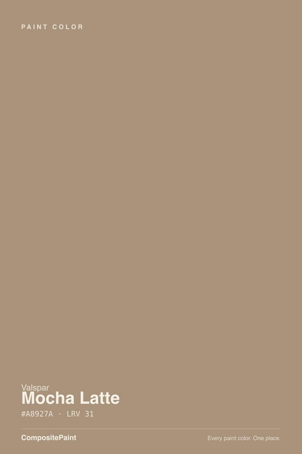
Color spec
| Brand | Valspar |
| Name | Mocha Latte |
| SKU | 3002-10C |
| Hex | #A8927A |
| RGB | 168, 146, 122 |
| HSL | 31°, 21%, 57% |
| LRV | 31 |
| Undertone | warm red-orange tone |
| Family | Neutral |
What Color Is Mocha Latte, Really?
Valspar Mocha Latte is a warm, mid-depth taupe that reads like coffee softened with cream. Its warmth comes from a red-orange base, but the color is only moderately saturated, so it never looks like a bright brown. Instead it settles into a muted, grounded tan that sits comfortably between beige and true brown.
With a light reflectance value of 31, it absorbs more light than it bounces back. That makes it a color you feel in a room rather than one that disappears, giving walls a cozy, enclosed quality without going dark.
Valspar keeps Mocha Latte in its trend reports because it is the dependable warm taupe people reach for when they want something richer than off-white but easier to live with than a saturated brown. It suits traditional and transitional homes, and anyone who likes a warm, settled backdrop rather than a cool gray one.
Mocha Latte leans warm, toward a soft red-orange. That warmth is real but restrained: the saturation sits at 21 percent, high enough that you will notice the brown-tan color yet low enough that it stays muted rather than clay-like. Think of it as a taupe with a coffee cast, not a pink or peach.
The undertone shows most in strong warm light and against clean, cool surfaces. Put it next to a crisp white trim or a cool gray floor and the red-orange warmth becomes obvious. Set it beside honey oak or warm wood and it can start to look more brown and blend in.
Test it against a bright white card and a true beige card at the same time. The white will pull out its warmth, and the beige will tell you whether it reads more tan or more brown in your specific room.
Best Rooms and Uses for Mocha Latte
With a mid-tone LRV of 31, Mocha Latte is versatile enough for whole-room walls but has enough depth to feel intentional rather than plain. It is a strong choice for living rooms, bedrooms, and dining rooms where you want warmth and a settled, enclosed feeling. In smaller or darker rooms it will read cozy; in bright rooms it stays light and open.
It also works well on cabinets and built-ins, where its coffee warmth pairs naturally with wood and brass. As an accent or a single feature wall it adds contrast against creamy whites without shouting.
Outside, its warm taupe tone suits exteriors and reads as a grounded, earthy body color that plays well with stone and brick. On a front door it is more subtle than bold, so use it where you want a soft, welcoming look rather than a high-contrast statement. On trim it can work as a warm, low-contrast frame against lighter walls.
How Lighting Changes Mocha Latte
At an LRV of 31, Mocha Latte is a mid-tone, so lighting has a strong effect on how deep it looks. In bright, direct light it lifts into a soft, milky taupe. In shade or evening light it drops into a richer, cozier brown.
North-facing rooms get cool, steady light that will mute the warmth and can make it feel a touch grayer and darker, so it works there if you want a snug room. South-facing rooms flood it with warm light and bring the coffee tones forward. East light reads warm in the morning then cools by afternoon, while west light does the reverse and glows warm at the end of the day.
Bulb choice matters. Warm 2700K bulbs push the red-orange base and make it feel toasty. Cooler 4000K bulbs calm the warmth and let it read closer to a neutral greige. Always judge it after dark under your own fixtures.
Most complaints about Mocha Latte are a light mismatch. Upload a photo of your actual room and see it on your walls — then ask for the same wall in north light or evening lamps before you buy a single sample.
TEST IT IN YOUR LIGHT →Mocha Latte vs Similar Colors
Valspar makes several warm taupes in this range, and the differences are small but visible on a wall. Wild Mushroom (3007-9C), at LRV 31.7, is almost the same depth but reads a touch more balanced and less overtly warm, so choose it if Mocha Latte looks too coffee-toned in your light.
Changing Seasons (3001-9C), at LRV 31.1, is a hair lighter and leans slightly more golden-tan, which makes it feel a little sunnier and less brown in the same room.
Cafe Americaine (T586), at LRV 28.2, is noticeably deeper and more muted. If you want the same warm-taupe character but with more weight and a cozier, shadowier feel, it is the better pick. For the brightest, most open version of this look, stay with Mocha Latte or step up to Changing Seasons.
Colors That Go With Mocha Latte
For trim and ceilings, a clean high-reflectance white keeps things crisp. Ultra White (7006-24), at an LRV of 92, gives the sharpest contrast, while Du Jour (7002-16), at LRV 87, is a slightly softer warm white if you want less of a hard edge.
For a second, lighter wall color in an open plan, Pavilion Beige (3005-10A) at LRV 56 stays in the same warm family and lifts adjoining spaces without clashing. To go deeper in the same tone, Coffee Custard (3004-10C) at LRV 16 makes a rich accent for an island, built-in, or lower wall.
For contrast accents, Polished Pine (5006-2B) at LRV 11 brings a grounded green that flatters the warm taupe, and Lyndhurst Duchess Blue (5001-9A) at LRV 8 makes a handsome front door or cabinet color. Natural wood tones and brass or aged-bronze metals also sit well against it.
Need It From Another Brand?
Any paint counter can custom-tint Valspar 3002-10C directly — but if you would rather stay in one brand's own deck, these are the closest stock matches:
Similar Valspar colors
closest in the Valspar deckThe nearest shades to Mocha Latte within Valspar's own range, ranked by perceptual color distance — useful when you want the same look a touch lighter, darker, or warmer.
Coordinated palette
Generated by hue-rotating #A8927A in HSL space. Pair Mocha Latte with one accent and one neutral — the swatches below are starting points, not final picks.
Accessibility (WCAG contrast)
WCAG 2.1: AA = 4.5:1 normal text · AA Large = 3:1 large text · AAA = 7:1 normal text.
The Questions Everyone Asks
Is Mocha Latte warm or cool?
Mocha Latte is a warm color. Its base is a soft red-orange, giving it a coffee-and-cream warmth rather than a cool gray cast. The saturation is moderate, so the warmth stays muted and never looks bright or orange, but in most rooms it will clearly read as a warm taupe next to a cool white or gray.
Is Mocha Latte more gray or more brown?
It is more brown than gray. Mocha Latte sits in the taupe zone, closer to a soft coffee brown with just enough muting to keep it from looking heavy. It is not a true greige, so if you want something that reads gray, look elsewhere. Against warm wood it can appear even browner, so test it in your space.
What trim white goes with Mocha Latte?
Ultra White (7006-24), with an LRV of 92, is a clean, bright trim white that gives crisp contrast against Mocha Latte's warm taupe. If you prefer a softer, warmer edge, Du Jour (7002-16) at LRV 87 pairs well too. Both keep trim and ceilings looking fresh without competing with the wall color.
Does Mocha Latte work on cabinets and exteriors?
Yes. On cabinets its coffee warmth pairs naturally with wood, brass, and stone, making it a good choice for kitchens and built-ins that want warmth instead of stark white. Outside, its earthy warm taupe works as a grounded body color that suits brick and stone. Its mid LRV of 31 keeps both uses from feeling too dark.
What does an LRV of 31 mean for Mocha Latte?
LRV measures how much light a color reflects, from 0 (black) to 100 (white). At 31, Mocha Latte is a mid-tone that absorbs more light than it reflects, so it feels warm and enclosed rather than airy. It stays open in bright rooms but reads cozy and deeper in low light, which is why lighting testing matters.
How is Mocha Latte different from Wild Mushroom?
Both are warm Valspar taupes at nearly the same depth, with Wild Mushroom (3007-9C) at LRV 31.7 versus Mocha Latte at 31. The practical difference is warmth: Mocha Latte reads a bit more coffee-toned, while Wild Mushroom looks slightly more balanced and less overtly warm. Choose Wild Mushroom if Mocha Latte feels too warm in your light.
Will It Work in YOUR Room?
No page can promise how Mocha Latte behaves in your light. Upload a photo and see it on your own walls in seconds — before you spend a cent on samples.
TRY MOCHA LATTE ON YOUR ROOM →Ask a Question

Not sure about Mocha Latte in your room?
Ask Jessica below — every question gets a real reply, usually within a day.