Color spec
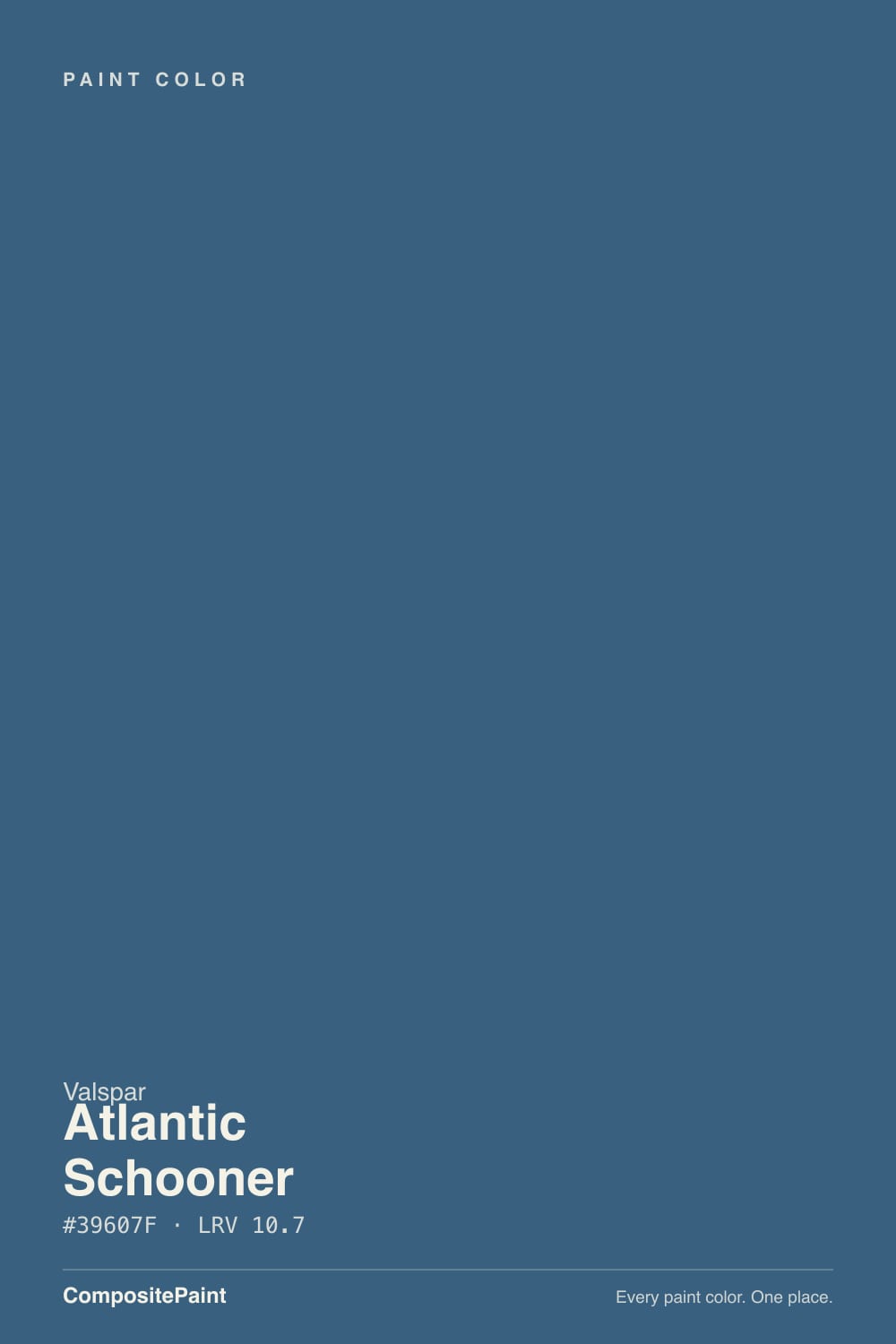
| Brand | Valspar |
| Name | Atlantic Schooner |
| SKU | 4004-6C |
| Hex | #39607F |
| RGB | 57, 96, 127 |
| HSL | 207°, 38%, 36% |
| LRV | 10.7 |
| Undertone | cool blue tone |
| Family | Blue |
About Valspar Atlantic Schooner
With an LRV of 10.7, Atlantic Schooner is a deep, dramatic shade. It soaks up light in north-facing rooms and looks richest where strong daylight hits it. Its blue undertone is the part to watch: it gets picked up by whatever sits next to it, so test it against your trim, floor and the room's main light before committing. Warm artificial light softens it; cool LED can make it look flat, so match your bulbs to the mood you want.
Atlantic Schooner works best as a feature — a single wall, built-ins, a study or dining room — rather than wrapping a whole bright space. Blues calm a room, which makes them popular in bedrooms, bathrooms and home offices.
Closest matches by brand
13 brands within ΔE 5The closest matches per brand by ΔE2000, computed against each brand's full deck. Only colors within ΔE 5 (close enough to substitute on a wall) are shown — brands with no real match are left off. Tap any swatch for its full single-color spec; tap the brand title to browse all blue from that brand.
Sherwin-Williams
Behr
Benjamin Moore
PPG / Glidden
Glidden
Dutch Boy
Magnolia Home
Diamond Vogel
Hirshfield's
Rodda
C2 Paint
Rust-Oleum
Kompozit
Similar Valspar colors
closest in the Valspar deckThe nearest shades to Atlantic Schooner within Valspar's own range, ranked by perceptual color distance — useful when you want the same look a touch lighter, darker, or warmer.
Coordinated palette
Generated by hue-rotating #39607F in HSL space. Pair Atlantic Schooner with one accent and one neutral — the swatches below are starting points, not final picks.
Accessibility (WCAG contrast)
WCAG 2.1: AA = 4.5:1 normal text · AA Large = 3:1 large text · AAA = 7:1 normal text.
Valspar Atlantic Schooner Equivalents at Other Brands
Matching Atlantic Schooner from a different paint counter? Below is the single closest color in each major US deck and how close it really is. Remember that any paint store can also custom-tint Valspar 4004-6C directly — these equivalents are for when you'd rather stay inside one brand's own deck.
Sherwin-Williams Equivalent of Atlantic Schooner
At Sherwin-Williams, the closest color to Atlantic Schooner is Azure Tide (SW 9684) — very close at ΔE 2.45, though not an exact twin. It sits at the same lightness (LRV 12 vs 10.7) and carries a cool blue undertone; sample both side by side if the room gets strong natural light. See the full Azure Tide swatch →
Behr Equivalent of Atlantic Schooner
Behr's nearest match is Mood Indigo (570F-6), visually identical in normal room light (ΔE 1.13). It sits at the same lightness (LRV 11 vs 10.7) and carries a cool blue undertone, so it substitutes for Atlantic Schooner without repainting risk. See the full Mood Indigo swatch →
Benjamin Moore Equivalent of Atlantic Schooner
At Benjamin Moore, the closest color to Atlantic Schooner is Lucerne (AF-530) — very close at ΔE 3.21, though not an exact twin. It runs slightly lighter (LRV 14 vs 10.7) and carries a cool blue undertone; sample both side by side if the room gets strong natural light. See the full Lucerne swatch →
PPG / Glidden Equivalent of Atlantic Schooner
The closest PPG / Glidden equivalent of Atlantic Schooner is Chinese Porcelain (PPG1160-6). At ΔE 0.57 the two are indistinguishable on a wall — it carries the same cool blue undertone and sits at the same lightness (LRV 11 vs 10.7). If PPG / Glidden is your counter, order Chinese Porcelain and you'll get the same color. See the full Chinese Porcelain swatch →
Glidden Equivalent of Atlantic Schooner
The closest Glidden equivalent of Atlantic Schooner is Chinese Porcelain (PPG1160-6). At ΔE 0.49 the two are indistinguishable on a wall — it carries the same cool blue undertone and sits at the same lightness (LRV 11 vs 10.7). If Glidden is your counter, order Chinese Porcelain and you'll get the same color. See the full Chinese Porcelain swatch →
Dutch Boy Equivalent of Atlantic Schooner
Dutch Boy has no exact twin of Atlantic Schooner. The nearest is Ribbon Blue (237-7DB) at ΔE 3.72 — close, but the difference shows next to trim and in side light. It sits at the same lightness (LRV 10 vs 10.7). Compare large swatches before substituting. See the full Ribbon Blue swatch →
Magnolia Home Equivalent of Atlantic Schooner
At Magnolia Home, the closest color to Atlantic Schooner is Superior (JG-163) — very close at ΔE 3.43, though not an exact twin. It sits at the same lightness (LRV 11 vs 10.7) and carries a cool blue undertone; sample both side by side if the room gets strong natural light. See the full Superior swatch →
Diamond Vogel Equivalent of Atlantic Schooner
The closest Diamond Vogel equivalent of Atlantic Schooner is Queen of the Night (0655). At ΔE 0.91 the two are indistinguishable on a wall — it carries the same cool blue undertone and sits at the same lightness (LRV 10 vs 10.7). If Diamond Vogel is your counter, order Queen of the Night and you'll get the same color. See the full Queen of the Night swatch →
Hirshfield's Equivalent of Atlantic Schooner
At Hirshfield's, the closest color to Atlantic Schooner is Happy Tune (0648) — very close at ΔE 2.82, though not an exact twin. It sits at the same lightness (LRV 11 vs 10.7) and carries a cool blue undertone; sample both side by side if the room gets strong natural light. See the full Happy Tune swatch →
Rodda Equivalent of Atlantic Schooner
Rodda has no exact twin of Atlantic Schooner. The nearest is Stellar Feather (R077) at ΔE 4.49 — close, but the difference shows next to trim and in side light. It sits at the same lightness (LRV 10 vs 10.7). Compare large swatches before substituting. See the full Stellar Feather swatch →
C2 Paint Equivalent of Atlantic Schooner
At C2 Paint, the closest color to Atlantic Schooner is Kauai (C2-761) — very close at ΔE 2.62, though not an exact twin. It sits at the same lightness (LRV 11 vs 10.7) and carries a cool blue undertone; sample both side by side if the room gets strong natural light. See the full Kauai swatch →
Rust-Oleum Equivalent of Atlantic Schooner
At Rust-Oleum, the closest color to Atlantic Schooner is Coastal Blue (329207) — very close at ΔE 3.07, though not an exact twin. It sits at the same lightness (LRV 12 vs 10.7) and carries a cool blue undertone; sample both side by side if the room gets strong natural light. See the full Coastal Blue swatch →
Kompozit Equivalent of Atlantic Schooner
At Kompozit, the closest color to Atlantic Schooner is Happy Tune (0648) — very close at ΔE 2.82, though not an exact twin. It runs slightly darker (LRV 9 vs 10.7) and carries a cool blue undertone; sample both side by side if the room gets strong natural light. See the full Happy Tune swatch →