Color spec
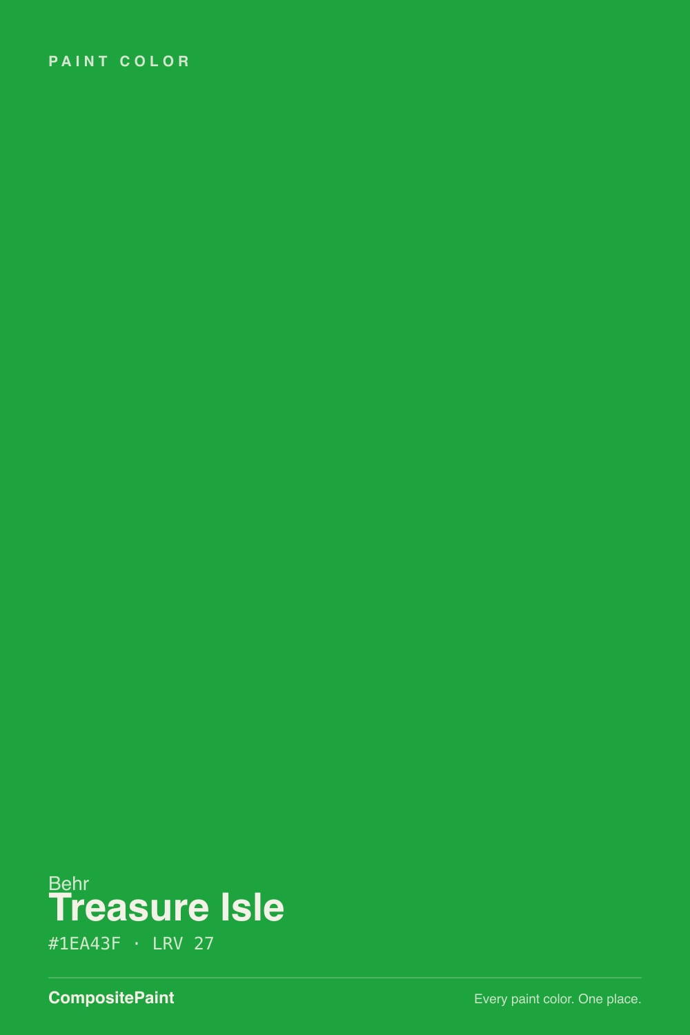
| Brand | Behr |
| Name | Treasure Isle |
| SKU | 480B-6 |
| Hex | #1EA43F |
| RGB | 30, 164, 63 |
| HSL | 135°, 69%, 38% |
| LRV | 27 |
| Undertone | cool green tone |
| Family | Green |
About Behr Treasure Isle
Treasure Isle sits in the mid-range at LRV 27, so it shifts visibly through the day — lighter and more open in morning light, deeper and moodier after dark. Its green undertone is the part to watch: it gets picked up by whatever sits next to it, so test it against your trim, floor and the room's main light before committing. South-facing rooms will pull it lighter and warmer, while north light cools it down.
Treasure Isle is versatile enough for full rooms but has enough depth to anchor a space, so it suits living rooms, bedrooms and cabinetry alike. Greens bridge indoors and out, so they suit living rooms, kitchens and sunrooms.
Closest matches by brand
7 brands within ΔE 5The closest matches per brand by ΔE2000, computed against each brand's full deck. Only colors within ΔE 5 (close enough to substitute on a wall) are shown — brands with no real match are left off. Tap any swatch for its full single-color spec; tap the brand title to browse all green from that brand.
Sherwin-Williams
Benjamin Moore
Valspar
PPG / Glidden
Glidden
Dutch Boy
Dunn-Edwards
Similar Behr colors
closest in the Behr deckThe nearest shades to Treasure Isle within Behr's own range, ranked by perceptual color distance — useful when you want the same look a touch lighter, darker, or warmer.
Coordinated palette
Generated by hue-rotating #1EA43F in HSL space. Pair Treasure Isle with one accent and one neutral — the swatches below are starting points, not final picks.
Accessibility (WCAG contrast)
WCAG 2.1: AA = 4.5:1 normal text · AA Large = 3:1 large text · AAA = 7:1 normal text.
Behr Treasure Isle Equivalents at Other Brands
Matching Treasure Isle from a different paint counter? Below is the single closest color in each major US deck and how close it really is. Remember that any paint store can also custom-tint Behr 480B-6 directly — these equivalents are for when you'd rather stay inside one brand's own deck.
Sherwin-Williams Equivalent of Treasure Isle
Sherwin-Williams has no exact twin of Treasure Isle. The nearest is Straightforward Green (SW 6935) at ΔE 4.14 — close, but the difference shows next to trim and in side light. It runs slightly lighter (LRV 29 vs 27). Compare large swatches before substituting. See the full Straightforward Green swatch →
Benjamin Moore Equivalent of Treasure Isle
At Benjamin Moore, the closest color to Treasure Isle is Traffic Light Green (2032-20) — very close at ΔE 2.53, though not an exact twin. It sits at the same lightness (LRV 27 vs 27) and carries a cool green undertone; sample both side by side if the room gets strong natural light. See the full Traffic Light Green swatch →
Valspar Equivalent of Treasure Isle
At Valspar, the closest color to Treasure Isle is Spinach (6004-10C) — very close at ΔE 3.17, though not an exact twin. It sits at the same lightness (LRV 27 vs 27) and carries a cool green undertone; sample both side by side if the room gets strong natural light. See the full Spinach swatch →
PPG / Glidden Equivalent of Treasure Isle
At PPG / Glidden, the closest color to Treasure Isle is Leap Frog (PPG1225-7) — very close at ΔE 2.95, though not an exact twin. It runs slightly lighter (LRV 30 vs 27) and carries a cool green undertone; sample both side by side if the room gets strong natural light. See the full Leap Frog swatch →
Glidden Equivalent of Treasure Isle
At Glidden, the closest color to Treasure Isle is Leap Frog (PPG1225-7) — very close at ΔE 3, though not an exact twin. It runs slightly lighter (LRV 30 vs 27) and carries a cool green undertone; sample both side by side if the room gets strong natural light. See the full Leap Frog swatch →
Dutch Boy Equivalent of Treasure Isle
Dutch Boy has no exact twin of Treasure Isle. The nearest is Feeling Lucky (128-6DB) at ΔE 4.14 — close, but the difference shows next to trim and in side light. It runs slightly lighter (LRV 29 vs 27). Compare large swatches before substituting. See the full Feeling Lucky swatch →
Dunn-Edwards Equivalent of Treasure Isle
At Dunn-Edwards, the closest color to Treasure Isle is Get Up and Go (DE5636) — very close at ΔE 3.24, though not an exact twin. It runs slightly darker (LRV 23 vs 27) and carries a cool green undertone; sample both side by side if the room gets strong natural light. See the full Get Up and Go swatch →