Pink, Blue & Purple Color Palette — Twilight Veil
A soft four-color scheme weaving dusky pink, twilight blue, and muted purple together with a quiet ivory base — every color matched to real paint you can buy.
By Jessica Williams · Color Stylist & Interior Editor
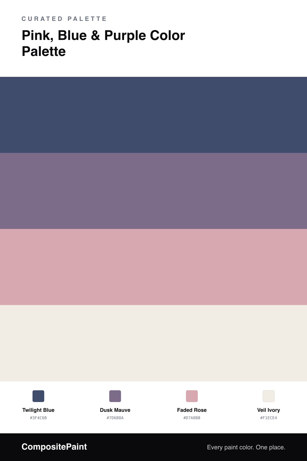
There is a moment just after sunset when the sky holds blue, purple, and pink all at once, and none of them shout. This scheme bottles that light. A deep, grayed Twilight Blue sets the mood and does most of the heavy lifting, the kind of blue that feels calm rather than cold.
From there, Dusk Mauve softens the edges — a muted purple that bridges the cooler blue and the warmer pink so nothing feels like a hard jump. A whisper of Faded Rose comes in last, dusty and grown-up, the warm spark that keeps the whole thing from going too quiet.
Holding it together is Veil Ivory, a soft off-white that gives every other color room to breathe. Lean contemporary by keeping the brights dusty and the surfaces matte, and this twilight trio reads serene and modern rather than sugary.
Buy These Colors
Each color matched to the closest real paint in every brand, by ΔE2000. Tap a swatch for its full guide or + to save it — take any SKU to the store, they mix on demand.
Questions
Pick muted, dusty versions of each instead of candy brights. Here the blue is deep and grayed, the purple is soft mauve, and the pink is faded rather than hot, so the trio reads grown-up and calm rather than girly.
Lead with the Twilight Blue. Let the mauve and faded rose come in as smaller moments, roughly a 60/25/15 split, and let the ivory carry the open space so the warmer tones feel like accents.
Similar Palettes
Closest schemes by color — not by label.