Pink, Blue & Purple Color Palette — Dusk Dune
A soft five-color scheme weaving dusty pink with slate blue and muted purple, settled on warm dune neutrals — every color matched to real paint you can buy.
By Emily Roberts · DIY Editor & First-Timer's Guide
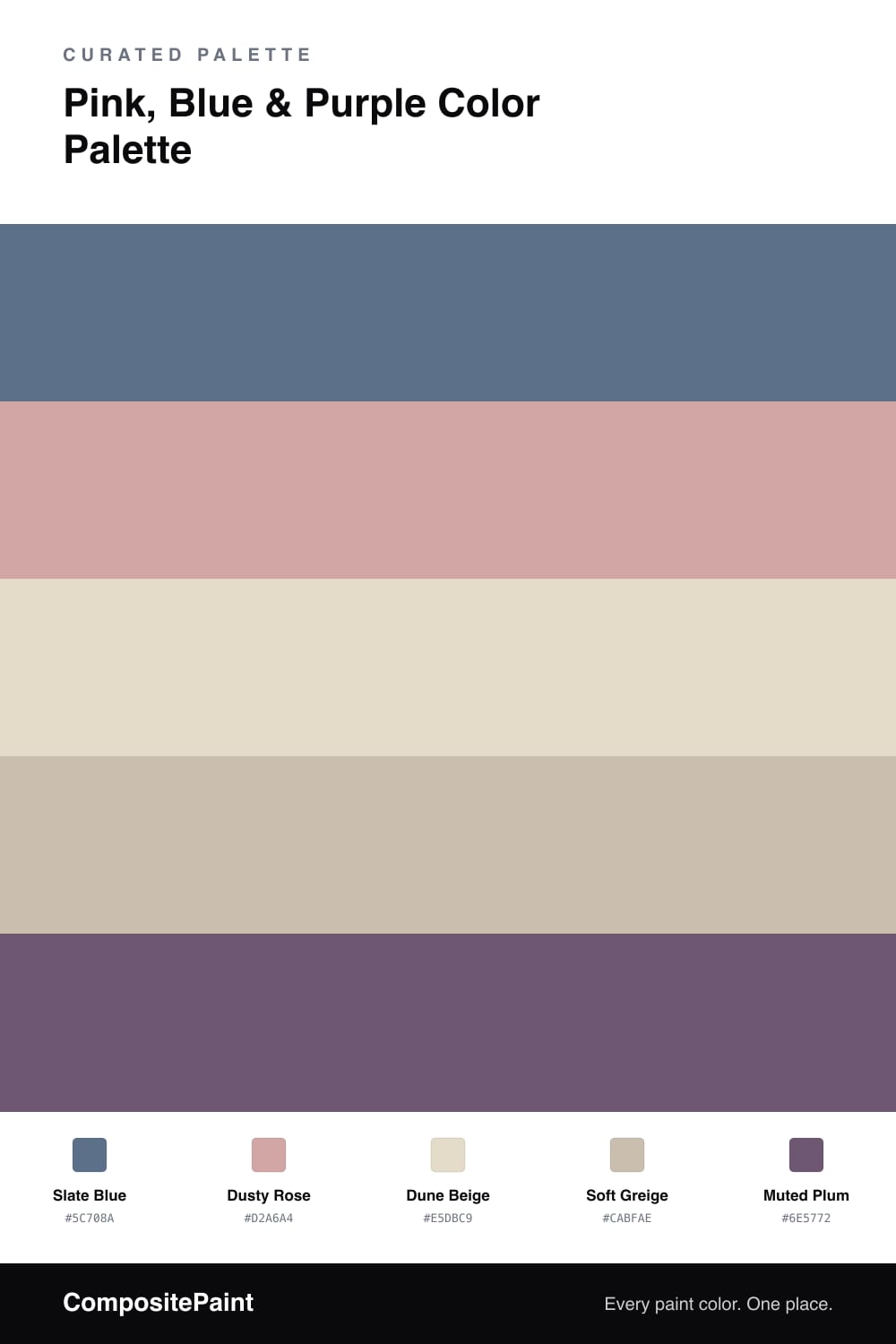
This is one of those grown-up pastel mixes that feels right at home in 2026. Slate Blue does the heavy lifting as the dominant color, giving everything a calm, grounded base that never reads babyish.
Then the warmer tones come in to soften it. Dusty Rose is your gentle pink moment, while Dune Beige and Soft Greige act as the cozy middle ground that ties the cool and warm sides together. They are the quiet glue here.
For the spark, a little Muted Plum goes a long way. Use it in small doses, maybe a single piece or a thin trim, so it reads as a thoughtful accent rather than a bold statement. The whole palette stays soft, layered, and easy to live with.
Buy These Colors
Each color matched to the closest real paint in every brand, by ΔE2000. Tap a swatch for its full guide or + to save it — take any SKU to the store, they mix on demand.
Questions
Blue, pink, and purple all sit near each other on the color wheel, so they share a quiet family feeling instead of fighting. The warm dune neutrals between them keep the cooler tones from feeling chilly.
Let the slate blue lead on the biggest surfaces, bring in dusty rose on softer touches, and save the plum for a small accent. Think roughly a 60/30/10 split with the neutrals filling the calm space.
Similar Palettes
Closest schemes by color — not by label.