Pink, Blue & Purple Color Palette — Canyon Dusk
A modern four-color scheme blending soft canyon pink, slate blue, and muted plum purple with a warm bone neutral — every color matched to real paint you can buy.
By Maya Patel · Reviews Editor & Product Tester
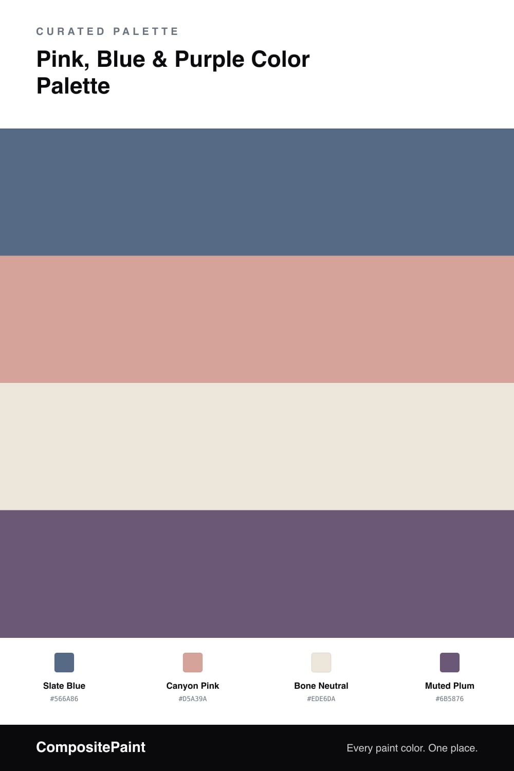
This is a scheme I keep coming back to in 2026 because it feels current without trying too hard. A grounded Slate Blue carries the room, while a dusty Canyon Pink warms it up just enough to keep things from going cold or corporate.
The clever piece is the Muted Plum, which sits right between the pink and the blue and quietly stitches them together. Without it the pairing can read like two unrelated ideas, but a little plum on a door, a chair, or trim makes the whole thing feel intentional.
A soft Bone Neutral is the breathing room that lets all three colors land. Use the blue as your dominant tone, the pink as the warm secondary, the bone everywhere you need calm, and the plum in small, confident doses.
Buy These Colors
Each color matched to the closest real paint in every brand, by ΔE2000. Tap a swatch for its full guide or + to save it — take any SKU to the store, they mix on demand.
Questions
Purple sits between pink and blue on the color wheel, so it acts as a bridge that ties the warmer pink and cooler blue into one family instead of letting them fight.
Lean on the slate blue as your main color and keep the pink to about one-fifth of the room, with the bone neutral doing the quiet work so the plum reads as a deliberate accent.
Similar Palettes
Closest schemes by color — not by label.