CP

Pink, Blue & Purple Color Palette — Clay Garden

A soft four-color scheme weaving dusty pink, slate blue, and muted purple over a warm clay base, every color matched to real paint you can buy.

By Jessica Williams · Color Stylist & Interior Editor

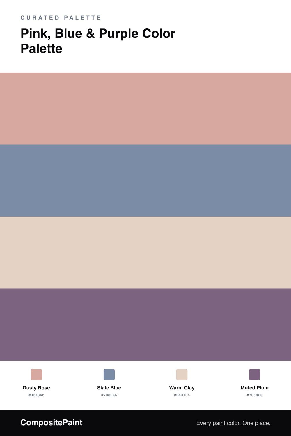
There is something gentle and grown-up about pink, blue, and purple when you pull them down into dusty, clay-warmed tones. The Dusty Rose here is the kind of pink that reads as soft and warm rather than sweet, the shade that catches late afternoon light and holds onto it.

I lean on Warm Clay as the base because it gives the whole scheme an earthy floor to stand on, keeping the cooler colors from feeling chilly. Against it, Slate Blue brings a quiet contrast, a touch of calm and distance that stops the room from going too soft.

The Muted Plum is the bridge and the grounding note all at once, a color that feels very 2026 in its murky, lived-in depth. Use it in the smallest dose, on a single chair, a frame, or a doorway, and let the rose and clay do the everyday work.

View palette in
Dusty Rose
Dominant
Backdrop Rosita · BD-RO
#D2A299
LRV 38
Slate Blue
Secondary
PPG / Glidden Evening Hush · PPG1165-5
#7B8DA8
LRV 26
Warm Clay
Base
Benjamin Moore Soft Satin · 2164-60
#E6D4C4
LRV 66
Muted Plum
Accent
Glidden Grape Jelly · PPG1177-6
#7E667F
LRV 15

Buy These Colors

Each color matched to the closest real paint in every brand, by ΔE2000. Tap a swatch for its full guide or + to save it — take any SKU to the store, they mix on demand.

Dusty Rose
#D6A8A0 · LRV 45 · Dominant
Sherwin-Williams · SW 7581 · ΔE 4.52
Behr · PMD-70 · ΔE 2.45
Benjamin Moore · 1174 · ΔE 5.42
Valspar · 1006-10B · ΔE 4.16
PPG / Glidden · PPG1057-4 · ΔE 2.32
Glidden · 60YR 57/216 · ΔE 2.32
Dutch Boy · 409-3DB · ΔE 4.59
HGTV Home by Sherwin-Williams · HGSW 3016 · ΔE 6.38
Dunn-Edwards · DET416 · ΔE 2.61
Magnolia Home · JG-154 · ΔE 7.34
Farrow & Ball · NO. 9806 · ΔE 4.1
Diamond Vogel · 0049 · ΔE 2.86
Hirshfield's · 0049 · ΔE 3.23
Rodda · R122 · ΔE 6.86
C2 Paint · C2-528 · ΔE 6.26
Clare · PNT100-MD-76 · ΔE 2.99
Portola Paints · HAVANA · ΔE 8.31
Annie Sloan · PALOMA · ΔE 12
Backdrop · BD-RO · ΔE 1.68
Rust-Oleum · 285143 · ΔE 18.14
Kompozit · 0049 · ΔE 3.23
Slate Blue
#7B8DA6 · LRV 26 · Secondary
Sherwin-Williams · SW 6242 · ΔE 5.24
Behr · N550-5 · ΔE 0.9
Benjamin Moore · 2128-40 · ΔE 3.58
Valspar · V111-4 · ΔE 1.51
PPG / Glidden · PPG1165-5 · ΔE 0.78
Glidden · PPG1165-5 · ΔE 1.41
Dutch Boy · 340-5DB · ΔE 2.77
HGTV Home by Sherwin-Williams · HGSW 3353 · ΔE 5.24
Dunn-Edwards · DE5900 · ΔE 4.96
Magnolia Home · JG-95 · ΔE 8.9
Farrow & Ball · NO. 306 · ΔE 7.87
Diamond Vogel · 0618 · ΔE 4.28
Hirshfield's · 0589 · ΔE 3.06
Rodda · R081 · ΔE 8.5
C2 Paint · C2-747 · ΔE 5.62
Clare · PNT100-MD-39 · ΔE 10.59
Portola Paints · CYCLONE · ΔE 3.51
Annie Sloan · GREEK BLUE · ΔE 4.63
Backdrop · BD-PW · ΔE 7.38
Rust-Oleum · 285141 · ΔE 16.88
Kompozit · 0589 · ΔE 3.06
Warm Clay
#E4D3C4 · LRV 67 · Base
Sherwin-Williams · SW 7596 · ΔE 0.91
Behr · MQ3-37 · ΔE 1.97
Benjamin Moore · 2164-60 · ΔE 0.53
Valspar · 2006-8C · ΔE 1.17
PPG / Glidden · PPG1067-2 · ΔE 3.45
Glidden · 10YY 67/089 · ΔE 1.23
Dutch Boy · 311-1DB · ΔE 1.94
HGTV Home by Sherwin-Williams · HGSW 3157 · ΔE 2.57
Dunn-Edwards · DE6128 · ΔE 1.37
Magnolia Home · JG-24 · ΔE 3.26
Farrow & Ball · NO. 202 · ΔE 2.42
Diamond Vogel · 0181 · ΔE 1.85
Hirshfield's · 0181 · ΔE 1.68
Rodda · R121 · ΔE 2.68
C2 Paint · C2-833 · ΔE 4.12
Clare · PNT100-LT-20 · ΔE 1.48
Portola Paints · FIGUEROA · ΔE 5.53
Annie Sloan · OLD OCHRE · ΔE 6.53
Backdrop · BD-CC · ΔE 6.51
Rust-Oleum · 285142 · ΔE 7.62
Kompozit · 0181 · ΔE 1.68
Muted Plum
#7C6480 · LRV 15 · Accent
Sherwin-Williams · SW 6557 · ΔE 3.58
Behr · MQ5-34 · ΔE 2.64
Benjamin Moore · 1385 · ΔE 1.35
Valspar · V077-5 · ΔE 4.26
PPG / Glidden · PPG1177-6 · ΔE 1.44
Glidden · PPG1177-6 · ΔE 1.26
Dutch Boy · 344-5DB · ΔE 7.05
HGTV Home by Sherwin-Williams · HGSW 2423 · ΔE 3.58
Dunn-Edwards · DE5985 · ΔE 5.72
Magnolia Home · JG-147 · ΔE 15.06
Farrow & Ball · NO. 220 · ΔE 13.32
Diamond Vogel · 1214 · ΔE 5.14
Hirshfield's · 1207 · ΔE 3.7
Rodda · R118 · ΔE 10.43
C2 Paint · C2-778 · ΔE 9.25
Clare · PNT100-DP-33 · ΔE 6.46
Portola Paints · CARMINE · ΔE 7.26
Annie Sloan · RODMELL · ΔE 9.8
Backdrop · BD-MJ · ΔE 20.49
Rust-Oleum · 329207 · ΔE 21.63
Kompozit · 1207 · ΔE 3.7

Questions

Why do pink, blue, and purple work together here?

Purple already lives halfway between pink and blue, so it acts as a bridge that ties the warm rose and cool slate into one calm family instead of three separate notes.

How do I balance them in a room?

Lead with the soft rose and let the clay base carry the quiet middle, then bring in slate blue as the steady supporting tone and save the plum for small grounding moments.

KEEP EXPLORING

Similar Palettes

Closest schemes by color — not by label.