CP

Pink, Blue & Purple Color Palette — Smoke & Petal

A soft four-color scheme blending dusty pink, smoky blue, and muted purple with a warm greige base, every color matched to real paint you can buy.

By Emily Roberts · DIY Editor & First-Timer's Guide

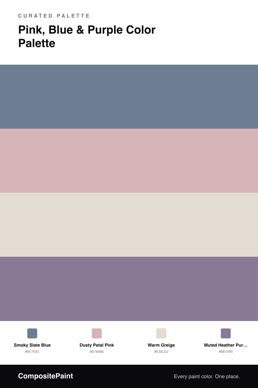
This is one of those color combos that sounds risky on paper and turns out to be the easiest thing in the world to live with. The secret is that nothing here is bright. Smoky Slate Blue leads the way as a calm, grown-up anchor, and Dusty Petal Pink warms it up without going sweet.

The Muted Heather Purple is the quiet hero. Because purple is literally pink and blue mixed together, it bridges the two and makes the whole scheme feel intentional instead of random. Use it sparingly — a little goes a long way.

Warm Greige is your safety net. Spread it across the biggest surfaces and let the three colors take turns playing off it. This palette feels right at home in 2026, where soft, slightly moody tones are doing all the heavy lifting in calm, lived-in spaces.

View palette in
Smoky Slate Blue
Dominant
Valspar Window Screen · 4004-4A
#717F90
LRV 21
Dusty Petal Pink
Secondary
Benjamin Moore Pink Attraction · 1255
#D8B4B5
LRV 50
Warm Greige
Base
Sherwin-Williams Aesthetic White · SW 7035
#E3DDD3
LRV 73
Muted Heather Purple
Accent
Behr Gypsy Magic · 100F-5
#877895
LRV 21

Buy These Colors

Each color matched to the closest real paint in every brand, by ΔE2000. Tap a swatch for its full guide or + to save it — take any SKU to the store, they mix on demand.

Smoky Slate Blue
#6E7E92 · LRV 20 · Dominant
Sherwin-Williams · SW 6543 · ΔE 4.27
Behr · ICC-74 · ΔE 3.18
Benjamin Moore · 1434 · ΔE 3.32
Valspar · 4004-4A · ΔE 1.28
PPG / Glidden · PPG1163-5 · ΔE 1.64
Glidden · PPG1163-5 · ΔE 1.42
Dutch Boy · 342-5DB · ΔE 4.27
HGTV Home by Sherwin-Williams · HGSW 2403 · ΔE 4.27
Dunn-Edwards · DE5921 · ΔE 4.79
Magnolia Home · JG-78 · ΔE 13.69
Farrow & Ball · NO. 299 · ΔE 8.44
Diamond Vogel · 0590 · ΔE 4.23
Hirshfield's · 0506 · ΔE 3.7
Rodda · R098 · ΔE 4.42
C2 Paint · C2-778 · ΔE 9.6
Clare · PNT100-MD-16 · ΔE 8.4
Portola Paints · BLUE HERON · ΔE 8.37
Annie Sloan · GREEK BLUE · ΔE 5.1
Backdrop · BD-PW · ΔE 7.96
Rust-Oleum · 391446 · ΔE 16.32
Kompozit · 0506 · ΔE 3.7
Dusty Petal Pink
#D7B4B6 · LRV 50 · Secondary
Sherwin-Williams · SW 76 · ΔE 1.38
Behr · 230E-3 · ΔE 1.4
Benjamin Moore · 1255 · ΔE 0.5
Valspar · 1006-8B · ΔE 1.32
PPG / Glidden · PPG1048-4 · ΔE 2.2
Glidden · PPG1048-4 · ΔE 2
Dutch Boy · 347-3DB · ΔE 3.23
HGTV Home by Sherwin-Williams · HGSW 2036 · ΔE 1.6
Dunn-Edwards · DE6024 · ΔE 1.24
Magnolia Home · JG-133 · ΔE 11.51
Farrow & Ball · NO. 207 · ΔE 6.56
Diamond Vogel · 0104 · ΔE 2.15
Hirshfield's · 0104 · ΔE 2.45
Rodda · R122 · ΔE 5.68
C2 Paint · C2-784 · ΔE 13.02
Clare · PNT100-LT-13 · ΔE 10.72
Portola Paints · TOPANGA · ΔE 11.85
Annie Sloan · PALOMA · ΔE 9.54
Backdrop · BD-BG · ΔE 7.25
Rust-Oleum · 285143 · ΔE 15.05
Kompozit · 0104 · ΔE 2.45
Warm Greige
#E3DCD2 · LRV 72 · Base
Sherwin-Williams · SW 7035 · ΔE 0.53
Behr · N230-1 · ΔE 1.37
Benjamin Moore · 971 · ΔE 1.95
Valspar · 6005-1A · ΔE 0.92
Ash
PPG / Glidden · PPG1076-2 · ΔE 0.64
Ash
Glidden · PPG1076-2 · ΔE 0.69
Dutch Boy · 347-1DB · ΔE 1.25
HGTV Home by Sherwin-Williams · HGSW 4011 · ΔE 0.53
Dunn-Edwards · DE6072 · ΔE 3.54
Magnolia Home · JG-108 · ΔE 1.01
Farrow & Ball · NO. 291 · ΔE 2.35
Diamond Vogel · 0229 · ΔE 1.07
Hirshfield's · 0229 · ΔE 1.61
Rodda · CA024 · ΔE 2.23
C2 Paint · BD4 · ΔE 0.86
Clare · PNT100-LT-19 · ΔE 2.69
Gem
Portola Paints · GEM · ΔE 2.22
Annie Sloan · OLD OCHRE · ΔE 9.46
Backdrop · BD-CC · ΔE 5.46
Rust-Oleum · 285142 · ΔE 9.11
Kompozit · 0229 · ΔE 1.61
Muted Heather Purple
#8B7A95 · LRV 22 · Accent
Sherwin-Williams · SW 9069 · ΔE 4.57
Behr · 100F-5 · ΔE 1.35
Benjamin Moore · 2117-40 · ΔE 4.77
Valspar · 1001-5B · ΔE 3.9
PPG / Glidden · PPG13-24 · ΔE 9.12
Glidden · 50RB 23/161 · ΔE 2.88
Dutch Boy · 144-6DB · ΔE 2.68
HGTV Home by Sherwin-Williams · HGSW 2413 · ΔE 4.52
Dunn-Edwards · DE5956 · ΔE 2.74
Magnolia Home · JG-100 · ΔE 8.86
Farrow & Ball · NO. 271 · ΔE 8.02
Diamond Vogel · 1298 · ΔE 2.55
Hirshfield's · 1290 · ΔE 3.47
Rodda · R098 · ΔE 14.8
C2 Paint · C2-779 · ΔE 7.4
Clare · PNT100-MD-16 · ΔE 15.74
Portola Paints · VOODOO · ΔE 10.85
Annie Sloan · GREEK BLUE · ΔE 19.83
Backdrop · BD-PW · ΔE 19.53
Rust-Oleum · 391446 · ΔE 18.31
Kompozit · 1290 · ΔE 3.47

Questions

Why do pink, blue, and purple work together here?

Purple sits right between pink and blue on the color wheel, so it acts like a bridge that ties the other two together. Keeping all three soft and a little grayed-out is the trick — it stops them from feeling like a nursery and reads grown-up instead.

How do I balance these colors in a room?

Let the smoky blue lead and the warm greige do most of the quiet work. Use the dusty pink in medium doses and save the heather purple for small accents like a pillow, a vase, or one painted shelf.

KEEP EXPLORING

Similar Palettes

Closest schemes by color — not by label.