CP

Sky Color Palette — Sky Vale

A soft five-color scheme of pale blue, cloud white, and quiet hints of dawn pink and dusk lavender — every color matched to real paint you can buy.

By Jessica Williams · Color Stylist & Interior Editor

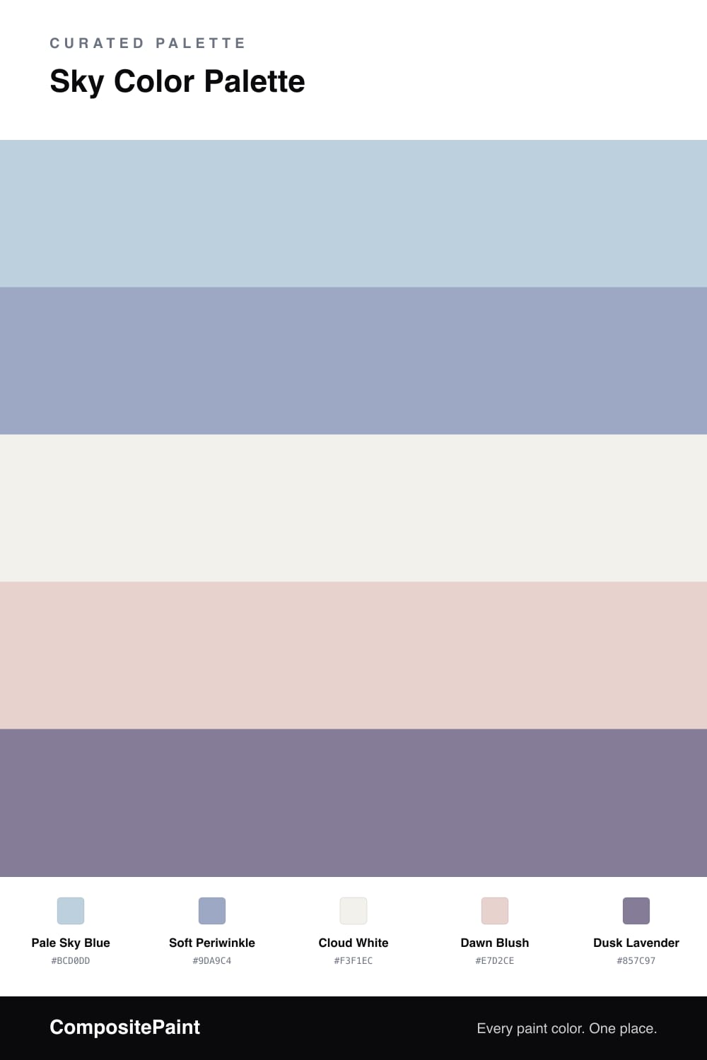
This is the color of a sky that has not quite woken up yet. Pale Sky Blue leads, soft and a little hazy, with Soft Periwinkle stepping in just behind it to add a cooler, dustier note where you want a touch more depth.

Cloud White keeps everything open and breathing, while Dawn Blush brings in the faintest warmth, like the first pink light catching the underside of a cloud. It is barely there, which is exactly the point.

For 2026 I love grounding all this airiness with Dusk Lavender in small, deliberate doses — a window frame, a slim console, the edge of a built-in. It is the dusk to your dawn, and it keeps the whole palette from floating away.

View palette in
Pale Sky Blue
Dominant
PPG / Glidden Constellation · PPG1155-4
#BCCEDA
LRV 60
Soft Periwinkle
Secondary
Behr Poetry Reading · MQ5-17
#9DABC7
LRV 40
Cloud White
Base
Behr Nano White · HDC-MD-06
#F3F1ED
LRV 88
Dawn Blush
Support
Glidden Birthday Cake · PPG1059-2
#E9D2CC
LRV 68
Dusk Lavender
Accent
Kompozit Violet Vibes · 1290
#898098
LRV 23

Buy These Colors

Each color matched to the closest real paint in every brand, by ΔE2000. Tap a swatch for its full guide or + to save it — take any SKU to the store, they mix on demand.

Pale Sky Blue
#BCD0DD · LRV 61 · Dominant
Sherwin-Williams · SW 6960 · ΔE 2.48
Behr · PPU15-17 · ΔE 3.9
Benjamin Moore · 835 · ΔE 1.66
Valspar · V109-2 · ΔE 1.33
PPG / Glidden · PPG1155-4 · ΔE 0.77
Glidden · PPG1155-4 · ΔE 0.82
Dutch Boy · 239-2DB · ΔE 1.5
HGTV Home by Sherwin-Williams · HGSW 1396 · ΔE 1.42
Dunn-Edwards · DE5813 · ΔE 0.81
Magnolia Home · JG-93 · ΔE 5.87
Farrow & Ball · NO. 205 · ΔE 7.63
Diamond Vogel · 0643 · ΔE 0.81
Hirshfield's · 0643 · ΔE 1.63
Rodda · R085 · ΔE 2.12
C2 Paint · C2-736 · ΔE 1.11
Clare · PNT100-LT-31 · ΔE 7.25
Portola Paints · PIGEON GRAY · ΔE 6.53
Annie Sloan · LOUIS BLUE · ΔE 4.59
Backdrop · BD-LO · ΔE 4.9
Rust-Oleum · 285139 · ΔE 9.11
Kompozit · 0643 · ΔE 1.63
Soft Periwinkle
#9DA9C4 · LRV 40 · Secondary
Sherwin-Williams · SW 6969 · ΔE 2.95
Behr · MQ5-17 · ΔE 0.9
Benjamin Moore · 1412 · ΔE 5.11
Valspar · 8003-47C · ΔE 1.8
PPG / Glidden · 1166-4 · ΔE 1.83
Glidden · PPG1166-4 · ΔE 1.83
Dutch Boy · 141-4DB · ΔE 1.83
HGTV Home by Sherwin-Williams · HGSW 2395 · ΔE 4.64
Dunn-Edwards · DE5899 · ΔE 1.94
Magnolia Home · JG-89 · ΔE 10.53
Farrow & Ball · NO. 89 · ΔE 7.7
Diamond Vogel · 1282 · ΔE 6.04
Hirshfield's · 0624 · ΔE 6
Rodda · R087 · ΔE 7.88
C2 Paint · BD12 · ΔE 4.31
Clare · PNT100-LT-38 · ΔE 10.71
Portola Paints · TWIN PEAKS · ΔE 9.63
Annie Sloan · DUCK EGG BLUE · ΔE 19.46
Backdrop · BD-UD · ΔE 10.64
Rust-Oleum · 371675 · ΔE 14.66
Kompozit · 0624 · ΔE 6
Cloud White
#F3F1EC · LRV 88 · Base
Sherwin-Williams · SW 9623 · ΔE 2.45
Behr · HDC-MD-06 · ΔE 0.5
Benjamin Moore · OC-152 · ΔE 1.45
Valspar · 8007-6E · ΔE 0.53
PPG / Glidden · PPG1001-1 · ΔE 1.45
Glidden · PPG1001-1 · ΔE 1.45
Dutch Boy · 004W · ΔE 1.39
HGTV Home by Sherwin-Williams · HGSW 4002 · ΔE 1.82
Dunn-Edwards · DE6225 · ΔE 0.59
Magnolia Home · JG-107 · ΔE 1.07
Farrow & Ball · NO. 239 · ΔE 2.77
Diamond Vogel · 1265 · ΔE 1.01
Hirshfield's · 1265 · ΔE 0.64
Rodda · R001 · ΔE 1.26
C2 Paint · C2-820 · ΔE 1.49
Clare · PNT100-LT-24 · ΔE 2.77
Portola Paints · ORIGAMI · ΔE 0.77
Annie Sloan · OLD OCHRE · ΔE 14.07
Backdrop · BD-TR · ΔE 2.77
Rust-Oleum · 285140 · ΔE 3.8
Kompozit · 1265 · ΔE 0.64
Dawn Blush
#E7D2CE · LRV 68 · Support
Sherwin-Williams · SW 6302 · ΔE 2.18
Behr · S200-1 · ΔE 1.63
Benjamin Moore · 1374 · ΔE 3.37
Valspar · V128-1 · ΔE 1.81
PPG / Glidden · PPG1059-2 · ΔE 1.05
Glidden · PPG1059-2 · ΔE 1.04
Dutch Boy · 305-1DB · ΔE 2.77
HGTV Home by Sherwin-Williams · HGSW 2037 · ΔE 2.18
Dunn-Edwards · DE6030 · ΔE 3.06
Magnolia Home · JG-24 · ΔE 4.31
Farrow & Ball · NO. 230 · ΔE 1.83
Diamond Vogel · 1217 · ΔE 3.86
Hirshfield's · 1217 · ΔE 3.88
Rodda · R121 · ΔE 4.23
C2 Paint · C2-833 · ΔE 8.9
Clare · PNT100-LT-20 · ΔE 7.05
Portola Paints · GYPSY · ΔE 4.43
Annie Sloan · OLD OCHRE · ΔE 12.38
Backdrop · BD-CC · ΔE 12.46
Rust-Oleum · 285142 · ΔE 1.82
Kompozit · 1217 · ΔE 3.88
Dusk Lavender
#857C97 · LRV 22 · Accent
Sherwin-Williams · SW 6550 · ΔE 2.74
Behr · 100F-5 · ΔE 2.49
Benjamin Moore · 2117-40 · ΔE 3.43
Valspar · 1001-5B · ΔE 3.39
PPG / Glidden · PPG13-24 · ΔE 7.83
Glidden · 10RB 21/218 · ΔE 4.31
Dutch Boy · 144-6DB · ΔE 2.1
HGTV Home by Sherwin-Williams · HGSW 2413 · ΔE 2.74
Dunn-Edwards · DE5928 · ΔE 4.17
Magnolia Home · JG-100 · ΔE 8.17
Farrow & Ball · NO. 271 · ΔE 7.59
Diamond Vogel · 1298 · ΔE 1.97
Hirshfield's · 1290 · ΔE 1.79
Rodda · R098 · ΔE 12.4
C2 Paint · C2-779 · ΔE 6.16
Clare · PNT100-MD-16 · ΔE 14.07
Portola Paints · VOODOO · ΔE 10.38
Annie Sloan · GREEK BLUE · ΔE 16.56
Backdrop · BD-PW · ΔE 16.9
Rust-Oleum · 391446 · ΔE 17.64
Kompozit · 1290 · ΔE 1.79

Questions

Why do these soft colors work together?

They all share a hazy, low-saturation quality, the way the sky looks just after dawn. Because none of them shouts, your eye drifts easily from the pale blue to the blush to the lavender without any jolt.

How do I keep a palette this gentle from feeling flat?

Lean on the dusk lavender as a quiet anchor — a little of it on a piece of trim or a single chair gives the airy blues and whites something to settle against.

KEEP EXPLORING

Similar Palettes

Closest schemes by color — not by label.