Spring Color Palette — Spring Cove
A fresh five-color spring scheme layering soft sage green with blossom pink, buttery yellow, and a clear sky blue, all matched to real paint you can buy.
By David Chen · Formulation Lead & Resident Chemist
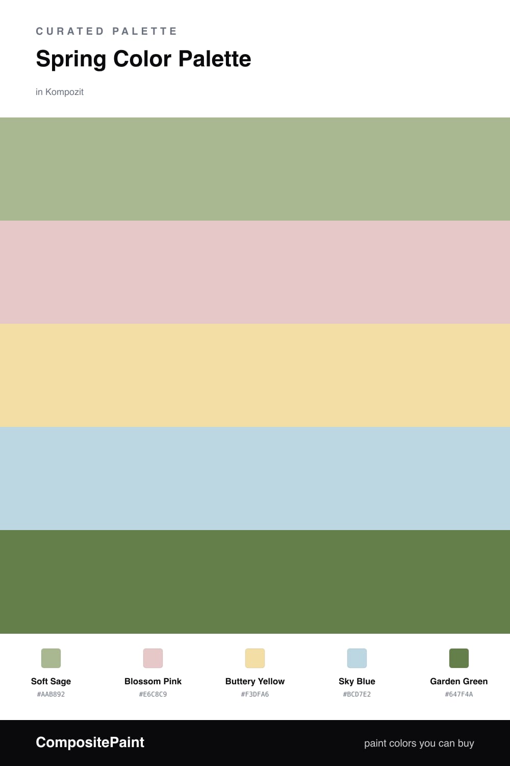
Spring is less about bright color and more about light. This scheme starts with Soft Sage, a gentle gray-green that reads like new leaves seen through morning fog, and lets it carry most of the room.
Around it I scattered the spark colors. Blossom Pink and Buttery Yellow behave like petals and pollen — warm, soft, and best used in small doses — while Sky Blue opens everything up the way a clear day does. Think of these three as the supporting cast, not the lead.
To keep it feeling current rather than sweet, I anchored the palette with Garden Green, a deeper, more saturated note. That one dark color does a lot of quiet work; it gives the pastels something to push against and keeps the whole scheme grounded.
Buy These Colors
Each color matched to the closest real paint in every brand, by ΔE2000. Kompozit first; take any SKU to the store — these mix on demand.
Questions
They all share a soft, slightly grayed tone, which is what keeps them feeling calm rather than candy-bright. Sage, pink, yellow, and blue are spread evenly around the color wheel, so each one gets a little pop from its neighbors without any single shade shouting.
Let the sage lead on walls and keep the pink and yellow small — think pillows, art, or a single piece of furniture. The deeper garden green is your grounding move; one dark note stops the whole room from drifting into pastel.
Similar Palettes
Closest schemes by color — not by label.