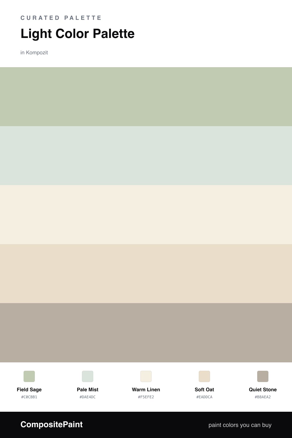
Light Color Palette — Sage Field Morning
A bright, airy five-color scheme of soft sage, warm white, and pale linen that feels like early light over an open field — every color matched to real paint you can buy.
By Jessica Williams · Color Stylist & Interior Editor
There is a particular light right after sunrise, before the day decides what it wants to be, that this palette tries to hold. Field Sage leads it — a gentle green-gray that feels grown rather than mixed, like the color of leaves seen through morning haze. It is soft enough to live on every wall and never tire you.
Pale Mist carries that same green a shade lighter and quieter, perfect for trim or a ceiling so the room feels lifted. Underneath it all, Warm Linen and Soft Oat add a creamy, sun-warmed base that keeps the greens from drifting cool. This is the kind of low-contrast layering that feels very 2026 — calm, tactile, unhurried.
For the smallest touch, Quiet Stone steps in. Use it on a single piece — a stool, a frame, a length of shelf — where you want the eye to rest. It is barely there, and that restraint is exactly the point.
Buy These Colors
Each color matched to the closest real paint in every brand, by ΔE2000. Kompozit first; take any SKU to the store — these mix on demand.
Questions
They all share a soft, low-contrast quality and a touch of warmth, so nothing jumps forward. The sage and mist sit close in tone, the linen and oat warm them up, and the stone gives just enough edge to keep the scheme from feeling washed out.
No, because each one carries a warm undertone — the linen and oat especially. In low light they read soft and creamy rather than gray, which keeps the airy feeling without the chill.
Similar Palettes
Closest schemes by color — not by label.