CP

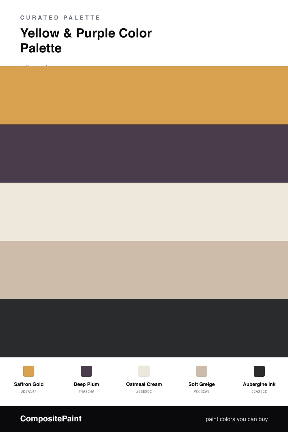
Yellow & Purple Color Palette — Saffron & Plum

A warm five-color scheme pairing golden saffron yellow with deep plum purple, softened by oatmeal and greige neutrals — every color matched to real paint you can buy.

By Emily Roberts · DIY Editor & First-Timer's Guide

Saffron Gold
Dominant
Kompozit Angel Food Cake · 0913
#D7A14F
LRV 41
Deep Plum
Secondary
Kompozit Petunia Patty · 1228
#4A3C4A
LRV 5
Oatmeal Cream
Base
Kompozit Hint of Vanilla · 0001
#EEE8DC
LRV 81
Soft Greige
Support
Kompozit Moth Wing · 0183
#CCBCA9
LRV 52
Aubergine Ink
Accent
Kompozit Silent Sea · 0515
#2A2B2C
LRV 2
View palette in

Yellow and purple are true opposites on the color wheel, which is exactly why they make each other glow. This scheme leans warm and a little contemporary, with a golden Saffron Gold doing most of the talking and a moody Deep Plum stepping in for contrast.

The two neutrals are what keep it grown-up instead of playful. Oatmeal Cream and Soft Greige sit in the middle so the saffron and plum never have to touch head-on, and they carry most of the room while the brights do the accenting.

For the finishing touch, a near-black Aubergine Ink sharpens the edges — picture it on a window frame or a slim band of trim. Keep the yellow dominant, use the plum sparingly, and let the soft neutrals do the quiet work that holds the whole thing together.

Buy These Colors

Each color matched to the closest real paint in every brand, by ΔE2000. Kompozit first; take any SKU to the store — these mix on demand.

Saffron Gold
#E0A23B · LRV 42 · Dominant
Kompozit Angel Food Cake · 0913 ΔE 3.1
Backdrop Eames · BD-EA ΔE 11.47
Behr Solar Fusion · UL150-3 ΔE 2.66
Benjamin Moore Golden Vista · 308 ΔE 1.6
Clare Good as Gold · PNT100-DP-59 ΔE 9.27
Dunn-Edwards Fortune Cookie · DE5355 ΔE 2.68
Farrow & Ball India Yellow · No. 66 ΔE 6.01
Magnolia Home Bright Days · JG-45 ΔE 9.69
PPG / Glidden Brass Mesh · 1209-6 ΔE 2.04
Sherwin-Williams Sunflower · SW 6678 ΔE 3.33
Valspar Golden Tiger · V052-4 ΔE 1.91
Deep Plum
#4A3354 · LRV 4 · Secondary
Kompozit Petunia Patty · 1228 ΔE 7.92
Backdrop Last Call · BD-LC ΔE 12.64
Behr Deep Aubergine · 100F-7 ΔE 6.12
Benjamin Moore Exotic Purple · 2071-10 ΔE 3.12
Clare Blackish · PNT100-DP-54 ΔE 19.56
Dunn-Edwards Preserve · DEA193 ΔE 5.75
Farrow & Ball Pelt · No. 254 ΔE 9.55
Magnolia Home Plum Suede · JG-102 ΔE 8.21
PPG / Glidden Victory Blue · 1165-7 ΔE 11.36
Sherwin-Williams Concord Grape · SW 6559 ΔE 3.32
Valspar Virtuoso · M215 ΔE 6.86
Oatmeal Cream
#EFE7D7 · LRV 80 · Base
Kompozit Hint of Vanilla · 0001 ΔE 1.65
Backdrop Don't Eat the Yellow Snow · BD-DS ΔE 3.1
Behr Rye Flour · HDC-FL13-5 ΔE 1.36
Benjamin Moore Navajo White · 947 ΔE 1.09
Clare Like Buttah · PNT100-LT-62 ΔE 1.36
Dunn-Edwards Ball of String · DE6190 ΔE 0.48
Farrow & Ball James White · No. 2010 ΔE 2.13
Magnolia Home Carter Crème · JG-16 ΔE 1.09
PPG / Glidden Edelweiss · 14-23 ΔE 0.93
Sherwin-Williams Restful White · SW 7563 ΔE 1.19
Valspar Double Scoop · V176 ΔE 0.52
Soft Greige
#C9BEAC · LRV 52 · Support
Kompozit Moth Wing · 0183 ΔE 2.29
Backdrop Boy Meets Girl · BD-BG ΔE 12.26
Behr Still Moment · MQ6-59 ΔE 1.55
Benjamin Moore Ashen Tan · 996 ΔE 1.3
Clare Greige · PNT100-LT-13 ΔE 5.7
Dunn-Edwards Birchwood · DEC752 ΔE 1.48
Farrow & Ball Drop Cloth · No. 283 ΔE 0.42
Magnolia Home Solid Wood · JG-109 ΔE 1.4
PPG / Glidden Stonington · 15-25 ΔE 0.9
Sherwin-Williams Sandbar · SW 7547 ΔE 0.58
Valspar Snake Charmer · 8004-23B ΔE 2.38
Aubergine Ink
#2C2230 · LRV 2 · Accent
Kompozit Silent Sea · 0515 ΔE 10.89
Backdrop Hocus Pocus · BD-HP ΔE 8.71
Behr Beluga · 770F-7 ΔE 15.41
Benjamin Moore Velvet Cloak · CSP-480 ΔE 4.95
Clare Blackish · PNT100-DP-54 ΔE 16.02
Dunn-Edwards Black · DEA187 ΔE 12.25
Farrow & Ball Pitch Black · No. 256 ΔE 12.33
Magnolia Home Blackboard · JG-05 ΔE 10.57
PPG / Glidden Black Magic · 1001-7 ΔE 13.42
Sherwin-Williams Raisin · SW 7630 ΔE 7.31
Valspar Tuxedo · 8006-8G ΔE 10.63

Questions

Won't yellow and purple feel too bold together?

They can if you use them at full strength side by side, so the trick is the split. Let the warm saffron lead and keep the plum to about one-fifth of the room, with the oatmeal and greige neutrals filling the space between them. That softens the contrast into something cozy rather than loud.

Where should I actually put the plum?

Use it where you want a little drama and not much of it. Think a single accent wall, the inside of a bookcase, or smaller pieces like a door or trim. The deep plum reads almost like a neutral in small doses, so a little goes a long way against all that golden yellow.

Similar Palettes

Closest schemes by color — not by label.