Yellow & Purple Color Palette — Royal Bloom
A regal four-color scheme pairing golden yellow with deep plum purple, softened by warm linen and grounded by charcoal — every color matched to real paint you can buy.
By Jessica Williams · Color Stylist & Interior Editor
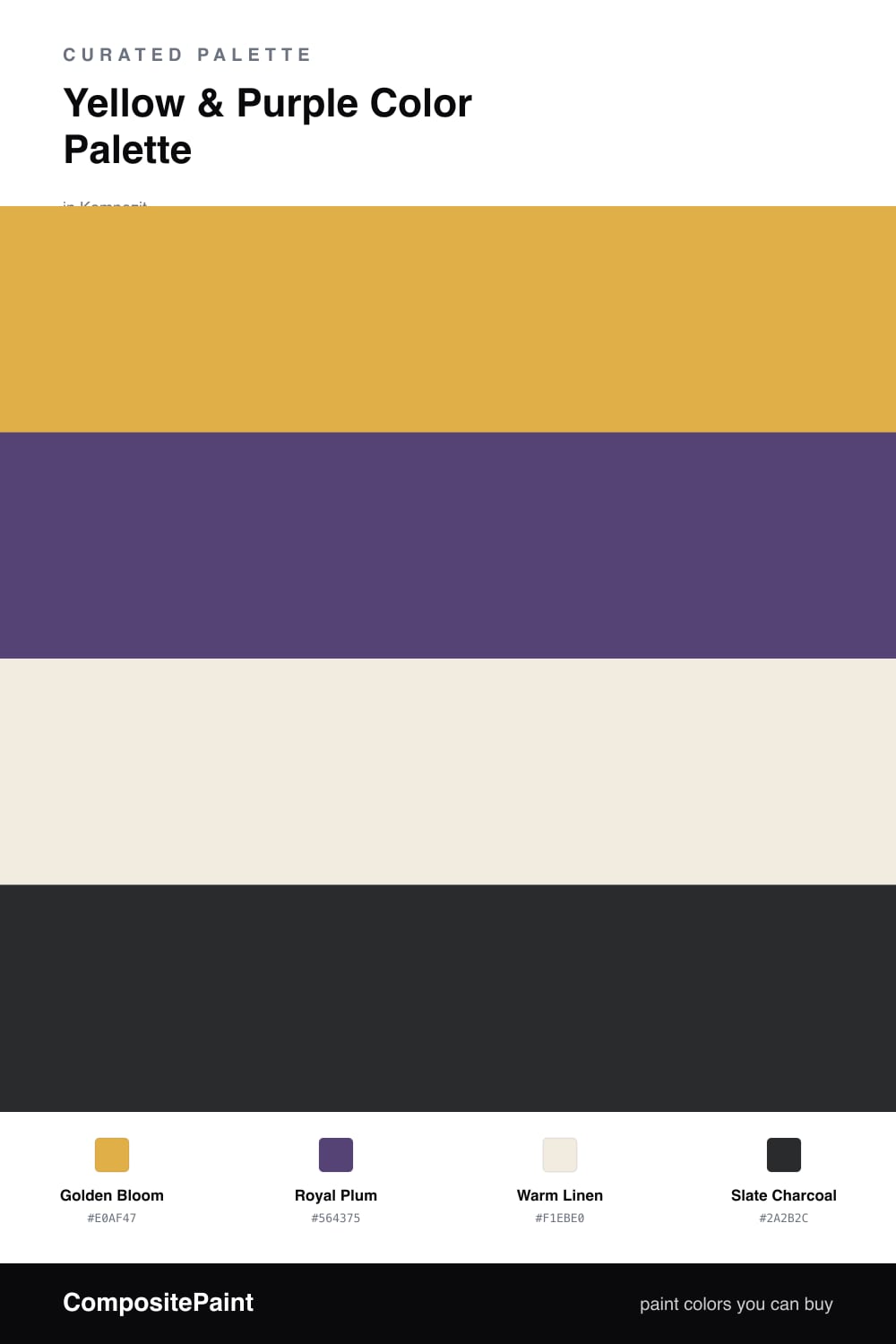
Yellow and purple are true opposites on the color wheel, which is exactly why they flatter each other. This scheme leans on a soft Golden Bloom as the warm anchor and a deep Royal Plum as the jewel-toned counterweight, a pairing that feels regal without ever tipping into costume.
Warm Linen is the quiet base that lets both of those colors breathe, washing the larger surfaces in a creamy oat tone so the brights read as intentional rather than busy. A little Slate Charcoal grounds the edges and gives the eye somewhere to rest.
For a contemporary 2026 feel, keep the yellow chalky and the plum muted rather than glossy, and let the linen do most of the talking. Use the gold in generous strokes, the plum in smaller punctuating moments, and you get a room that feels sunlit, soft, and just a little luxe.
Buy These Colors
Each color matched to the closest real paint in every brand, by ΔE2000. Kompozit first; take any SKU to the store — these mix on demand.
Questions
It works beautifully when you let the linen carry most of the room. Use the golden yellow on a feature wall or in soft furnishings and keep the plum to smaller doses like a door, a chair, or trim. The neutral base keeps the pairing rich rather than loud.
Lead with Golden Bloom as your dominant, around 60 percent, then let Royal Plum sit as the secondary accent at roughly 25 percent. Warm Linen and a touch of Slate Charcoal fill the rest and keep everything calm.
Similar Palettes
Closest schemes by color — not by label.