CP

Blue & Yellow Color Palette — Cobalt & Gold

A rich four-color scheme pairing deep cobalt blue with warm golden yellow, softened by oat and warm white — every color matched to real paint you can buy.

By Emily Roberts · DIY Editor & First-Timer's Guide

Cobalt Ink
Dominant
Kompozit Florida Waters · 0599
#2A4983
LRV 7
Honey Gold
Secondary
Kompozit Lioness · 0864
#E0AF47
LRV 47
Warm Oat
Base
Kompozit Yellow Page · 0286
#EADCC6
LRV 73
Soft Linen White
Support
Kompozit Bunny Cake · 0012
#F5EFE2
LRV 87
Slate Graphite
Accent
Kompozit Octavius · 0522
#38393F
LRV 4
View palette in

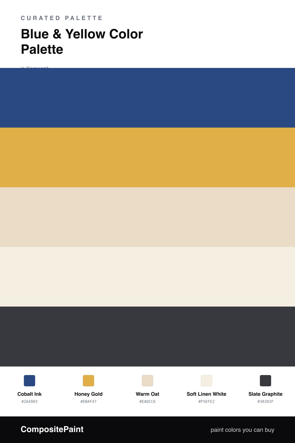
Cobalt and gold is one of those pairings that feels classic and current at the same time. A deep, saturated Cobalt Ink does the anchoring, and a warm Honey Gold brings the light. Together they have that quietly luxe feel you are seeing all over 2026 interiors, without tipping into anything fussy.

The neutrals are what keep it wearable. Warm Oat and Soft Linen White give the two bold tones somewhere to breathe, so the cobalt stays rich instead of heavy and the gold stays warm instead of brassy. Think of them as the calm space around the louder colors.

A touch of Slate Graphite grounds the whole thing where you need a little weight, like a frame or a fixture. Let the cobalt lead, treat the gold as your accent, and lean on the oat and linen for the rest, and you get a scheme that feels confident but easy to live with.

Buy These Colors

Each color matched to the closest real paint in every brand, by ΔE2000. Kompozit first; take any SKU to the store — these mix on demand.

Cobalt Ink
#27457A · LRV 6 · Dominant
Kompozit Florida Waters · 0599 ΔE 1.66
Backdrop Last Call · BD-LC ΔE 10.68
Behr Elegant Navy · M530-7 ΔE 1.87
Benjamin Moore Laura Bay · 2064-20 ΔE 3.67
Clare Blackish · PNT100-DP-54 ΔE 21.21
Dunn-Edwards Indigo Night · DEA138 ΔE 2.31
Farrow & Ball Hague Blue · No. 30 ΔE 13.91
Magnolia Home Silos District · JG-92 ΔE 7.16
PPG / Glidden Dragonfly · 1162-7 ΔE 2.19
Sherwin-Williams Honorable Blue · SW 6811 ΔE 2.93
Valspar Jazzy Blue · 4010-9 ΔE 3.93
Honey Gold
#D9A93C · LRV 43 · Secondary
Kompozit Lioness · 0864 ΔE 1.84
Backdrop Eames · BD-EA ΔE 9.51
Behr Galley Gold · 340D-5 ΔE 2.19
Benjamin Moore Golden Bounty · 294 ΔE 2.35
Clare Good as Gold · PNT100-DP-59 ΔE 9.33
Dunn-Edwards Fortune Cookie · DE5355 ΔE 1.99
Farrow & Ball India Yellow · No. 66 ΔE 6.87
Magnolia Home Bright Days · JG-45 ΔE 7.37
PPG / Glidden Yarrow · 1214-7 ΔE 2.03
Sherwin-Williams Nugget · SW 6697 ΔE 2.21
Valspar Ripe Pear · P091 ΔE 2.45
Warm Oat
#E7DCC4 · LRV 72 · Base
Kompozit Yellow Page · 0286 ΔE 1.87
Backdrop Cookies & Cream · BD-CC ΔE 0.95
Behr Writers Parchment · N280-2 ΔE 2.52
Benjamin Moore Pale Almond · 951 ΔE 0.51
Clare Greenish · PNT100-LT-68 ΔE 4.19
Dunn-Edwards Cream Wave · DE6198 ΔE 1.43
Farrow & Ball Lime White · No. 1 ΔE 1.14
Magnolia Home Morning Snow · JG-167 ΔE 1.23
PPG / Glidden Camel Tan · 12-13 ΔE 1.15
Sherwin-Williams Antique White · SW 6119 ΔE 1.04
Valspar Natural Soap · T559 ΔE 1.4
Soft Linen White
#F4EFE4 · LRV 87 · Support
Kompozit Bunny Cake · 0012 ΔE 0.84
Backdrop Tabula Rasa · BD-TR ΔE 1.56
Behr Nude W-f-210 · W-F-210 ΔE 1.42
Benjamin Moore Pink Damask · 890 ΔE 1.22
Clare Wing It · PNT100-LT-24 ΔE 2.83
Dunn-Edwards Trite White · DE6204 ΔE 1.13
Farrow & Ball Pointing · No. 2003 ΔE 1.29
Magnolia Home Silos White · JG-107 ΔE 1.97
PPG / Glidden Crumb Cookie · 18-01 ΔE 1.42
Sherwin-Williams Whitetail · SW 7103 ΔE 0
Valspar Wings of an Angel · V153 ΔE 0.5
Slate Graphite
#33363B · LRV 4 · Accent
Kompozit Octavius · 0522 ΔE 1.92
Backdrop After Hours · BD-AH ΔE 7.28
Behr Black Garnet · N110-7 ΔE 3.66
Benjamin Moore After Midnight · CSP-630 ΔE 1.2
Clare Blackish · PNT100-DP-54 ΔE 7.37
Dunn-Edwards Black · DEA187 ΔE 3.83
Farrow & Ball Pitch Black · No. 256 ΔE 4.49
Magnolia Home Blackboard · JG-05 ΔE 0.91
PPG / Glidden Black Magic · 1001-7 ΔE 4.92
Sherwin-Williams Inkwell · SW 6992 ΔE 1.55
Valspar Forest Canopy · 5010-1 ΔE 5.9

Questions

Won't cobalt blue and gold feel too much like a sports team?

Only if you let them go head to head at full strength. The trick here is letting the warm oat and linen white sit between them, so the cobalt reads calm and grown-up and the gold feels like a glow rather than a flag.

How much of the gold should I actually use?

Keep it as the spark, not the main event. Lean on cobalt as your dominant color, add the gold in roughly one-fifth of the space through a door, a chair, or art, and let the two neutrals carry the rest so nothing feels loud.

Similar Palettes

Closest schemes by color — not by label.