CP

Yellow & Purple Color Palette — Harbor Dusk

A modern five-color scheme pairing soft golden yellow with deep plum purple, settled by warm white and greige — every color matched to real paint you can buy.

By Jessica Williams · Color Stylist & Interior Editor

Plum Dusk
Dominant
Kompozit Vivid Vision · 1227
#5E4B62
LRV 8
Golden Glow
Secondary
Kompozit Lemon Surprise · 0815
#E1BC5C
LRV 53
Warm White
Base
Kompozit Bunny Cake · 0012
#F5EFE2
LRV 87
Soft Greige
Support
Kompozit Awakening · 0560
#D5CBBE
LRV 61
Deep Aubergine
Accent
Kompozit Silent Sea · 0515
#2A2B2C
LRV 2
View palette in

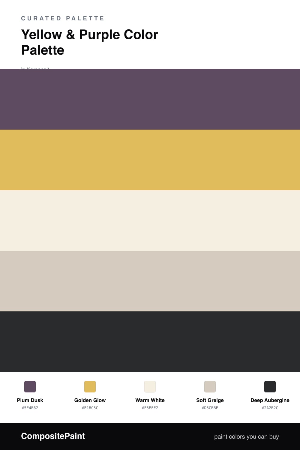
Yellow and purple is the pairing people forget about, and that is exactly why it feels fresh in 2026. This scheme leans on a soft, dusky Plum Dusk as the anchor and a warm Golden Glow as the spark that lifts the whole room.

Warm White and Soft Greige sit between them like a quiet exhale, keeping the contrast from tipping into costume territory. They let the plum feel grounded and the gold feel like late afternoon light rather than neon.

For the deepest corners and the smallest details, a near-black Deep Aubergine adds shadow and weight. Use the plum generously, the gold sparingly, and let the neutrals do the calm, steady work in between.

Buy These Colors

Each color matched to the closest real paint in every brand, by ΔE2000. Kompozit first; take any SKU to the store — these mix on demand.

Plum Dusk
#5A4A6B · LRV 8 · Dominant
Kompozit Vivid Vision · 1227 ΔE 3.88
Backdrop We Three Kings · BD-WK ΔE 15.94
Behr Exotic Eggplant · S110-7 ΔE 2.85
Benjamin Moore Dark Lilac · 2070-30 ΔE 3.19
Clare Night Groove · PNT100-DP-77 ΔE 8.79
Dunn-Edwards Your Majesty · DE5986 ΔE 2.58
Farrow & Ball Stiffkey Blue · No. 281 ΔE 16.11
Magnolia Home Silos District · JG-92 ΔE 12.72
PPG / Glidden Pansy Petal · 1177-7 ΔE 4.14
Sherwin-Williams Impulsive Purple · SW 6832 ΔE 4.2
Valspar Velvet Beret · 1001-3A ΔE 1.9
Golden Glow
#E3B85A · LRV 51 · Secondary
Kompozit Lemon Surprise · 0815 ΔE 1.99
Backdrop Eames · BD-EA ΔE 5.49
Behr English Custard · M290-5 ΔE 1.07
Benjamin Moore Damask Gold · CW-405 ΔE 1.23
Clare Golden Hour · PNT100-MD-23 ΔE 5.14
Dunn-Edwards Santa Fe Tan · DE5375 ΔE 1.75
Farrow & Ball Sudbury Yellow · No. 51 ΔE 4
Magnolia Home Bright Days · JG-45 ΔE 4.82
PPG / Glidden Oro De Maya · 17-19 ΔE 3.3
Sherwin-Williams Gambol Gold · SW 6690 ΔE 2.66
Valspar Mustard Glaze · 3006-3A ΔE 2.77
Warm White
#F3EEE3 · LRV 86 · Base
Kompozit Bunny Cake · 0012 ΔE 0.87
Backdrop Jane · BD-JA ΔE 1.45
Behr Snowy Pine · PPU10-13 ΔE 1.49
Benjamin Moore Steam · AF-15 ΔE 1.92
Clare Wing It · PNT100-LT-24 ΔE 2.87
Dunn-Edwards Trite White · DE6204 ΔE 1.18
Farrow & Ball Pointing · No. 2003 ΔE 1.37
Magnolia Home Silos White · JG-107 ΔE 1.98
PPG / Glidden Atrium White · 1020-1 ΔE 0.95
Sherwin-Williams Westhighland White · SW 7566 ΔE 0
Valspar Wings of an Angel · V153 ΔE 0.44
Soft Greige
#D6CCBC · LRV 61 · Support
Kompozit Awakening · 0560 ΔE 1.34
Backdrop Real Real · BD-RR ΔE 1.79
Behr Almond Wisp · PPU5-12 ΔE 1.29
Benjamin Moore Rocking Chair · CSP-400 ΔE 1.34
Clare Flatiron · PNT100-LT-17 ΔE 2.11
Dunn-Edwards Porous Stone · DE6220 ΔE 1.91
Farrow & Ball Cromarty · No. 285 ΔE 4.31
Magnolia Home Plaster · JG-156 ΔE 1.15
PPG / Glidden In The Buff · 1019-2 ΔE 2.06
Sherwin-Williams Sedate Gray · SW 6169 ΔE 2.83
Valspar Desert Fortress · 2008-10B ΔE 2.73
Deep Aubergine
#322A38 · LRV 3 · Accent
Kompozit Silent Sea · 0515 ΔE 9.98
Backdrop Hocus Pocus · BD-HP ΔE 8.62
Behr Dark Burgundy Wine · BXC-09 ΔE 4
Benjamin Moore Velvet Cloak · CSP-480 ΔE 4.85
Clare Blackish · PNT100-DP-54 ΔE 14
Dunn-Edwards Black · DEA187 ΔE 10.53
Farrow & Ball Pitch Black · No. 256 ΔE 10.72
Magnolia Home Blackboard · JG-05 ΔE 8.8
PPG / Glidden Black Magic · 1001-7 ΔE 11.47
Sherwin-Williams Raisin · SW 7630 ΔE 6.95
Valspar Rare Wine · 1011-9 ΔE 4.99

Questions

Why do these two colors work together?

Yellow and purple sit across from each other on the color wheel, so each one makes the other look richer. A muted plum and a soft gold feel calm rather than loud, and the neutrals give your eye a place to rest.

How do I balance them in a room?

Let the plum lead and use the yellow in smaller doses, roughly a 70/30 split. The warm white and greige carry the rest, so the gold reads as a glow instead of a shout.

Similar Palettes

Closest schemes by color — not by label.