Yellow & Purple Color Palette — Iris & Gold
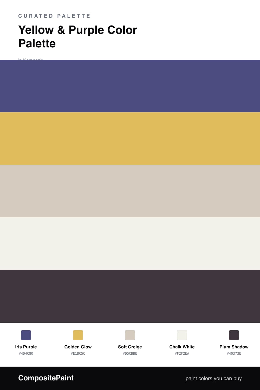
A luminous four-color scheme pairing soft golden yellow with deep iris purple, settled on warm greige and a chalky off-white — every color matched to real paint you can buy.
By Jessica Williams · Color Stylist & Interior Editor
Yellow and purple are near-opposites on the color wheel, which is exactly why they flatter each other so easily. This scheme leans on a deep, slightly grayed Iris Purple as the anchor and a warm Golden Glow as the light that breaks through it, the way a low sun catches the edge of an iris petal.
Soft Greige and Chalk White do the quiet work in between, giving both brights room to breathe so the contrast feels considered rather than loud. A touch of Plum Shadow on the smallest details pulls everything a shade deeper and keeps the palette feeling rich.
It reads soft and a little contemporary, the way 2026 color is trending toward warmth and ease. Use the purple as your dominant color, let the gold glow in smaller moments, and the neutrals will hold it all together.
Buy These Colors
Each color matched to the closest real paint in every brand, by ΔE2000. Kompozit first; take any SKU to the store — these mix on demand.
Questions
Pull the purple deep and a little grayed, the way iris reads at dusk, and keep the yellow soft and golden rather than neon. Let greige and chalk white sit between them and the pairing turns grown-up and calm instead of cartoonish.
Let Iris Purple do the heavy lifting on the largest surfaces and use Golden Glow in small, glowing doses, roughly a 70/30 split. Plum Shadow steps in only on the smallest details to deepen the whole scheme.
Similar Palettes
Closest schemes by color — not by label.