Spring Color Palette — Fresh Fern Morning
A soft five-color spring scheme of fern green, blossom pink, buttery yellow, and sky blue, grounded by a warm white — every color matched to real paint you can buy.
By Emily Roberts · DIY Editor & First-Timer's Guide
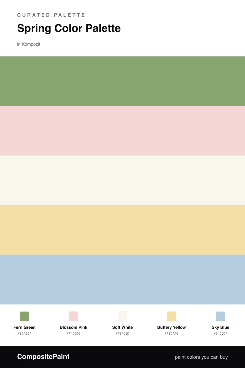
This is what spring feels like turned into paint. Fern Green does the heavy lifting here, a calm, leafy green that reads modern rather than country, while Soft White keeps everything light and easy to live with.
The fun comes from the smaller players. Blossom Pink adds a gentle warmth, Buttery Yellow brings a little sunshine, and Sky Blue cools the whole thing back down. You only need a touch of each.
For a 2026 take, try the fern green on a wall or a piece of furniture and treat the other three as accents you can swap with the seasons. It is a soft scheme, but the green gives it just enough backbone to feel grown-up.
Buy These Colors
Each color matched to the closest real paint in every brand, by ΔE2000. Kompozit first; take any SKU to the store — these mix on demand.
Questions
They all share a soft, slightly muted quality, so nothing shouts over the rest. The green leads, the pink and yellow warm things up, and the sky blue keeps it feeling fresh instead of sweet.
Let the fern green lead on the biggest surfaces, lean on the soft white to give your eyes a rest, and save the pink, yellow, and blue for smaller touches like a chair, a door, or a few cushions.
Similar Palettes
Closest schemes by color — not by label.