Orange Color Palette — Orange Meadow
A warm five-color scheme led by a sun-ripened terracotta orange, softened with oatmeal and clay neutrals and lifted by a deep olive accent — every color matched to real paint you can buy.
By Emily Roberts · DIY Editor & First-Timer's Guide
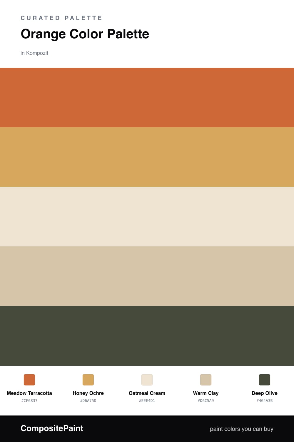
This is the kind of orange that feels like late-afternoon sun, not a traffic cone. Meadow Terracotta leads the whole scheme — warm, a little dusty, and very easy to live with. If a bold orange has scared you off before, this is the friendlier version.
Around it, Honey Ochre adds a softer golden glow, while Oatmeal Cream and Warm Clay keep everything calm and breathable. Those two neutrals are doing the quiet work so the orange never has to shout.
For 2026, that Deep Olive accent is the move — it pulls the palette toward something earthy and grown-up. Use it sparingly on a door, a shelf, or trim, and the orange suddenly looks intentional rather than accidental.
Buy These Colors
Each color matched to the closest real paint in every brand, by ΔE2000. Kompozit first; take any SKU to the store — these mix on demand.
Questions
The orange is muted and earthy rather than bright, so it reads cozy instead of busy. The cream and clay neutrals give your eye places to rest, and the olive keeps the whole thing grounded.
Let the terracotta lead but not take over — think roughly two-thirds neutrals to one-third orange. Use the honey and olive in small doses, like a throw, a frame, or a single painted door.
Similar Palettes
Closest schemes by color — not by label.