CP

Green & Blue Color Palette — Teal Forest

A calm four-color scheme pairing deep forest green with a cool slate blue, softened by warm linen and grounded by charcoal — every color matched to real paint you can buy.

By Maya Patel · Reviews Editor & Product Tester

Forest Green
Dominant
Kompozit Cute Pixie · 0711
#1A5445
LRV 7
Slate Blue
Secondary
Kompozit Happy Tune · 0648
#345875
LRV 9
Warm Linen
Base
Kompozit Bleached Meadow · 0376
#EAE5D5
LRV 78
Sea Glass
Support
Kompozit Plunge · 0701
#A4C2B9
LRV 50
Charcoal Pine
Accent
Kompozit Silent Sea · 0515
#2A2B2C
LRV 2
View palette in

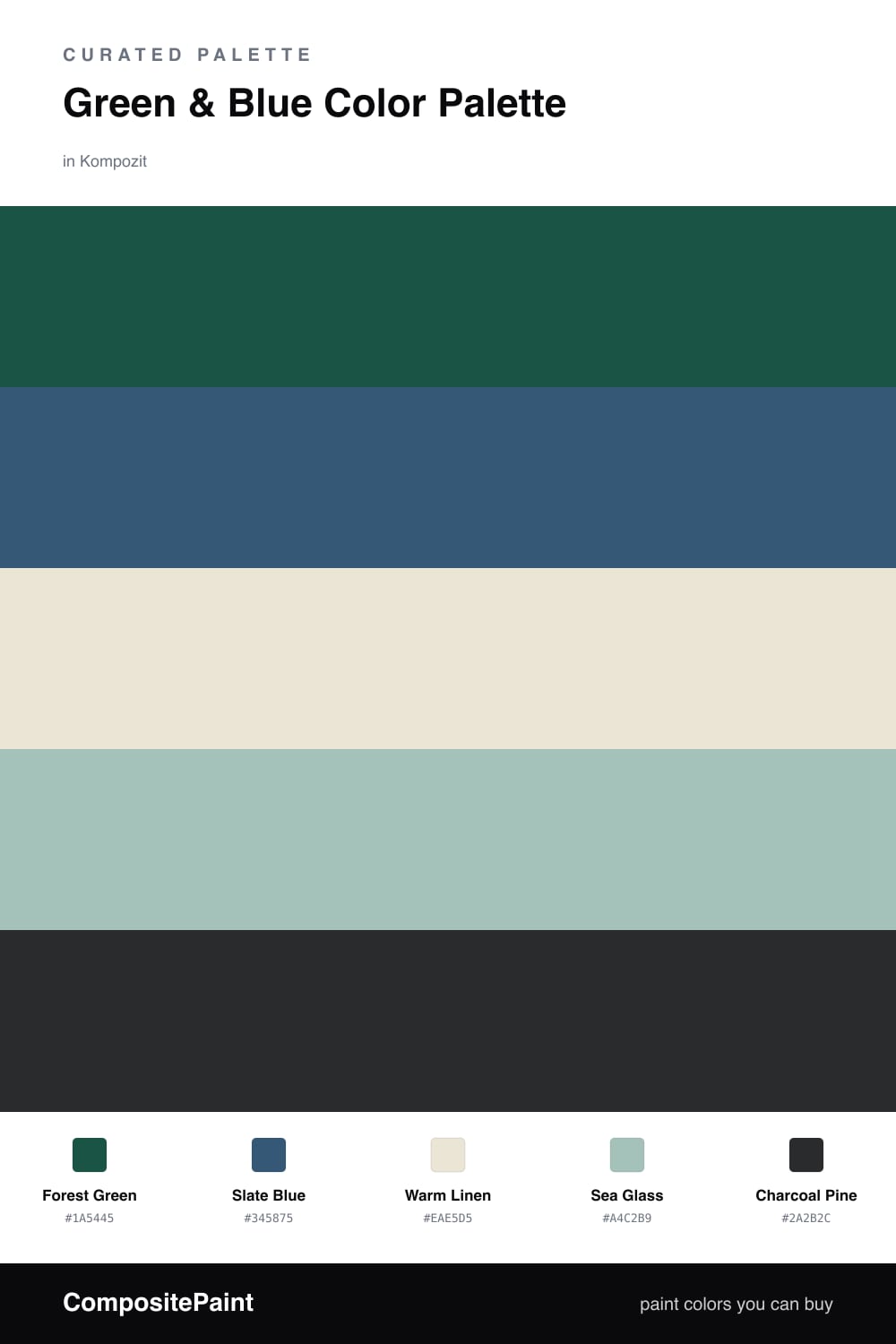
Green and blue is the easiest cool pairing to live with, because the two colors already meet in nature. This scheme anchors on a deep Forest Green and balances it with a soft, grayed Slate Blue so the contrast feels gentle instead of loud.

Warm Linen keeps the whole thing from going cold, adding just enough warmth to make the greens and blues feel current rather than heavy. Sea Glass bridges the two main tones, a teal-leaning middle note that ties the green and blue together.

Let the forest green dominate, bring the slate blue in for a quarter of the scheme, and use Charcoal Pine only in small doses for grounding. It is a quiet, contemporary look that reads fresh in 2026 without chasing a trend.

Buy These Colors

Each color matched to the closest real paint in every brand, by ΔE2000. Kompozit first; take any SKU to the store — these mix on demand.

Forest Green
#33503F · LRV 7 · Dominant
Kompozit Cute Pixie · 0711 ΔE 5.66
Backdrop North End · BD-NE ΔE 4.49
Behr Hazel Woods · 460F-7 ΔE 1.61
Benjamin Moore Colonial Verdigris · CW-530 ΔE 5.84
C2 Paint Chargreen · C2-694 ΔE 4.93
Clare Blackish · PNT100-DP-54 ΔE 15.2
Diamond Vogel Atlantic Waves · 0473 ΔE 10.48
Dunn-Edwards Walk in the Park · DESS29 ΔE 3.84
Dutch Boy Emerald Forest · 328-6DB ΔE 3
Farrow & Ball Studio Green · No. 93 ΔE 11.46
Magnolia Home Cottage Grove · JG-161 ΔE 11.93
PPG / Glidden Pine Forest · PPG1134-7 ΔE 3.82
Sherwin-Williams Hunt Club · SW 6468 ΔE 3
Valspar Wilderness · 6009-5 ΔE 1.77
Slate Blue
#3E5A78 · LRV 10 · Secondary
Kompozit Happy Tune · 0648 ΔE 2.58
Backdrop We Three Kings · BD-WK ΔE 3.07
Behr China Pattern · ICC-85 ΔE 1.94
Benjamin Moore Indi Go-Go · CSP-565 ΔE 2.66
C2 Paint Newport · C2-744 ΔE 3.11
Clare Deep Dive · PNT100-MD-40 ΔE 12.04
Diamond Vogel Queen of the Night · 0655 ΔE 2.72
Dunn-Edwards Newbury Port · DE5881 ΔE 2.13
Dutch Boy Sailing Suzy · 336-6DB ΔE 6.49
Farrow & Ball Stiffkey Blue · No. 281 ΔE 5.2
Magnolia Home Superior · JG-163 ΔE 5.81
PPG / Glidden Chinese Porcelain · PPG1160-6 ΔE 2.7
Sherwin-Williams Endless Sea · SW 9150 ΔE 5.56
Valspar Sapphire Earbobs · 8003-46F ΔE 4.15
Warm Linen
#EDE6D6 · LRV 79 · Base
Kompozit Bleached Meadow · 0376 ΔE 1.03
Backdrop Don't Eat the Yellow Snow · BD-DS ΔE 3.01
Behr Eastern Wind · ECC-24-2 ΔE 0.41
Benjamin Moore White Down · 970 ΔE 0.93
C2 Paint Breathless · C2-595 ΔE 0.22
Clare Like Buttah · PNT100-LT-62 ΔE 1.8
Diamond Vogel Creamy White · OW4 ΔE 0.91
Dunn-Edwards Antique White · DEW351 ΔE 0.74
Dutch Boy Antiquated Lace · 017W ΔE 1.2
Farrow & Ball James White · No. 2010 ΔE 2.34
Magnolia Home Carter Crème · JG-16 ΔE 0.82
PPG / Glidden Edelweiss · PPG14-23 ΔE 0.56
Sherwin-Williams Ivory Lace · SW 7013 ΔE 1.28
Valspar Double Scoop · V176 ΔE 0.98
Sea Glass
#A7C4BC · LRV 51 · Support
Kompozit Plunge · 0701 ΔE 0.8
Backdrop Lost in the 80s · BD-LO ΔE 11.06
Behr Flint Smoke · 730F-4 ΔE 0.99
Benjamin Moore Warm Springs · 682 ΔE 1.03
C2 Paint Salty Brine · C2-701 ΔE 1.93
Clare Summer Friday · PNT100-LT-37 ΔE 6.78
Diamond Vogel Plunge · 0701 ΔE 1.05
Dunn-Edwards Patina Creek · DE6297 ΔE 5.11
Dutch Boy Reservoir Teal · 333-3DB ΔE 1.39
Farrow & Ball Blue Ground · No. 210 ΔE 5
Magnolia Home Texas Summer · JG-64 ΔE 2.36
PPG / Glidden Crystal Oasis · PPG1138-3 ΔE 2.11
Sherwin-Williams Hazel · SW 6471 ΔE 1.55
Valspar New-Age Green · M315 ΔE 1.99
Charcoal Pine
#262B27 · LRV 2 · Accent
Kompozit Silent Sea · 0515 ΔE 4.74
Backdrop Hocus Pocus · BD-HP ΔE 7.97
Behr Beluga · 770F-7 ΔE 3.82
Benjamin Moore Black Forest Green · HC-187 ΔE 2.76
C2 Paint Angus · BD49 ΔE 12.56
Clare Blackish · PNT100-DP-54 ΔE 10.47
Diamond Vogel Grantsburg Gray · H101 ΔE 7.01
Dunn-Edwards Black · DEA002 ΔE 7.45
Dutch Boy True Black · 438-7DB ΔE 5.46
Farrow & Ball Pitch Black · No. 256 ΔE 7.38
Magnolia Home Blackboard · JG-05 ΔE 7.93
PPG / Glidden Starless Sky · PPG0995-7 ΔE 7.38
Sherwin-Williams Tricorn Black · SW 6258 ΔE 5.46
Valspar Dark Kettle Black · 4011-2 ΔE 6.01

Questions

Do forest green and slate blue clash or work together?

They work, because they share a cool, earthy backbone. Both lean a little gray, so instead of competing they read like two sides of the same nature palette. The trick is letting green lead and keeping blue as the quieter partner.

How much of each color should I use?

Give the deep forest green the most space, roughly half the scheme, and use slate blue for about a quarter. Let warm linen carry the rest as the lightest tone, with sea glass and a touch of charcoal pine for depth.

Similar Palettes

Closest schemes by color — not by label.