CP

Green & Blue Color Palette — Pine Lake

A calm four-color scheme pairing deep pine green with a still lake blue, softened by oatmeal and warm stone — every color matched to real paint you can buy.

By Jessica Williams · Color Stylist & Interior Editor

Pine Green
Dominant
Kompozit Green Column · 0466
#465149
LRV 8
Lake Blue
Secondary
Kompozit Madonna Blue · 0590
#5F7799
LRV 18
Oatmeal
Base
Kompozit Herare White · 0215
#E7E0D3
LRV 75
Warm Stone
Support
Kompozit Moth Wing · 0183
#CCBCA9
LRV 52
View palette in

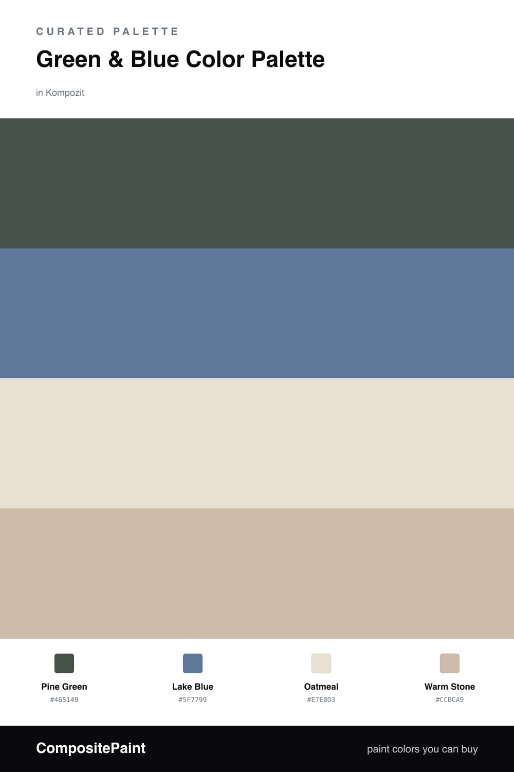
Green and blue are nature’s own pairing, and this scheme reads like a quiet morning at the water’s edge. A deep, foresty Pine Green does the heavy lifting, grounded and a little moody, while a soft Lake Blue answers it with the cool, hazy calm of still water.

The trick to keeping two cool colors from feeling cold is warmth underneath. Oatmeal gives you a soft, light base that never reads as stark, and Warm Stone bridges the green and blue with a gentle beige that keeps everything friendly.

This is a slow, contemporary palette — the kind that feels current in 2026 because it leans into texture and calm rather than contrast. Let the pine lead, the blue support, and the two neutrals carry the light.

Buy These Colors

Each color matched to the closest real paint in every brand, by ΔE2000. Kompozit first; take any SKU to the store — these mix on demand.

Pine Green
#3A5147 · LRV 7 · Dominant
Kompozit Green Column · 0466 ΔE 4.89
Backdrop North End · BD-NE ΔE 3.23
Behr Lush Grass · ECC-48-3 ΔE 4.02
Benjamin Moore Yukon Green · 2051-10 ΔE 4.4
C2 Paint Chargreen · C2-694 ΔE 2.19
Clare Blackish · PNT100-DP-54 ΔE 12.4
Diamond Vogel Atlantic Waves · 0473 ΔE 6.83
Dunn-Edwards Walk in the Park · DESS29 ΔE 1.74
Dutch Boy Minnesota Pines · 328-7DB ΔE 3.46
Farrow & Ball Studio Green · No. 93 ΔE 8.3
Magnolia Home Cottage Grove · JG-161 ΔE 8.77
PPG / Glidden Night Watch · PPG1145-7 ΔE 4.36
Sherwin-Williams Olympic Range · SW 7750 ΔE 5.29
Valspar Devon Green · T607 ΔE 1.56
Lake Blue
#5C7E94 · LRV 19 · Secondary
Kompozit Madonna Blue · 0590 ΔE 7.04
Backdrop Mom Jeans · BD-MJ ΔE 6.7
Behr Cotton Denim · HDC-FL14-11 ΔE 3.11
Benjamin Moore Fiji · AF-525 ΔE 4.39
C2 Paint Halifax · C2-711 ΔE 8.66
Clare Hyperlink · PNT100-MD-41 ΔE 5.61
Diamond Vogel Blue Depths · 0626 ΔE 5.55
Dunn-Edwards Bay View · DE5886 ΔE 5.88
Dutch Boy Lustrous Blue · 339-5DB ΔE 6.43
Farrow & Ball De Nimes · No. 299 ΔE 7.71
Magnolia Home Tranquility · JG-78 ΔE 12.09
PPG / Glidden Canyon Blue · PPG1155-6 ΔE 2.11
Sherwin-Williams St. Bart's · SW 7614 ΔE 5.2
Valspar Indigo Dreams · 8003-46E ΔE 5.52
Oatmeal
#E7E0D2 · LRV 75 · Base
Kompozit Herare White · 0215 ΔE 0.44
Backdrop Cookies & Cream · BD-CC ΔE 3.83
Behr Hazelnut Cream · 750C-2 ΔE 0.79
Benjamin Moore Muskoka Trail · 974 ΔE 1.5
C2 Paint Cricket White · C2-916 ΔE 1
Clare No Filter · PNT100-LT-19 ΔE 1.7
Diamond Vogel Herare White · 0215 ΔE 0.84
Dunn-Edwards Bone · DEC765 ΔE 1.87
Dutch Boy Worn Pages · 016W ΔE 0.58
Farrow & Ball Slipper Satin · No. 2004 ΔE 0.5
Magnolia Home Blanched · JG-103 ΔE 2.47
PPG / Glidden Focus · PPG1008-1 ΔE 1.68
Sherwin-Williams Shoji White · SW 7042 ΔE 0.9
Valspar Totten's Inlet · 7006-9 ΔE 0.99
Warm Stone
#C9BCA8 · LRV 51 · Support
Kompozit Moth Wing · 0183 ΔE 1.68
Backdrop Boy Meets Girl · BD-BG ΔE 11.93
Behr Matrix · T13-8 ΔE 0.89
Benjamin Moore Brick House Tan · CW-145 ΔE 0.76
C2 Paint Cappuccino Froth · C2-784 ΔE 2.35
Clare Greige · PNT100-LT-13 ΔE 6.18
Diamond Vogel Soft Leather · 0336 ΔE 1.37
Dunn-Edwards Seagull Wail · DET637 ΔE 1.69
Dutch Boy Weathered Stone · 421-2DB ΔE 0.99
Farrow & Ball Drop Cloth · No. 283 ΔE 2.3
Magnolia Home Solid Wood · JG-109 ΔE 2.04
PPG / Glidden Stonington · PPG15-25 ΔE 0.76
Sherwin-Williams Shiitake · SW 9173 ΔE 1.14
Valspar Dust Bunny · 2005-10B ΔE 5.09

Questions

How do I keep green and blue from looking cold together?

Warm the room with your neutrals. Here oatmeal and warm stone carry beige undertones, so the cool pine and lake sit against something soft instead of grey. Add wood, linen, or a brushed brass detail and the whole scheme feels grounded rather than chilly.

Which color should I use the most?

Lead with pine green and let it be roughly two-thirds of what you see, then bring in lake blue as the quieter partner. Keep oatmeal as your largest light surface and use warm stone in between, so the two cool shades read as a pairing rather than a contest.

Similar Palettes

Closest schemes by color — not by label.