Summer Color Palette — Palm Shade
A bright, breezy five-color scheme that pulls together sun-warmed citrus, clear sky blue, and cool palm green, every color matched to real paint you can buy.
By Jessica Williams · Color Stylist & Interior Editor
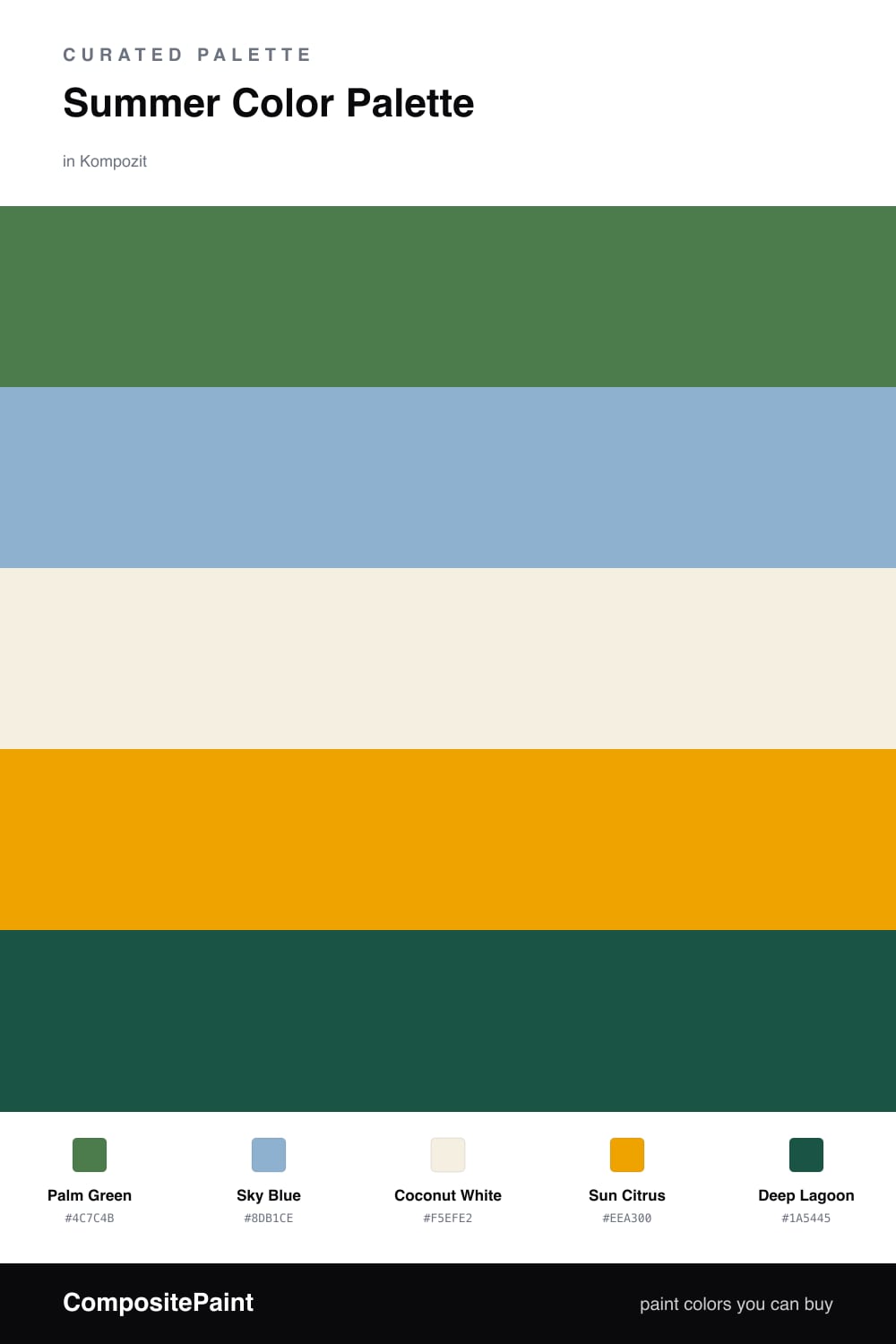
Summer is really a feeling of light, and this palette chases it. Palm Green is the leafy, sun-dappled anchor, the color of fronds moving against a bright sky, and it carries the whole scheme with a calm, leafy ease.
Against it, Sky Blue opens everything up like a clear morning, while Coconut White keeps the air soft and uncluttered. A little Sun Citrus is the warmth you feel on your skin, best used in small, glowing doses so it sparks rather than shouts.
For a contemporary 2026 finish, ground the brights with Deep Lagoon, a shadowy blue-green that reads almost like the cool side of a pool. Lead with the green, sprinkle the citrus, and let the white and lagoon hold the edges so the palette feels fresh all season long.
Buy These Colors
Each color matched to the closest real paint in every brand, by ΔE2000. Kompozit first; take any SKU to the store — these mix on demand.
Questions
Let Palm Green lead and keep the citrus small. When the green is the dominant color and Sun Citrus shows up only in a cushion, a stool, or a single painted shelf, the scheme reads fresh and grown-up rather than novelty.
Coconut White is your safest wall, since it lets the green and blue do the talking. If you want more depth, take Palm Green up a feature wall and let everything else stay light around it.
Similar Palettes
Closest schemes by color — not by label.