CP

Summer Color Palette — Sable & Citrus

A warm five-color summer scheme pairing sun-baked sable with bright citrus and clear sky blue, balanced by soft cream — every color matched to real paint you can buy.

By Maya Patel · Reviews Editor & Product Tester

Warm Sable
Dominant
Kompozit Cavern Sand · 0165
#947054
LRV 19
Citrus Zest
Secondary
Kompozit Lemon Dream · 0942
#EEA300
LRV 44
Sun Cream
Base
Kompozit Chapel Wall · 0009
#F3EAD7
LRV 83
Clear Sky Blue
Support
Kompozit Sea of Atlantis · 0653
#6AA1C1
LRV 32
Deep Espresso
Accent
Kompozit Silent Sea · 0515
#2A2B2C
LRV 2
View palette in

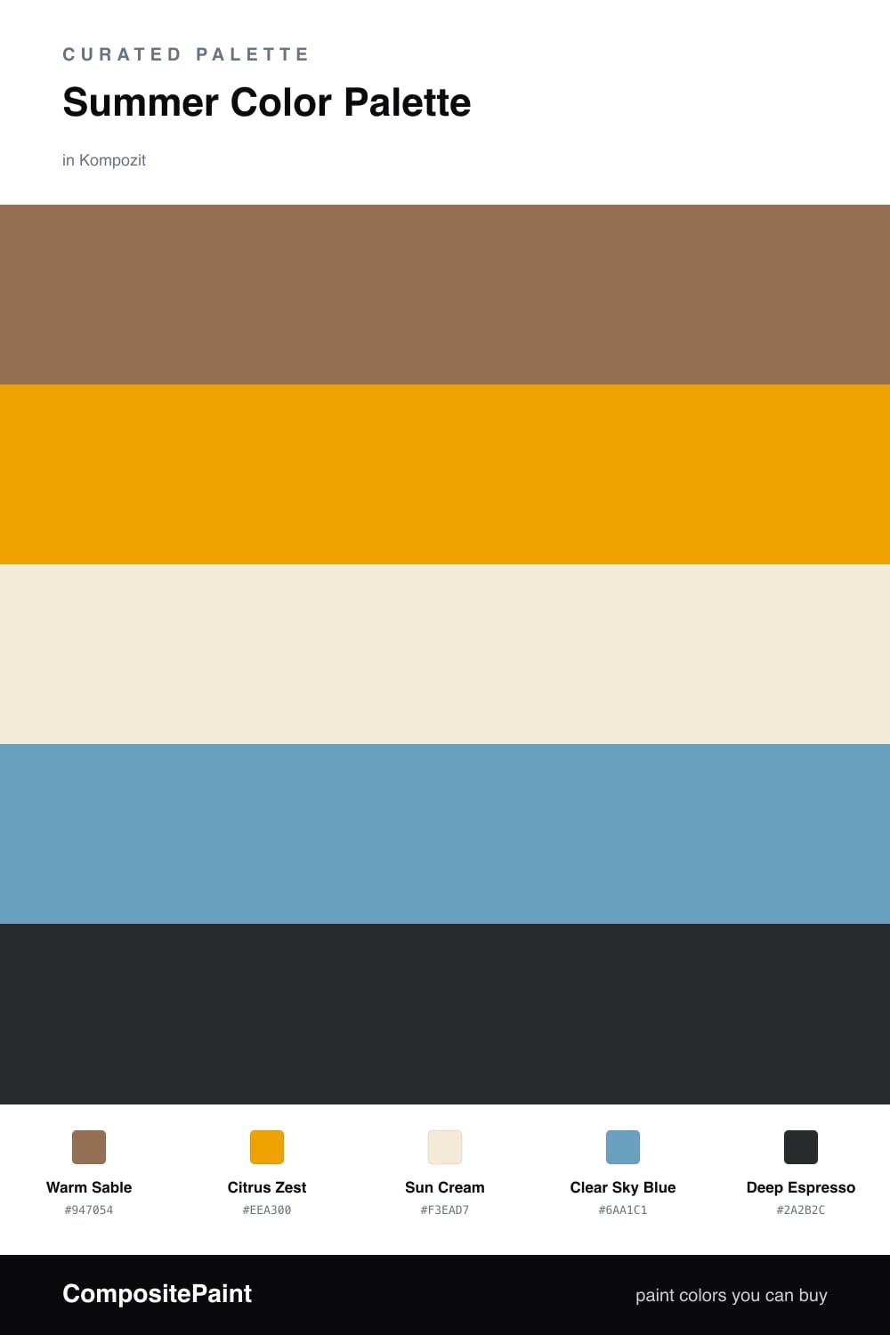
Most summer palettes reach straight for aqua and coral and call it a day. This one starts somewhere warmer. Warm Sable leads — a toasted, sun-baked brown that feels like weathered wood and late-afternoon light. It is the contemporary move for 2026, where earthy warm tones are doing the heavy lifting that cool grays used to.

Against that anchor, Citrus Zest is the spark. Use it in small doses — a cabinet, a chair, a front door — and it reads like fresh lemon and summer sun. Sun Cream is your base, the calm space that lets everything breathe, while Clear Sky Blue steps in as the cool counterweight that stops the whole thing from running too hot.

A little Deep Espresso at the edges — a frame, a fixture, a band of trim — pulls it all into focus. Keep the sable and cream doing most of the work, let the citrus and blue play, and you get a summer scheme with actual depth instead of one more pastel cliche.

Buy These Colors

Each color matched to the closest real paint in every brand, by ΔE2000. Kompozit first; take any SKU to the store — these mix on demand.

Warm Sable
#9A6B45 · LRV 18 · Dominant
Kompozit Cavern Sand · 0165 ΔE 3.93
Backdrop Old Soul · BD-OS ΔE 17.5
Behr Ranch Brown · S240-6 ΔE 1.64
Benjamin Moore Coppertone · 2161-10 ΔE 2.1
Clare Big Apple · PNT100-DP-30 ΔE 14.93
Dunn-Edwards Brown Eyes · DE5265 ΔE 2.39
Farrow & Ball Picture Gallery Red · No. 42 ΔE 12.36
Magnolia Home Remote Trail · JG-165 ΔE 11.16
PPG / Glidden Apple Butter · 15-02 ΔE 2.53
Sherwin-Williams El Caramelo · SW 9106 ΔE 2.87
Valspar Chestnut Beach · 3002-7A ΔE 0.95
Citrus Zest
#E8A22B · LRV 43 · Secondary
Kompozit Lemon Dream · 0942 ΔE 2.37
Backdrop Eames · BD-EA ΔE 12.73
Behr Optimist Gold · BIC-43 ΔE 2.06
Benjamin Moore Golden Vista · 308 ΔE 1.85
Clare Good as Gold · PNT100-DP-59 ΔE 11.27
Dunn-Edwards Acorn Squash · DE5292 ΔE 2.29
Farrow & Ball India Yellow · No. 66 ΔE 8.04
Magnolia Home Bright Days · JG-45 ΔE 11.38
PPG / Glidden Brass Mesh · 1209-6 ΔE 3.67
Sherwin-Williams Sunflower · SW 6678 ΔE 3.21
Valspar Queen Anne · M226 ΔE 2.11
Sun Cream
#F3EBD8 · LRV 83 · Base
Kompozit Chapel Wall · 0009 ΔE 0.51
Backdrop Don't Eat the Yellow Snow · BD-DS ΔE 1.88
Behr Original White · N290-1 ΔE 0.48
Benjamin Moore Canvas · 267 ΔE 0.76
Clare Like Buttah · PNT100-LT-62 ΔE 1.88
Dunn-Edwards White Sand · DEW336 ΔE 0.96
Farrow & Ball White Tie · No. 2002 ΔE 0.54
Magnolia Home Pearly Cotton · JG-33 ΔE 1.91
PPG / Glidden Adobe White · 1100-2 ΔE 0.97
Sherwin-Williams Medici Ivory · SW 7558 ΔE 1.22
Valspar Crème de Menthe · 8003-28A ΔE 2.85
Clear Sky Blue
#6FA8C4 · LRV 35 · Support
Kompozit Sea of Atlantis · 0653 ΔE 2.61
Backdrop Underdog · BD-UD ΔE 11.4
Behr Bleached Denim · 560F-5 ΔE 3.75
Benjamin Moore Lafayette Blue · CW-610 ΔE 0.88
Clare Blue Ivy · PNT100-MD-39 ΔE 5.34
Dunn-Edwards Wandering River · DE5850 ΔE 3.34
Farrow & Ball St Giles Blue · No. 280 ΔE 4.33
Magnolia Home Winter Solstice · JG-89 ΔE 6.7
PPG / Glidden Serene Sea · 1158-4 ΔE 1.99
Sherwin-Williams Baby Blue Eyes · SW 9070 ΔE 5.19
Valspar Soul Blue · 8002-43D ΔE 1
Deep Espresso
#3A2C22 · LRV 3 · Accent
Kompozit Silent Sea · 0515 ΔE 10.03
Backdrop Hocus Pocus · BD-HP ΔE 12.27
Behr Bitter Chocolate · 790B-7 ΔE 6.51
Benjamin Moore Wenge · AF-180 ΔE 5.07
Clare Blackish · PNT100-DP-54 ΔE 11.42
Dunn-Edwards Black · DEA187 ΔE 9.38
Farrow & Ball Pitch Black · No. 256 ΔE 8.56
Magnolia Home Moments · JG-150 ΔE 4.98
PPG / Glidden Black Magic · 1001-7 ΔE 10.32
Sherwin-Williams Raisin · SW 7630 ΔE 7.38
Valspar Noblesse Oblige · 8004-2G ΔE 6.86

Questions

Why does sable work as the lead color in a summer palette?

Sable is a warm, sun-baked brown that reads like driftwood or toasted sand, so it carries summer warmth without going pastel. It gives the brighter citrus and sky blue something grounded to bounce off, which keeps the whole scheme from feeling like a beach towel.

How do I keep this from looking too warm?

Lean on the clear sky blue as your cool relief — even a single wall, a door, or a set of chairs in that shade balances all the warm tones. The sun cream base does the rest, opening the room up so the sable and citrus feel rich rather than heavy.

Similar Palettes

Closest schemes by color — not by label.