CP

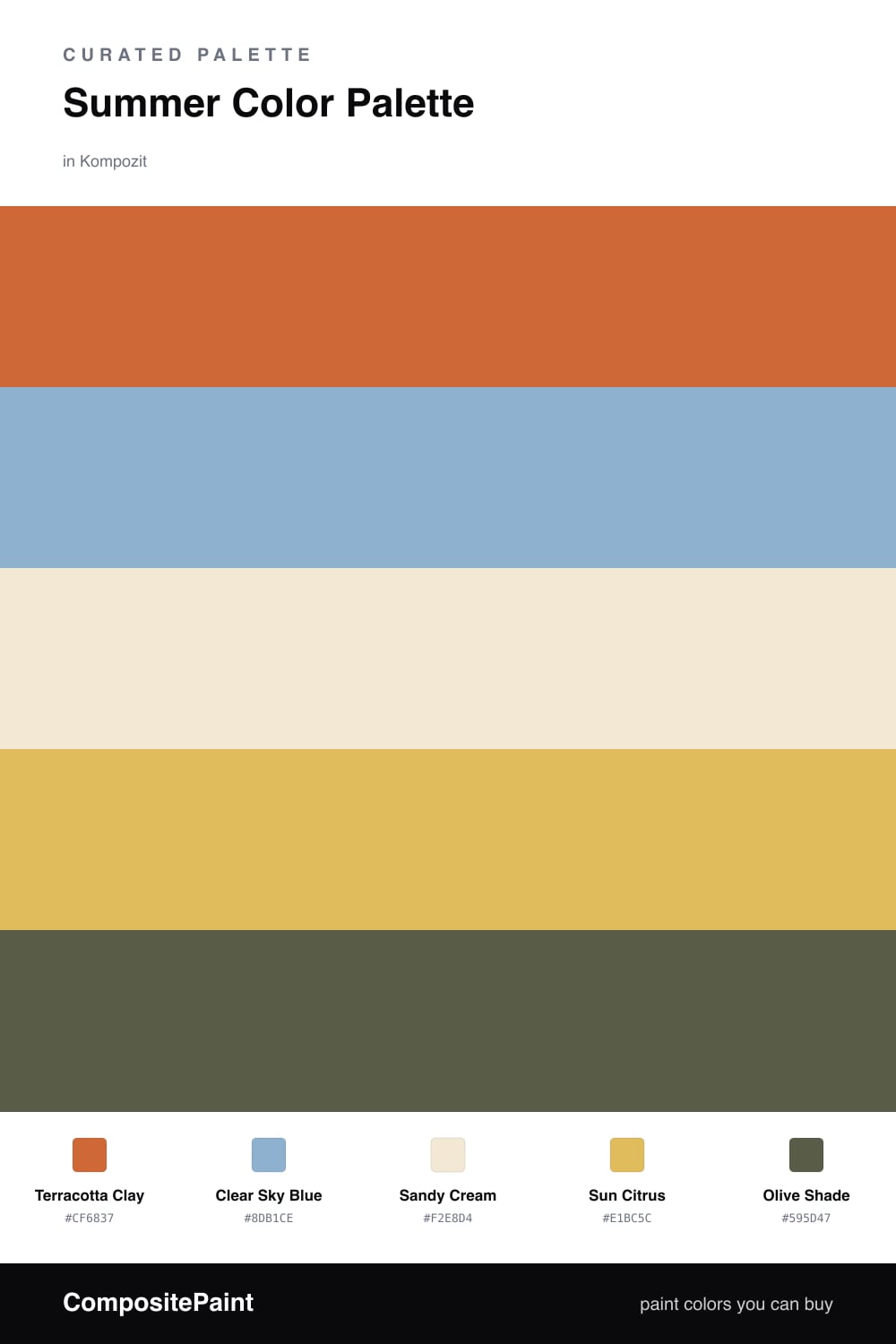
Summer Color Palette — Sun-Warmed Clay

A warm five-color summer scheme built around terracotta clay, soft citrus, and clear sky blue, balanced by sandy cream — every color matched to real paint you can buy.

By Jessica Williams · Color Stylist & Interior Editor

Terracotta Clay
Dominant
Kompozit Casa De Oro · 1026
#CF6837
LRV 23
Clear Sky Blue
Secondary
Kompozit Calm Tint · 0645
#8DB1CE
LRV 42
Sandy Cream
Base
Kompozit Eugenia · 0285
#F2E8D4
LRV 81
Sun Citrus
Support
Kompozit Lemon Surprise · 0815
#E1BC5C
LRV 53
Olive Shade
Accent
Kompozit Vegetarian · 0430
#595D47
LRV 10
View palette in

There is a moment in high summer when everything glows a little gold, and that is the feeling I chased here. Terracotta Clay leads the way, warm and grounded like a sun-baked patio, while Clear Sky Blue opens it back up with a cool, easy breath of air.

I lean on Sandy Cream as the quiet base so the warmth never tips into too much. A spark of Sun Citrus keeps things lively and a touch of Olive Shade anchors the corners, the way a shadow under a tree makes the sunlight look brighter.

For a 2026 room, I would wash the walls in the sandy cream, bring in the clay on a feature wall or built-ins, and save the blue and citrus for the things you can move, like cushions, art, and a painted side table.

Buy These Colors

Each color matched to the closest real paint in every brand, by ΔE2000. Kompozit first; take any SKU to the store — these mix on demand.

Terracotta Clay
#C76F4A · LRV 24 · Dominant
Kompozit Casa De Oro · 1026 ΔE 3.53
Backdrop Anita · BD-AN ΔE 19.31
Behr Orange Liqueur · M210-6 ΔE 1.81
Benjamin Moore Hale Orange · CW-295 ΔE 1.33
Clare Fire Sign · PNT100-DP-74 ΔE 1.85
Dunn-Edwards Spanish Peanut · DE5180 ΔE 2.41
Farrow & Ball Red Earth · No. 64 ΔE 6.33
Magnolia Home Work Worn Wood · JG-35 ΔE 3.97
PPG / Glidden Ginger Root · 1200-6 ΔE 4.43
Sherwin-Williams Yam · SW 6643 ΔE 3.73
Valspar Clove Bud · 2004-5B ΔE 3.26
Clear Sky Blue
#7FB0C4 · LRV 40 · Secondary
Kompozit Calm Tint · 0645 ΔE 5.82
Backdrop Underdog · BD-UD ΔE 8.75
Behr Sonata Blue · BNC-08 ΔE 0.93
Benjamin Moore Blue Jean · 2062-50 ΔE 2.03
Clare Vacay · PNT100-LT-44 ΔE 9.15
Dunn-Edwards Watson Lake · DE5766 ΔE 4.56
Farrow & Ball Dix Blue · No. 82 ΔE 11.06
Magnolia Home Winter Solstice · JG-89 ΔE 4.98
PPG / Glidden Arabella · 1157-4 ΔE 2.89
Sherwin-Williams Resolute Blue · SW 6507 ΔE 1.38
Valspar Sebastian Inlet · V104-3 ΔE 3.13
Sandy Cream
#F2E7D3 · LRV 81 · Base
Kompozit Eugenia · 0285 ΔE 0.51
Backdrop Don't Eat the Yellow Snow · BD-DS ΔE 2.45
Behr Rye Flour · HDC-FL13-5 ΔE 0.82
Benjamin Moore Franklin White · CW-200 ΔE 0.48
Clare Like Buttah · PNT100-LT-62 ΔE 0.82
Dunn-Edwards Rice Bowl · DE6170 ΔE 0.75
Farrow & Ball New White · No. 59 ΔE 1.44
Magnolia Home Carter Crème · JG-16 ΔE 1.79
PPG / Glidden Pita Bread · 1089-1 ΔE 1.3
Sherwin-Williams Crisp Linen · SW 6378 ΔE 1.49
Valspar Polished Ivory · 7006-6 ΔE 0.48
Sun Citrus
#E8B84B · LRV 52 · Support
Kompozit Lemon Surprise · 0815 ΔE 3.15
Backdrop Eames · BD-EA ΔE 7.25
Behr English Custard · M290-5 ΔE 2.15
Benjamin Moore Luminous Days · 300 ΔE 1.43
Clare Golden Hour · PNT100-MD-23 ΔE 6.1
Dunn-Edwards Honey Glow · DE5354 ΔE 1.4
Farrow & Ball Babouche · No. 223 ΔE 3.36
Magnolia Home Bright Days · JG-45 ΔE 6.87
PPG / Glidden Yellow Coneflower · 1209-5 ΔE 2.42
Sherwin-Williams Bee · SW 6683 ΔE 2.66
Valspar Mustard Glaze · 3006-3A ΔE 0.7
Olive Shade
#5E5A3C · LRV 10 · Accent
Kompozit Vegetarian · 0430 ΔE 4.85
Backdrop Buenos Aires · BD-BA ΔE 13.9
Behr Classic Bronze · N310-7 ΔE 2.56
Benjamin Moore Mediterranean Olive · 2142-10 ΔE 2.1
Clare Blackest · PNT100-DP-55 ΔE 15.35
Dunn-Edwards Olive Court · DEA174 ΔE 3.49
Farrow & Ball Bancha · No. 298 ΔE 6.2
Magnolia Home Mosswood · JG-168 ΔE 7.91
PPG / Glidden Olive Green · 1113-7 ΔE 1.62
Sherwin-Williams Palm Leaf · SW 7735 ΔE 3.21
Valspar Urbane · T609 ΔE 1.94

Questions

Why does terracotta feel so right for summer?

It carries the warmth of sun-baked earth, and when you set it next to a clear sky blue and a touch of citrus, the whole scheme reads like a bright afternoon outdoors.

How do I keep this warm palette from feeling heavy?

Let the sandy cream do most of the heavy lifting on big surfaces, then use the clay and citrus as the warm pulse and the blue as a cooling breath of air.

Similar Palettes

Closest schemes by color — not by label.