CP

Green & Blue Color Palette — Fjord Calm

A serene five-color scheme pairing deep fjord blue with a soft sage green, settled by warm stone and pale mist — every color matched to real paint you can buy.

By Emily Roberts · DIY Editor & First-Timer's Guide

Fjord Blue
Dominant
Kompozit Happy Tune · 0648
#345875
LRV 9
Sage Mist
Secondary
Kompozit Fair Maiden · 0456
#A5B3A5
LRV 43
Pale Mist
Base
Kompozit Sealskin Shadow · 0446
#E9ECE6
LRV 83
Warm Stone
Support
Kompozit Awakening · 0560
#D5CBBE
LRV 61
Slate Pine
Accent
Kompozit Black Licorice · 0529
#3A3B3B
LRV 4
View palette in

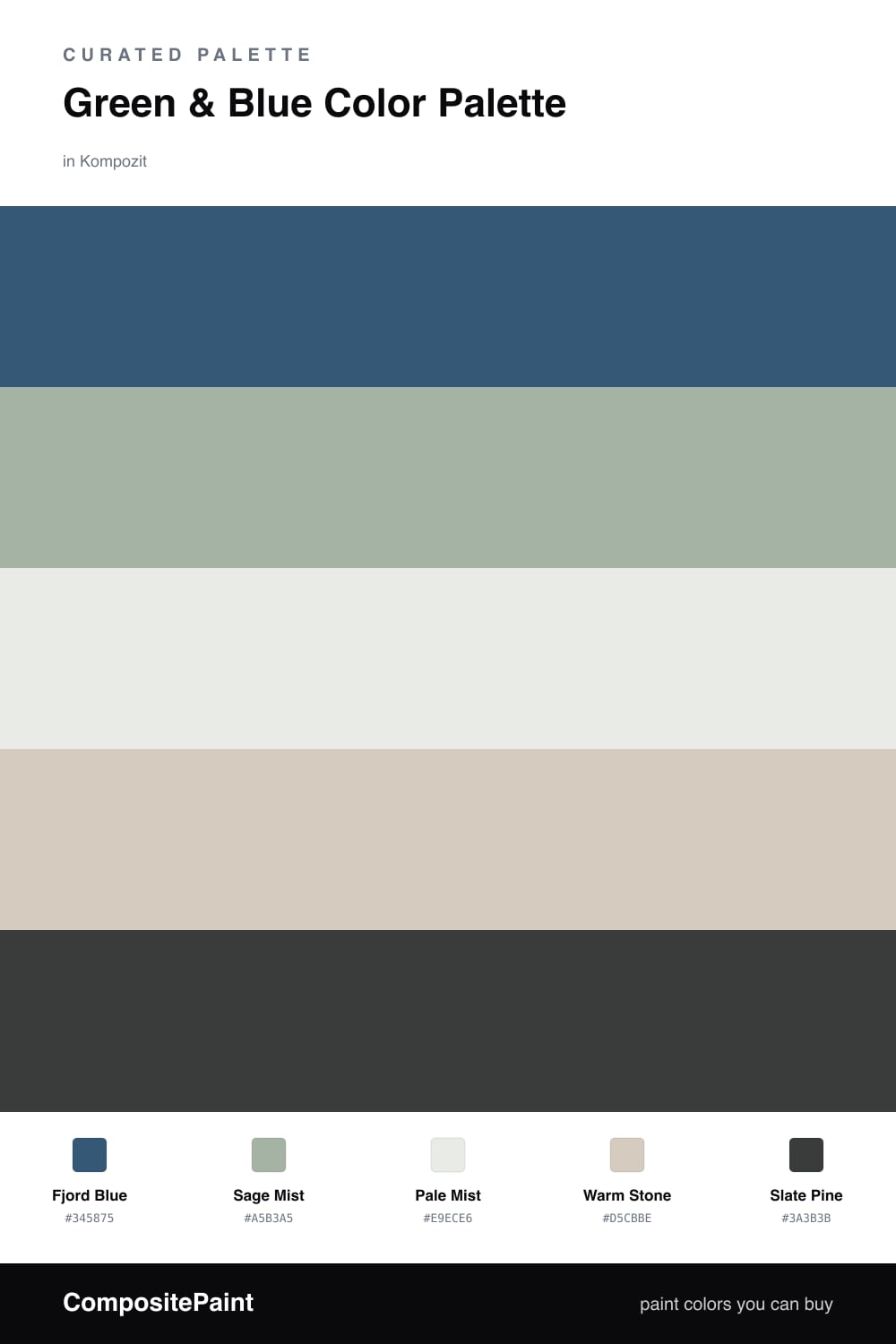
Green and blue is the pairing that feels like a deep breath. They sit side by side on the color wheel, so they blend rather than fight, and this scheme leans into that quiet by drawing both colors from a still Nordic fjord — water, hillside, and mist.

Fjord Blue is the anchor, a deep dusty blue that reads grown-up and grounded without going navy. Sage Mist is the soft green beside it, gentle enough to feel like a neutral, while Pale Mist and Warm Stone keep the whole thing airy and warm so it never tips into cold.

A little Slate Pine at the edges — think a door, a frame, or a single piece of furniture — adds just enough depth to hold it all together. It is an easy, contemporary mix for 2026: calm, lived-in, and the kind of palette you stop noticing in the best way.

Buy These Colors

Each color matched to the closest real paint in every brand, by ΔE2000. Kompozit first; take any SKU to the store — these mix on demand.

Fjord Blue
#3A5A72 · LRV 9 · Dominant
Kompozit Happy Tune · 0648 ΔE 1.87
Backdrop We Three Kings · BD-WK ΔE 3.63
Behr Inlet Harbor · ECC-16-3 ΔE 1.74
Benjamin Moore Summer Nights · 777 ΔE 2.77
C2 Paint Newport · C2-744 ΔE 0.28
Clare Deep Dive · PNT100-MD-40 ΔE 9.15
Diamond Vogel Queen of the Night · 0655 ΔE 2.13
Dunn-Edwards Blue Earth · DE5853 ΔE 2.69
Dutch Boy Sailing Suzy · 336-6DB ΔE 3.37
Farrow & Ball Stiffkey Blue · No. 281 ΔE 4.2
Magnolia Home Together · JG-87 ΔE 3.46
PPG / Glidden Brigade · PPG1152-6 ΔE 2.88
Sherwin-Williams Endless Sea · SW 9150 ΔE 2.36
Valspar Mountain River · 4005-6C ΔE 2.25
Sage Mist
#9FB29C · LRV 42 · Secondary
Kompozit Fair Maiden · 0456 ΔE 3.61
Backdrop Le Freak · BD-LF ΔE 4.6
Behr Confederate · N370-4 ΔE 0.57
Benjamin Moore Garden Path · 466 ΔE 2.79
C2 Paint Spearmint · C2-700 ΔE 1.5
Clare Matcha Latte · PNT100-DP-50 ΔE 5.19
Diamond Vogel Hidden Glade · 0744 ΔE 3.02
Dunn-Edwards Mow the Lawn · DET520 ΔE 3.28
Dutch Boy Silvered Teal · 427-4DB ΔE 6.25
Farrow & Ball French Gray · No. 18 ΔE 8.02
Magnolia Home Local Greenhouse · JG-68 ΔE 4.16
PPG / Glidden Silver Leaf · PPG1133-4 ΔE 2.82
Sherwin-Williams Burma Jade · SW 2862 ΔE 3.71
Valspar Spearmint Haze · 5006-5C ΔE 3.24
Pale Mist
#E8EDE9 · LRV 84 · Base
Kompozit Sealskin Shadow · 0446 ΔE 1.2
Backdrop Jane · BD-JA ΔE 3.83
Behr Dusting Powder · BL-W05 ΔE 0.21
Benjamin Moore Baby's Breath · 873 ΔE 1.39
C2 Paint Whiteout · C2-740 ΔE 2.05
Clare Classic · PNT100-LT-12 ΔE 2.82
Diamond Vogel Sealskin Shadow · 0446 ΔE 1.2
Dunn-Edwards North to Alaska · DEHW06 ΔE 1.6
Dutch Boy Glacial Hue · 128-1DB ΔE 2
Farrow & Ball Cabbage White · No. 269 ΔE 0.47
Magnolia Home Panna Cotta · JG-111 ΔE 2.89
PPG / Glidden Ice Castles · PPG1153-1 ΔE 0.94
Sherwin-Williams Serendipity · SW 9671 ΔE 0.98
Valspar Snowflake · V160 ΔE 0.6
Warm Stone
#D6CCBC · LRV 61 · Support
Kompozit Awakening · 0560 ΔE 1.34
Backdrop Real Real · BD-RR ΔE 1.79
Behr Almond Wisp · PPU5-12 ΔE 1.29
Benjamin Moore Rocking Chair · CSP-400 ΔE 1.34
C2 Paint Smidgeon · C2-912 ΔE 3.31
Clare Flatiron · PNT100-LT-17 ΔE 2.11
Diamond Vogel Awakening · 0560 ΔE 1.21
Dunn-Edwards Porous Stone · DE6220 ΔE 1.91
Dutch Boy Porcelain Slip · 423-1DB ΔE 3.15
Farrow & Ball Shaded White · No. 201 ΔE 1.96
Magnolia Home Plaster · JG-156 ΔE 1.15
PPG / Glidden Crushed Silk · PPG1024-3 ΔE 0.66
Sherwin-Williams Symmetry · SW 9601 ΔE 1.34
Valspar Desert Fortress · 2008-10B ΔE 2.73
Slate Pine
#2C3B3A · LRV 4 · Accent
Kompozit Black Licorice · 0529 ΔE 7.34
Backdrop After Hours · BD-AH ΔE 5.54
Behr Stealth Jet · 780F-7 ΔE 3.7
Benjamin Moore Salamander · 2050-10 ΔE 1.19
C2 Paint Aperture · C2-981 ΔE 7.97
Clare Blackish · PNT100-DP-54 ΔE 9.6
Diamond Vogel Grantsburg Gray · H101 ΔE 7.6
Dunn-Edwards Black · DEA002 ΔE 8.73
Dutch Boy Shaded Aspen · 331-7DB ΔE 2.8
Farrow & Ball Pitch Black · No. 256 ΔE 9.17
Magnolia Home Blackboard · JG-05 ΔE 8.65
PPG / Glidden Starless Sky · PPG0995-7 ΔE 7.45
Sherwin-Williams Rookwood Shutter Green · SW 2809 ΔE 1.7
Valspar Forest Canopy · 5010-1 ΔE 2.72

Questions

Does green and blue ever look too cold together?

It can if both shades are icy, so this scheme warms things up on purpose. The soft sage has a little gray-green in it, and Warm Stone adds a sandy note, which keeps the room feeling restful instead of chilly.

Which color should I use the most of?

Lead with Pale Mist or Warm Stone on the big walls, let Fjord Blue carry one feature wall or the cabinets, and sprinkle Sage Mist and Slate Pine through smaller pieces. Roughly a 60/30/10 split keeps it calm.

Similar Palettes

Closest schemes by color — not by label.