What Is the Fifth Wall (Painted Ceilings)?
The fifth wall is the ceiling, treated as a color surface instead of a default white. Here is what a painted ceiling does to a room and how to choose the color.

A room has four walls and one more that nobody looks at: the ceiling. Decorators call it the fifth wall, and the phrase is a quiet correction. It says the ceiling is a color surface like any other, not a default to leave white because that’s what ceilings are. Paint it, and you change the whole room. A ceiling carries more square footage than any single wall, it catches and bounces light all day, and most rooms hand it the cheapest treatment in the build: one coat of flat white nobody chose. The fifth wall is the idea that you should choose it on purpose, the same way you’d choose any color with an LRV, an undertone, and a job to do.
TL;DR
- The fifth wall is the ceiling, treated as a deliberate color surface instead of automatic white.
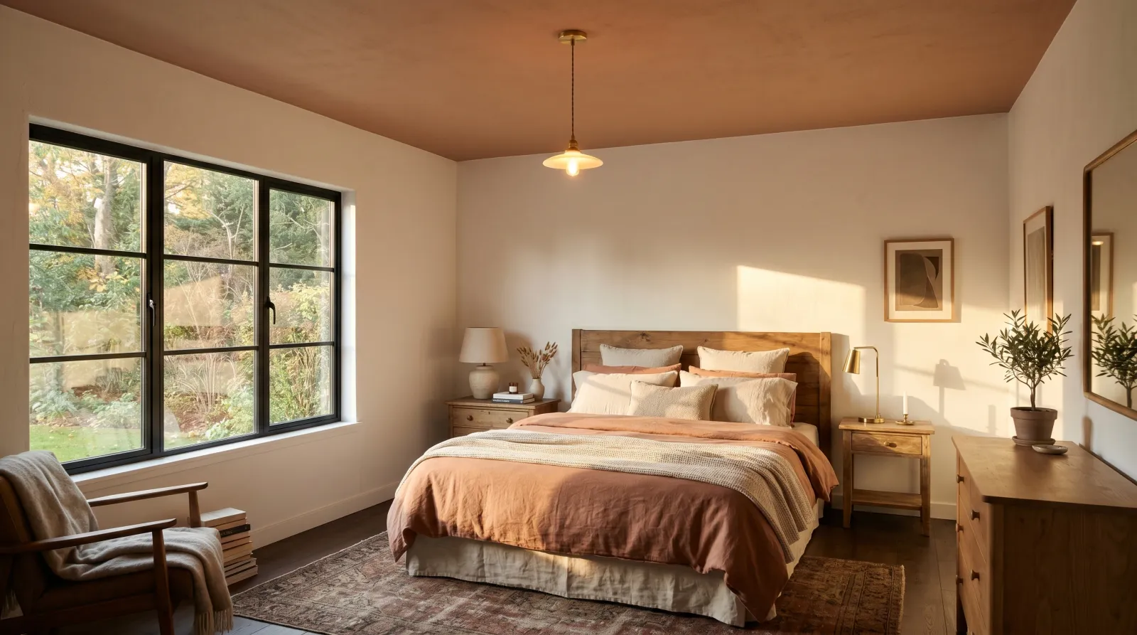
- A ceiling a few shades deeper than the walls reads cozy and intimate; one lighter than the walls lifts the room.
- The flattening culprit in most rooms is a stark white ceiling over colored walls, which draws a hard edge line.
- Use flat or matte sheen so roller texture and drywall seams stay invisible under raking light.
- Keep the ceiling within roughly 20 LRV points of the walls for a resolved, intentional look.
Why the Ceiling Deserves a Color
Stand in a room with white walls and a white ceiling and you don’t see five planes, you see a box. The eye finds the edges and measures them. Now imagine the same room with the ceiling painted a soft clay or a muted blue. The edge softens, the eye drifts up, and the room stops feeling like a container.
A ceiling does something a wall can’t: it sits above eye level and catches the light that rakes in from the windows. A colored ceiling pours that color back down into the room, tinting the air. A pale blush ceiling warms everything under it. A deep green one drapes the whole space in shade. The wall color you chose so carefully reads differently once the lid above it is no longer a neutral white reflector.
That’s the case for the fifth wall. The ceiling is the largest uninterrupted surface in the room, and leaving it white by default wastes the one plane that touches every other.
When to Paint the Ceiling
Use a colored or non-white ceiling for:
- Bedrooms, where a soft, slightly deeper ceiling makes the room feel held and restful.
- Dining rooms and small dens, where a rich, low-LRV ceiling builds intimacy and drama.
- Rooms with crown molding, where a colored ceiling lets the white trim read crisp against it. See how to paint crown molding for the cut line.
- Tall or vaulted rooms that feel cavernous, where a warmer ceiling brings the height down to human scale.
- Connecting one color across walls and ceiling in a small or busy room, to erase the edge and quiet the space.
Don’t reach for a painted ceiling when:
- The drywall is patched, lumpy, or full of seams, and a deeper color or any sheen would spotlight every flaw.
- You’re trying to make a genuinely low room feel taller and you’ve chosen a dark color (it will press down).
- The room already runs dim and north-facing, and a low-LRV ceiling would close off what little light it returns.
How a Painted Ceiling Compares
| Default white ceiling | Color-matched to walls | Deeper than walls | |
|---|---|---|---|
| What it does | Reads as a hard bright lid | Erases the edge, calms the room | Draws the eye up, wraps in color |
| Sense of height | Can feel like a ceiling drop | Feels taller, edges dissolve | Feels lower and more intimate |
| Best room | Rentals, plain workhorse spaces | Small or busy rooms, attics | Bedrooms, dining, cozy dens |
| Risk | Flattens mid-tone walls | Slightly less light bounce | Needs flat sheen and good drywall |
The number that governs all of this is the Light Reflectance Value. A ceiling above LRV 70 still bounces plenty of light back down even when it carries a soft color. Drop below LRV 40 and the room starts to feel deliberately shaded, which is the goal in a library and a mistake in a dim kitchen.
What Color and Sheen to Choose
The safest move is a softer, lighter version of the wall color. Take your wall hue, find it a few LRV points brighter, and put that on the ceiling. The room reads cohesive and the lid still lifts. Pale blues and soft greiges are the classic ceiling colors because they read as a high, calm sky no matter the wall.
Sheen matters more on a ceiling than anywhere else in the room. Use flat or matte. A ceiling lives under raking light from every window, and any gloss turns roller laps, drywall seams, and patched nail pops into visible ridges. The sheen guide covers where the low-sheen line sits, but on a ceiling the answer is nearly always the flattest finish you can buy. A dedicated ceiling paint earns its name here: it’s formulated dead-flat and high-hide. The best ceiling paint round-up sorts the ones worth buying.
One exception. A bathroom or kitchen ceiling that catches steam and grease wants a washable matte or eggshell so you can wipe it. You lose a little flaw-hiding, so the drywall has to be sound first.

Flat sheen is what keeps a colored ceiling reading as a calm plane instead of a map of every roller pass.
Common Mistakes
- Stark white over mid-tone walls. The single most flattening choice. A bright builder-white ceiling over a warm grey wall draws a hard contrast line at the top of the room, and the eye reads it as a low lid. Bring the ceiling color down toward the wall, or warm the white.
- Glossing the ceiling. Satin or semi-gloss on a ceiling spotlights every seam and lap mark under window light. Stay flat.
- Going dark in a low room you wanted taller. A deep ceiling is wonderful for intimacy and wrong for height. Decide which one you’re after before you choose the LRV.
- Skipping the prep. A colored or deeper ceiling shows water stains and texture far more than white did. Prime any water stains on the ceiling with a stain-blocker first, or they’ll bleed through and ghost.
- Ignoring the trim line. Where the ceiling meets the wall or crown molding, a clean cut-in is what sells the whole effect. A wobbly edge undoes a beautiful color.
Where to Start
Choose the ceiling color the way you’d choose any wall color, against the light in the actual room and at the hour you use it. Pull a chip, flip it for the LRV, and hold it overhead in the afternoon. If you want the room calmer and larger, match the ceiling close to the walls. If you want it cozier, drop two or three LRV points. For the products that go on flat and hide well, see the best ceiling paint round-up, and for a shortlist sorted by LRV and undertone, browse the color hub.
A white ceiling is a choice too. It just usually isn’t one anybody made.