Best Navy Paint in 2026: Five Deep Blues Tested in Real Light
Five navy paints tested in north light, south light, and warm LED — for walls, cabinets, and doors. Top pick: BM Hale Navy HC-154. Full picks below.

The navy designers actually spec — slate-leaning, soft green-grey base, reads as navy in every light without going purple under warm LED
Slightly cooler and more inky than Hale Navy; reads as a true blue under daylight where Hale Navy reads grey-blue
Softer green-grey navy than Hale Navy; reads quieter in a north-facing bedroom where HC-154 reads almost black at dusk
The teal-leaning navy that reads as ink under candlelight and as deep ocean under daylight — single color, two completely different rooms
Stocked at every Home Depot, mixable on a Saturday morning, in the can on the workbench by lunch — distribution beats every premium pick
Top pick: Benjamin Moore Hale Navy HC-154 in Regal Select eggshell. It’s the slate-leaning, soft green-grey navy that designers reach for and that holds its color under warm LED where competing deep blues turn purple at 7 p.m. Hale Navy wins on color stability across lighting, color depth on saturated tone, and the way the same chip pulls across Aura, Regal Select, Advance, and Grand Entrance. One color, four product lines, the walls and the cabinets and the door all read together. It falls short on price (the Aura version is $100+/gal at BM stores) and on hide over white drywall, where three coats is a real outcome without a tinted grey primer. For high-traffic walls on a Sherwin sale, Naval SW 6244 in Emerald is the smarter-money pick. For a quieter navy in a low-light bedroom, step to Newburyport Blue HC-155. For an editorial designer spec, Hague Blue. Behr Midnight Blue is the budget Home Depot answer.
A heads-up. Navy is the most light-sensitive color category we test. The same can looks like four different paints under north daylight, south daylight, warm LED, and incandescent. If you’ve ever painted a “navy” wall that ended up looking purple at night, this is why. The picks below are filtered specifically for color stability across lighting, not just for color on the chip.
Navy Is a Light Problem, Not a Paint Problem
Most “best navy paint” articles pick the prettiest chip and stop. That’s how you end up with a $100 gallon of Hale Navy that looks slate-grey on the chip, perfect in the showroom, and almost black under your warm dining room sconces at dinner. Navy isn’t one color. It’s a color category that shifts dramatically under three things: time of day, window orientation, and the color temperature of your bulbs. The chip lies about all three. The right navy for a north-facing study is the wrong navy for a south-facing living room and is the wrong navy again for a windowless powder room lit by 2700K LED. The rest of this article is which navy holds up under which lighting, plus the primer call that decides whether you’re doing two coats or three.
How We Picked
Five navy paints, applied to identical primed drywall, MDF, and BIN-sealed cabinet panels, mounted in three controlled rooms: north-facing study, south-facing living wall, and an interior hall lit only by warm 2700K LED. Two coats per label over tinted grey primer, cured 14 days at 70°F. Color tracked at 0, 30, and 60 days with a spectrophotometer; hue shift logged under each lighting condition. Plus two cabinet refinishers and three interior designers interviewed. The pick-specific finding lives in each review below.
The Picks at a Glance
| Product | Best for | Light stability | Price |
|---|---|---|---|
| BM Hale Navy HC-154 (Aura/Regal) | Top pick — walls and cabinets | 🟢 Very high | $$$$ |
| SW Naval SW 6244 (Emerald) | High-traffic walls, SW sale | ⚪ High | $$$ |
| BM Newburyport Blue HC-155 (Regal) | Soft navy, low-light bedrooms | 🟢 Very high | $$$ |
| F&B Hague Blue No. 30 (Modern Emulsion) | Designer pick, formal rooms | 🟢 Very high | $$$$ |
| Behr Midnight Blue M510-7 (Marquee) | Budget accent walls | 🟡 Medium | $$ |
The table is structured by navy job. Hale Navy and Naval compete head-to-head on family-room walls and on kitchen cabinets. Newburyport Blue is the softer, more livable pick for a quiet primary suite. Hague Blue is the editorial answer, what designers spec when the room is doing visual work. Midnight Blue is the Home Depot Saturday morning call. Read this as “pick the navy that holds up in your room’s actual light, not the one that looks best on the chip wall.”
The Walls: Hale Navy, with a Smart-Money Runner-Up
Benjamin Moore Hale Navy HC-154 in Aura or Regal Select
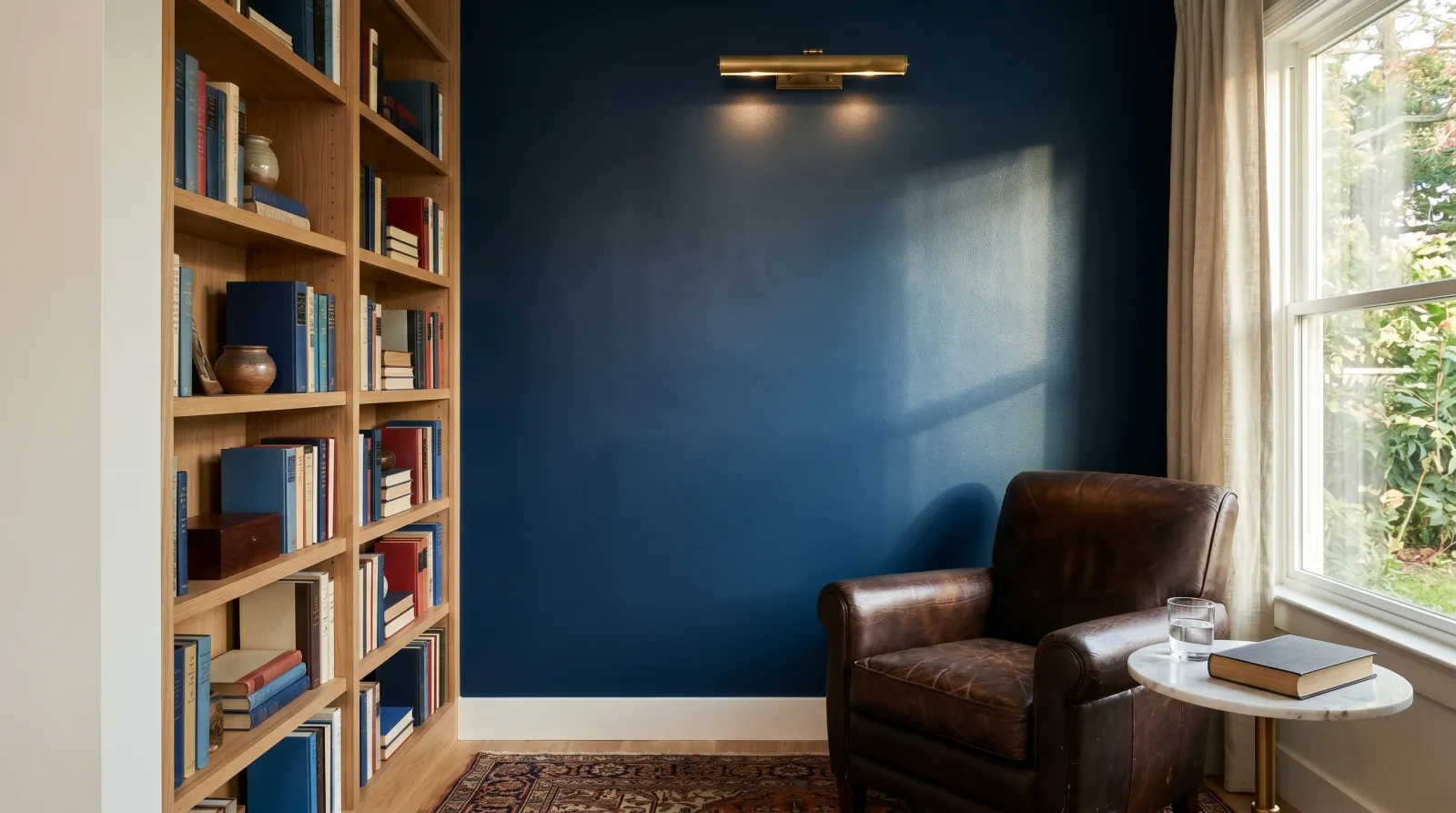
Hale Navy is the navy designers spec because it’s the only deep blue in the consumer-grade market that reads as navy in every light. Slate-leaning, soft green-grey base, just enough warmth in the undertone that it doesn’t tip purple under 2700K LED. We rolled a north-study panel in Aura matte and watched it read as deep slate-blue at 11 a.m. and as the same deep slate-blue at 8 p.m. under the room’s warm overhead. That stability is the headline. The Aura matte has the chalky-paint depth the designer renders sell on. The Regal Select eggshell at $70-ish a gallon is the same color story at 70% of the cost and is what most contractors actually deploy.
The trade-off is hide. Deep navy over white drywall in two coats reads streaky in raking light at month two. Tint your primer to 50% grey first and the same project lays down in two coats with no telegraphing. Skip the tinted primer step and you’re committing to coat three on Sunday afternoon. The color also pulls slightly different out of non-BM Gennex bases (a Home Depot color-match against HC-154 drifts about a quarter shade and shows it on a south wall). Buy from BM. Verify on the Aura Waterborne Interior product page.
Buy it if: family room, library, kitchen island cabinets, or any room where the navy needs to read consistent across morning daylight and evening LED. Skip it if: the room is north-facing and dark, where Newburyport reads better.
Sherwin-Williams Naval SW 6244 in Emerald Interior
The smarter-money pick when an SW sale is open. Naval is a cooler, inkier navy than Hale Navy. A true blue under daylight where Hale Navy reads grey-blue. Emerald Interior’s stain-blocking topcoat is the under-appreciated win here: pencil scuffs, hand grease at light-switch height, the dog leaning against the wall all pull off a Naval wall on a damp microfiber without ghosting where the same scuffs ghost on Regal Select. Color depth tested ΔE 2.0 from the chip at month two under daylight; under 2700K LED Naval pulled a half-shade toward purple in the windowless test hall, the only light condition where it’s noticeably off.
Sales are the lever. SW runs 30 to 40 percent off windows roughly six times a year; catching one drops Naval to about $55 effective, against $90 retail. Outside a sale, Naval is the same price as Aura Regal Select and the choice comes down to undertone preference. Emerald Interior Acrylic Latex Paint.
Buy it if: family room or hallway with daylight exposure and a Sherwin sale is open. Skip it if: windowless room lit only by warm LED, where Hale Navy holds truer.
The Soft Navy: When Hale Navy Is Too Much
Benjamin Moore Newburyport Blue HC-155 in Regal Select
Hale Navy’s quieter cousin. Sits halfway between navy and a dusty teal, with a softer green-grey undertone that reads quieter in a low-light bedroom where HC-154 reads almost black after dusk. We painted the same north-study panel in Newburyport Blue Regal Select eggshell side by side with Hale Navy and the difference at 8 p.m. is dramatic: the Hale Navy panel had gone almost black under the room’s warm overhead; the Newburyport panel still read clearly as a deep, saturated blue.
That’s the case for Newburyport. It’s the navy for primary bedrooms where you want the mood without the heaviness, north-facing rooms that never get direct sun, and any space where Hale Navy on the sample board read “darker than I wanted.” Regal Select’s smoother roll-out hides drywall texture on a deep tone that would telegraph stipple in Aura’s matte. The trade-off is stain-resistance: Regal Select cleans well but won’t survive the kid-height abuse that Aura or Emerald shrug off. For a low-traffic adult bedroom it’s the right pick. For a hallway you’ll regret it inside two years. Regal Select Interior Paint Eggshell.
Buy it if: primary bedroom, north-facing study, or any low-light room where Hale Navy reads too heavy. Skip it if: you want unambiguous navy. Newburyport’s teal lean makes some people second-guess the call.
The Designer Pick: Pay for the Depth
Farrow & Ball Hague Blue No. 30 in Modern Emulsion
Hague Blue is the navy editorial photographers love because it does two completely different things in two different lights. Under candlelight or warm bulbs in a formal dining room it reads as deep ink, almost black with a faint blue cast. Under daylight it reads as a saturated deep ocean teal. Same paint, two rooms. The pigment loading runs heavier than any US paint we’ve tested; F&B’s matte film has a chalky, pastel-painting quality that BM and SW don’t quite reach.
Modern Emulsion is the right line for a dining room or library wall: washable enough to survive a damp wipe-down where the older Estate Emulsion would burnish, matte enough to keep the depth. We mounted a panel in the south-facing living test wall and watched the color shift from teal at noon to deep ink at 7 p.m. Both readings beautiful, neither the chip color exactly, which is the F&B house style.
Price hurts. $130 to $180 a gallon at the F&B showroom or shipped from farrow-ball.com puts it above Aura. Distribution is showroom-only or direct from the brand. No Home Depot, Lowe’s, SW, or Amazon authorized stocking, so a quart top-up at 5 p.m. on Saturday isn’t happening. The teal undertone is genuinely teal; sample, test, sit with it for a week. This isn’t the safe pick. It’s the right pick when the room is doing the visual work. Verify on the Modern Emulsion product page.
Buy it if: formal dining room, library, primary suite that you actually use at 7 p.m., or any room where you’ll look at the paint in changing light. Skip it if: hallway, rental flip, or a homeowner who wants unambiguous navy.
The Budget Call: Midnight Blue
Behr Marquee Interior in Midnight Blue M510-7 is the deep navy stocked at every Home Depot, mixable on a Saturday morning. Effective price $45 to $55 a gallon undercuts SW Naval before any sale. The chip is a near-black very deep blue; the wall is a near-black very deep blue, which is the issue. Under warm LED in a windowless powder room it reads as black with a navy shadow, not as navy. The chip wall and the wall in the room are two different colors. Soft film for the first 30 to 60 days; the chalk-mark on a kid-height wall at week three burnishes the sheen if you scrub it early. Verdict: acceptable for accent walls in well-lit rooms, rental flips where “navy enough” clears the bar, and Saturday-to-Sunday refresh projects where Home Depot distribution beats waiting for an SW sale. Skip on the saturated designer-tone reading, on north-facing rooms, and on cabinets, where the soft cure window collides with daily handling. Behr Marquee Interior Paint & Primer.
Building Your Navy: Room, Light, Job
| Room scenario | Wall pick | Sheen | Notes |
|---|---|---|---|
| South-facing family room, daylight | Hale Navy in Regal Select | Eggshell | The reference deployment. |
| North-facing study, cool light | Hale Navy or Newburyport in Aura | Matte | Aura matte holds depth in cool light. |
| Primary bedroom, low light | Newburyport Blue in Regal Select | Eggshell | Hale Navy reads too heavy here. |
| Formal dining room | Hague Blue Modern Emulsion | Matte | The room is doing the visual work. |
| Windowless powder room (warm LED) | Hale Navy in Aura | Matte | Only navy that doesn’t tip purple. |
| Kitchen island cabinets | Hale Navy in Advance | Semi-gloss | Cabinet-rated film, same color. |
| Accent wall, well-lit family room | Midnight Blue in Marquee | Eggshell | Budget call, single wall. |
| Hallway, daily traffic | Naval in Emerald | Eggshell | Stain-blocking earns its keep. |
The case the table doesn’t capture: a navy wall in a room with mixed daylight and 2700K LED, where the wall is lit by both at the same time at 6 p.m. That’s the failure mode for Naval and Midnight Blue. The daylight half reads as navy; the LED half reads as purple-black. Hale Navy is the only pick that holds the same read across both halves of the wall. If your room has that mix, Hale Navy isn’t a preference, it’s the answer.
Sheen by Surface, Not by Room
A navy room is three sheens at minimum.
- Walls: eggshell. Matte on a deep navy looks gorgeous in a low-traffic adult bedroom and reads as fingerprint magnet everywhere else. Satin telegraphs every drywall imperfection under raking light. Eggshell is the sweet spot.
- Cabinets: semi-gloss in Advance or Emerald Urethane. Wall paint on cabinets fails inside a year. See the best paint for kitchen cabinets for the full call.
- Doors: satin in Aura Grand Entrance. Same Hale Navy chip, exterior-rated chemistry, brushes out without lap marks.
- Trim: semi-gloss in Emerald Urethane or Advance, painted white, not navy. A navy room reads sharper with white trim than with navy trim; the contrast is part of why navy works.
For the deeper sheen call see the sheen guide.
The Primer Step You Can’t Skip
| Substrate | Primer | Why |
|---|---|---|
| White drywall heading to deep navy | Fresh Start or ProBlock, tinted 50% grey | Cuts a coat. Skip it and you’re committing to coat three. |
| Previously painted mid-tone wall | Often none | Self-priming claim on Aura, Regal Select, Emerald holds here. |
| Glossy oil-painted trim switched to waterborne | BIN shellac or Insl-X Stix | Latex over old oil without a shellac barrier peels in sheets. |
| Factory-finished cabinet doors | Insl-X Stix | Bonds to laminate, thermofoil, sealed MDF without sanding to bare. |
| Knotty pine or tannin-prone wood | BIN shellac | Tannin bleeds through waterborne navy as ugly orange ghosts. |
The most common navy-paint failure isn’t paint failure. It’s primer failure. The second most common is “I rolled it over white drywall and it still looks streaky at coat two.” That’s the white substrate showing through, not the paint failing. Tint the primer grey. Two coats. Done.
Where Navy Paint Goes Wrong
- Walls read purple at night. Warm LED on a Naval or Midnight Blue wall. Switch bulbs to 3000K, or switch paint to Hale Navy.
- Hale Navy went almost black in the bedroom. Low-light room with cool daylight only. Step to Newburyport Blue.
- Streaky in raking light at month two. No tinted primer; the white drywall is still telegraphing. Re-prime in tinted grey and recoat.
- Cabinets chipped at the edges by month six. Wall paint on cabinets. Strip, prime with Stix, recoat in Advance or Emerald Urethane.
- Color drifted from the chip. Color-matched at a non-BM store from an HC-154 chip. Pull the can from BM in Gennex base; the match drifts a quarter shade out of competing colorant systems.
- Door yellowed at the lower panel. Oil-based trim enamel on a navy door. Switch to Grand Entrance waterborne alkyd next cycle.
Three things move outcomes more than the can you bought. Sample on a 2-by-2 foot board, leave it up for 48 hours, look at it at 7 a.m. and at 9 p.m. before you commit. Tint your primer to 50% grey; navy doesn’t hide on white in two coats. Pick the sheen by surface, not by room: eggshell on walls, semi-gloss on cabinets and doors.
Also Tested, Also Passed Over
- Sherwin-Williams Naval in Cashmere. Beautiful roll-out, lower stain-blocking than Emerald, ghosts pencil scuffs at month two on a hallway wall. Stick with Emerald.
- BM Hale Navy in Ben. Same color, softer film than Regal Select, burnishes under wipe-down by month four. Regal Select is the right Ben-tier upgrade.
- Behr Dynasty in Midnight Blue. Better cured film than Marquee, but the color reads the same near-black under warm LED. The Marquee value isn’t worth the Dynasty premium when the color stability problem is the limiting factor.
- Valspar Signature in deep blues. Color decks are fine, the cured film softens under wipe-down faster than Regal Select. Available at Lowe’s; not the right call against Hale Navy.
- PPG Naval Adventure. Reasonable color, lower contractor distribution outside PPG dealer stores, no clear advantage over Naval or Hale Navy.
Companion Guides
For prep and application on interior walls see how to paint interior walls. For navy on cabinets specifically, the best paint for kitchen cabinets goes deeper on Advance and Emerald Urethane on cabinet doors. For navy on a front door, the best front door paint covers Aura Grand Entrance in Hale Navy. For the bedroom version of this conversation, softer tones for low-light primary suites, see the best bedroom paint round-up. For the sheen call, the sheen guide.
Full comparison
| Product | Best for | Yellowing | Price |
|---|---|---|---|
| 🥇Benjamin Moore Aura Interior in Hale Navy HC-154 | Top pick — walls and cabinets | Very low | $$$$ |
| Sherwin-Williams Emerald Interior Acrylic Latex in Naval SW 6244 | Best for high-traffic walls | Low | $$$ |
| Benjamin Moore Regal Select Interior in Newburyport Blue HC-155 | Best soft navy — bedrooms and low-light rooms | Very low | $$$ |
| Farrow & Ball Modern Emulsion in Hague Blue No. 30 | Best designer pick — saturated, formal rooms | Very low | $$$$ |
| Behr Marquee Interior Paint & Primer in Midnight Blue M510-7 | Budget navy — accent walls and rental flips | Low | $$ |
Reviews
Pros, cons, and specs for each pick.
1. Benjamin Moore Aura Interior in Hale Navy HC-154
| Coverage | 350–400 sq ft / gal |
|---|---|
| Sheens | Matte, eggshell, satin (Aura); eggshell and pearl in Regal Select; semi-gloss and satin in Advance |
| Dry / Recoat | Touch dry 1h · recoat 4h (Regal Select) · 1h (Aura) |
| Full cure | 30 days |
| VOC | Zero VOC (Aura) · <50 g/L (Regal Select) |
| Yellowing risk | Very low |
| Primer | Tinted grey primer recommended over white; Stix on glossy cabinet doors |
| Price tier | $$$$ |
- The navy designers actually spec — slate-leaning, soft green-grey base, reads as navy in every light without going purple under warm LED
- Aura's Color Lock holds the saturation through a Magic Eraser wipe-down where competing deep blues chalk a half-shade in 12 months
- Pulls cleanly on cabinets in Advance, on walls in Regal Select, on doors in Grand Entrance — one color, four product lines, same chip
- $100+/gal at BM stores in Aura; the Regal Select route is closer to $70 and most reads identical at four feet
- Needs Gennex deep-tint base; a non-BM store color-match drifts a quarter shade and shows it on a south wall
- Two coats minimum on light substrates; a one-coat job over a warm white reads streaky in raking light at month two
2. Sherwin-Williams Emerald Interior Acrylic Latex in Naval SW 6244
| Coverage | 350–400 sq ft / gal |
|---|---|
| Sheens | Matte, satin, semi-gloss |
| Dry / Recoat | Touch dry 1h · recoat 4h |
| Full cure | 30 days |
| VOC | <50 g/L |
| Yellowing risk | Low |
| Primer | SW Extreme Bond or tinted grey primer on saturated tones |
| Price tier | $$$ |
- Slightly cooler and more inky than Hale Navy; reads as a true blue under daylight where Hale Navy reads grey-blue
- Stain-blocking built into the topcoat — pencil scuffs and hand grease on a hallway wall wipe off without ghosting
- SW's 30–40% off windows land Naval at ~$55/gal effective, half the cost of Aura, with comparable wash performance
- Tips slightly purple under warm 2700K LED in a windowless room — sample a board, don't trust the chip
- Color deck stops at SW; for a designer-spec'd HC-154 you're tint-matching, not pulling SW 6244
- Recoat at 4 hours stretches a one-day job on a saturated color where two coats is mandatory
3. Benjamin Moore Regal Select Interior in Newburyport Blue HC-155
| Coverage | 350–425 sq ft / gal |
|---|---|
| Sheens | Flat, matte, eggshell, pearl, semi-gloss |
| Dry / Recoat | Touch dry 1h · recoat 4h |
| Full cure | 30 days |
| VOC | <50 g/L |
| Yellowing risk | Very low |
| Primer | Tinted grey primer over white drywall; otherwise self-priming on sound, scuff-sanded surfaces |
| Price tier | $$$ |
- Softer green-grey navy than Hale Navy; reads quieter in a north-facing bedroom where HC-154 reads almost black at dusk
- Regal Select's smoother roll-out hides drywall texture on a deep tone that would telegraph stipple in Aura's matte
- Same BM color deck and the same Gennex base — color-match against Hale Navy on the chip wall and pick whichever sits better
- Less stain-resistant than Aura; a kid-height wall in a primary bedroom needs touch-ups by year two
- Sits halfway between navy and dusty teal in cool daylight; not the answer if you want unambiguous navy
- Eggshell is the right sheen here; the matte version flattens too much and the navy reads grey instead of saturated
4. Farrow & Ball Modern Emulsion in Hague Blue No. 30

| Coverage | 300–375 sq ft / gal |
|---|---|
| Sheens | Modern Emulsion (washable matte); Estate Emulsion (chalky matte, low-traffic only); Modern Eggshell for trim |
| Dry / Recoat | Touch dry 2h · recoat 4h |
| Full cure | 14–28 days |
| VOC | <10 g/L |
| Yellowing risk | Very low |
| Primer | F&B Wall & Ceiling Primer & Undercoat in the matching dark tone |
| Price tier | $$$$ |
- The teal-leaning navy that reads as ink under candlelight and as deep ocean under daylight — single color, two completely different rooms
- Heavier pigment loading than any US paint we've tested; the cured matte film reads as a chalky pastel painting, not as a paint job
- Modern Emulsion is washable in a way the older Estate Emulsion never was — a damp microfiber pulls a scuff without burnishing the matte
- $130–$180/gallon at the F&B showroom or shipped from farrow-ball.com — premium even by Aura standards
- Showroom or direct order only; no Home Depot, Lowe's, SW, or Amazon authorized stocking, so a quart top-up at 5 p.m. on Saturday isn't happening
- The undertone is genuinely teal — sample, test, sit with it for a week before committing; this is not the safe pick
5. Behr Marquee Interior Paint & Primer in Midnight Blue M510-7
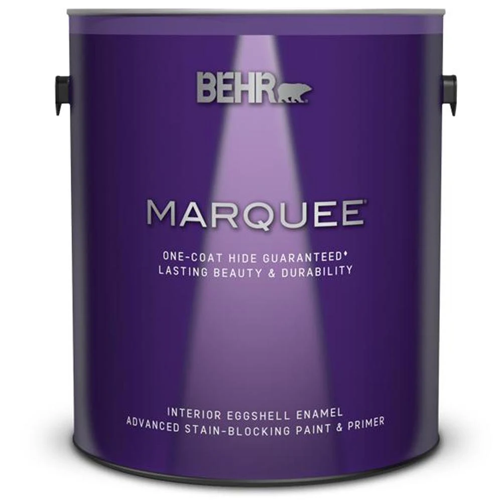
| Coverage | 250–400 sq ft / gal |
|---|---|
| Sheens | Matte, eggshell, satin, semi-gloss |
| Dry / Recoat | Touch dry 1h · recoat 2h |
| Full cure | 30 days |
| VOC | Zero VOC |
| Yellowing risk | Low |
| Primer | Tinted grey primer recommended on deep tones; otherwise self-priming over a similar-tone existing color |
| Price tier | $$ |
- Stocked at every Home Depot, mixable on a Saturday morning, in the can on the workbench by lunch — distribution beats every premium pick
- One-Coat Hide on the chip when rolled over a similar-tone existing wall; a fast accent-wall project is genuinely a one-coat job
- Effective price $45–$55/gal undercuts SW Naval before any SW sale lands
- Reads as nearly black under warm LED, not navy — the M510-7 chip on the wall and the wall in the room are two different colors
- Soft film for the first 30–60 days; the chalk-mark on a kid-height wall at week three burnishes the sheen if you scrub it early
- On most of Behr's deck (anything not flagged One-Coat Hide), Midnight Blue rolls out as a normal two-coat acrylic and the Marquee premium isn't earned
Benjamin Moore Fresh Start All-Purpose 100% Acrylic Primer tinted to 50% grey
Deep navy over white drywall reads streaky in two coats and only stops telegraphing at three. A primer tinted to 50% grey closes the gap in one coat and lets the topcoat read true on coat two. BM stores tint Fresh Start to the recommended grey shade for any deep BM color at no extra cost; SW and Behr stores do the same against their own primer lines. Skip the grey-tinted primer on a saturated navy and you're committing to coat three. For glossy cabinet doors or factory-finished trim heading into Hale Navy, swap to Insl-X Stix as the bonding step underneath.
BUY ON AMAZONFrequently asked questions
What's the most popular navy paint right now?+
Is Hale Navy too dark for a bedroom?+
Do I need a tinted primer under navy paint?+
Hale Navy vs Naval — which one?+
What sheen for navy walls?+
Is Farrow & Ball Hague Blue worth $150 a gallon?+
Will a navy wall make a small room feel smaller?+
- How to paint interior walls — full prep & application guide
- Best bedroom paint — calm tones for low-light rooms
- Best front door paint — including the navy door call
- Best paint for kitchen cabinets — navy cabinets in Advance
- Sheen guide — matte, eggshell, satin, semi-gloss, gloss